Newly established in 2022, Yonderlust is a family-owned business founded in Durham, North Carolina. The company has two primary focuses: an outdoor gear and apparel shop with a brick-and-mortar location in Durham paired with an e-commerce site, both set to launch in the Spring of 2023, and a mobile app featuring curated self-guided adventures. Kit Linton approached us with the goal of designing and building both the e-commerce site and the mobile app. As an avid outdoorsman, Kit had begun documenting several recommended adventures from his personal experience, complete with detailed itineraries, points of interest, and enticing photos. He saw a need for a more personalized and curated experience – especially for families – compared to the overly crowd-sourced existing offerings. With this depth of quality content and a detailed vision for what this app could be, Kit partnered with Savas to bring his vision to life.
Yonderlust
Navigating the Great Outdoors, a Curated Digital Experience
The Challenge
Create a comprehensive digital solution for a new outdoor lifestyle brand that seeks to not only sell outdoor gear both online and in-store but give their customer base custom guides for hiking, kayaking, and other activities.
Our Approach
Leveraging Shopify and WordPress, we built an eCommerce .com store, along with a custom mobile map-based application built using React Native, which includes customized packing lists, detailed itineraries, and detailed outdoor travel experiences.
The Results
A successful mobile app launch for adventurers in North Carolina and an eCommerce solution that complements a brick-and-mortar flagship store.
A new kind of adventure
Preparation for success
Rather than jumping right into wireframing the app flow, Savas kicked off the project with a Discovery phase. This included an analysis of user stories provided by Kit that detailed the desired functionality for users, administrators, a future marketing team, and a brand survey to inform the future design. We worked with the client to identify items of lower priority for the initial launch of the app, as well as functionality that was high on effort (and therefore budget) and low impact. With the final agreed-upon list of features for the MVP and a clear sense of brand direction, the team was ready to get started.
Building a brand identity
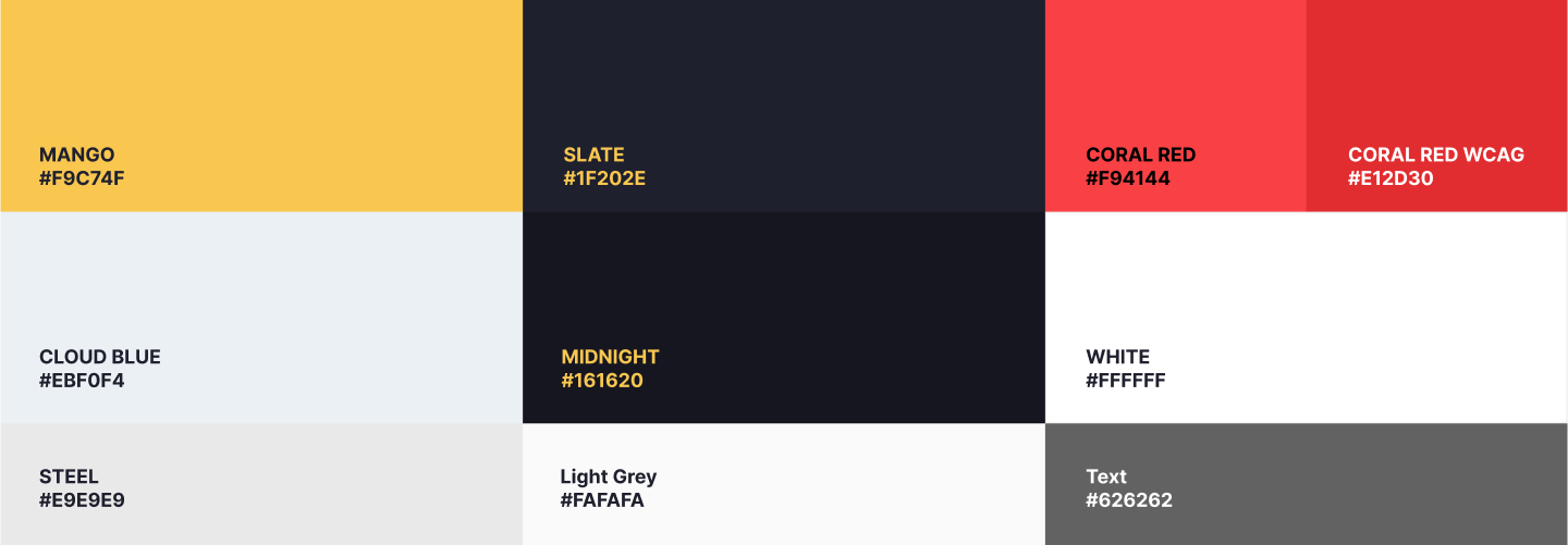
A key component of collaborating on any new business is establishing a strong brand identity. When Kit first approached us, his company was to be named Firefly Outfitters. With that name and the information gleaned from our conversations and investigation during discovery, our design team set out to put together a friendly yet professional, visually compelling logo and brand for Firefly. We presented multiple logo and color palette options for the client to review, a selection of which can be seen [below]. The final color palette for this iteration of the brand was built off of a straightforward base of grays and whites, with added accents of a glow green and firefly orange to brighten up the page visually. The logos captured the essence of the firefly -- whether in shape, glow highlight, or the actual letter F -- while also calling attention to the importance of location.

Months after this original branding work was complete, the client changed the name of the business to Yonderlust, and the logo and some aspects of the color palette necessarily changed along with it. But this foundational branding work set the stage for the app and eCommerce designs created after finalizing wireframes that clarified the exact user flow.
Simplifying the content management process
Savas engineers built the Yonderlust e-commerce site on the WordPress CMS, serving as a hub of information for users across the Yonderlust business family. Featuring the full assortment of apparel and gear sold at the Yonderlust store, users can browse, search for, and purchase items directly online. We implemented the ShopWP plugin to sync product information from Shopify so that the client can manage their available and incoming inventory in one centralized location, ensuring that the online products are in stock.
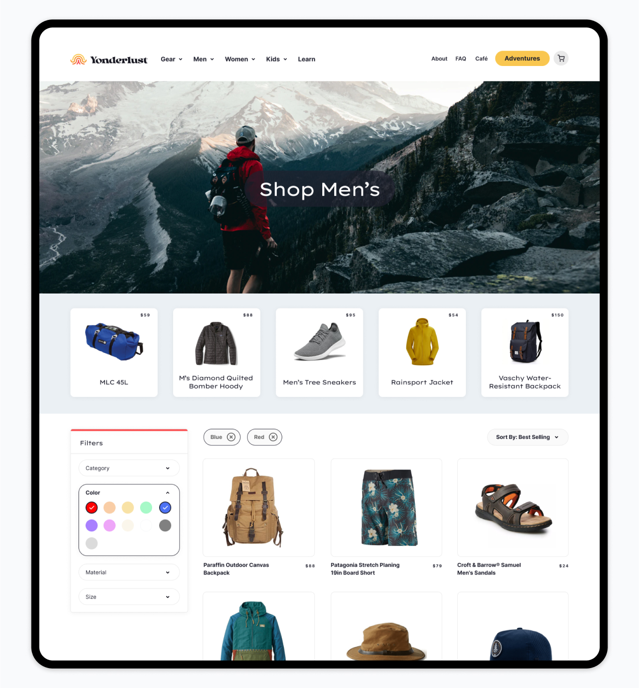
The site's Learn section also serves as a central resource for custom content -- including blog posts detailing Adventures available on the app, related news, and in-store events and trainings.
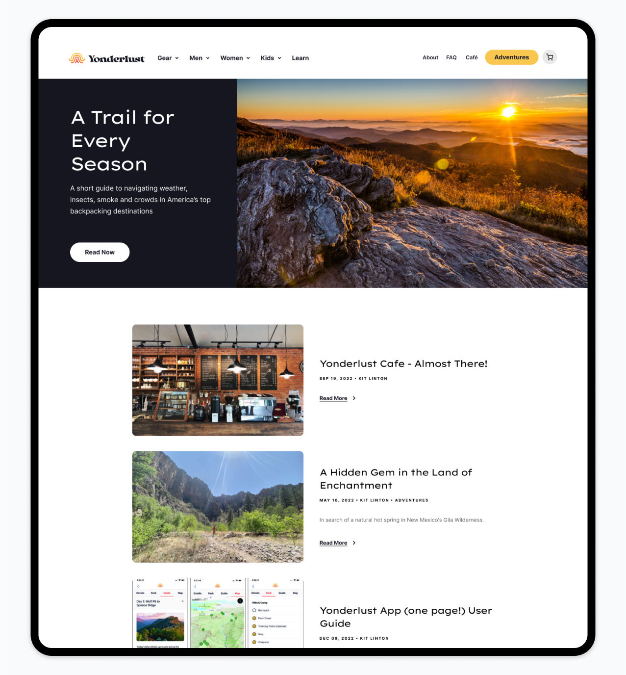
To keep an efficient, user-friendly workflow for the client, the mobile app also uses the same WordPress CMS for custom Adventure content, including detailed itineraries, packing lists, photos, featured points of interest, and even ad content. That means that Kit can edit an itinerary, add an adventure, or upload a point of interest photo in the same system where he manages which products appear on the e-commerce site, new blog posts, and featured store events.
Functionality breakdown
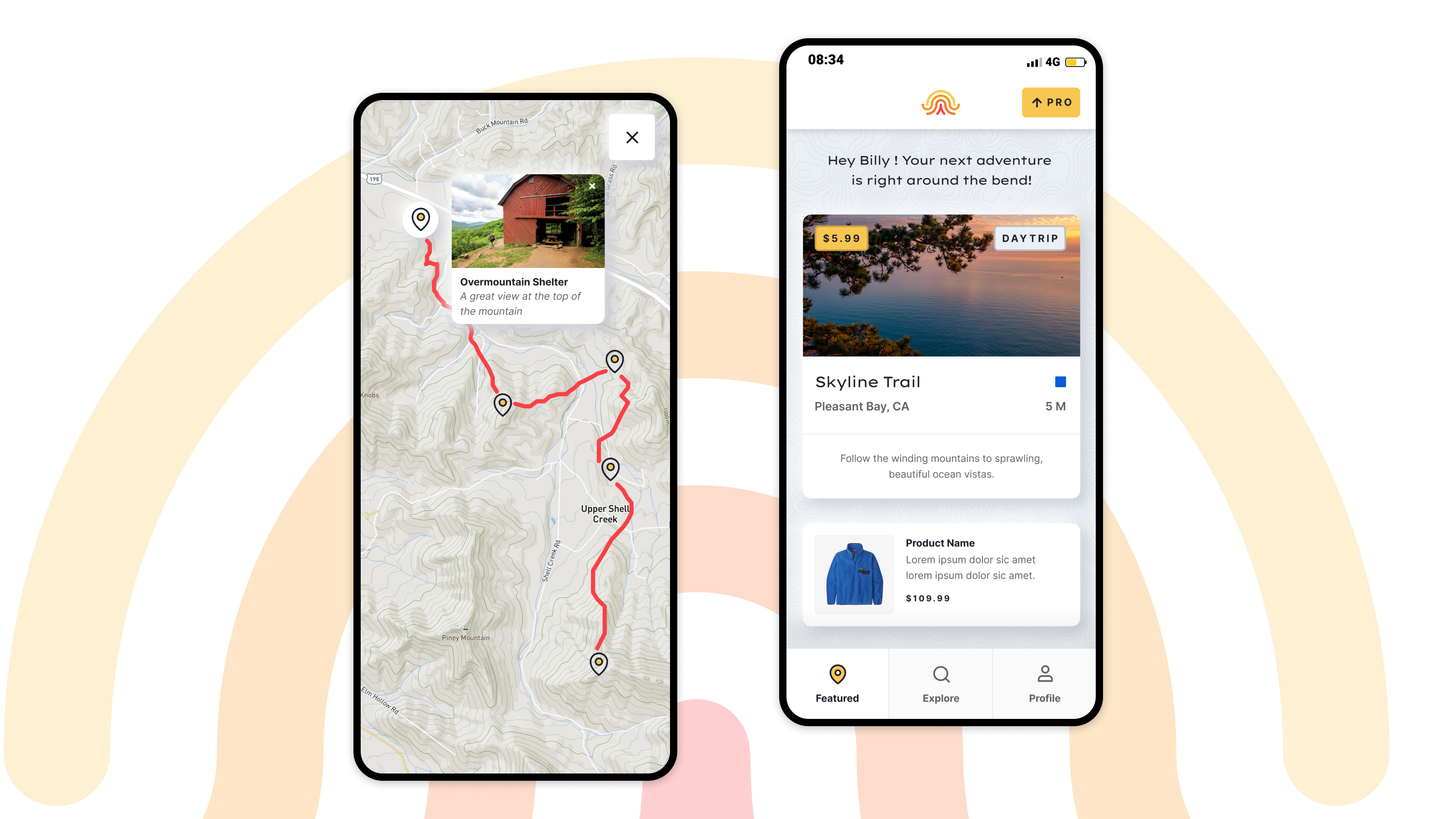
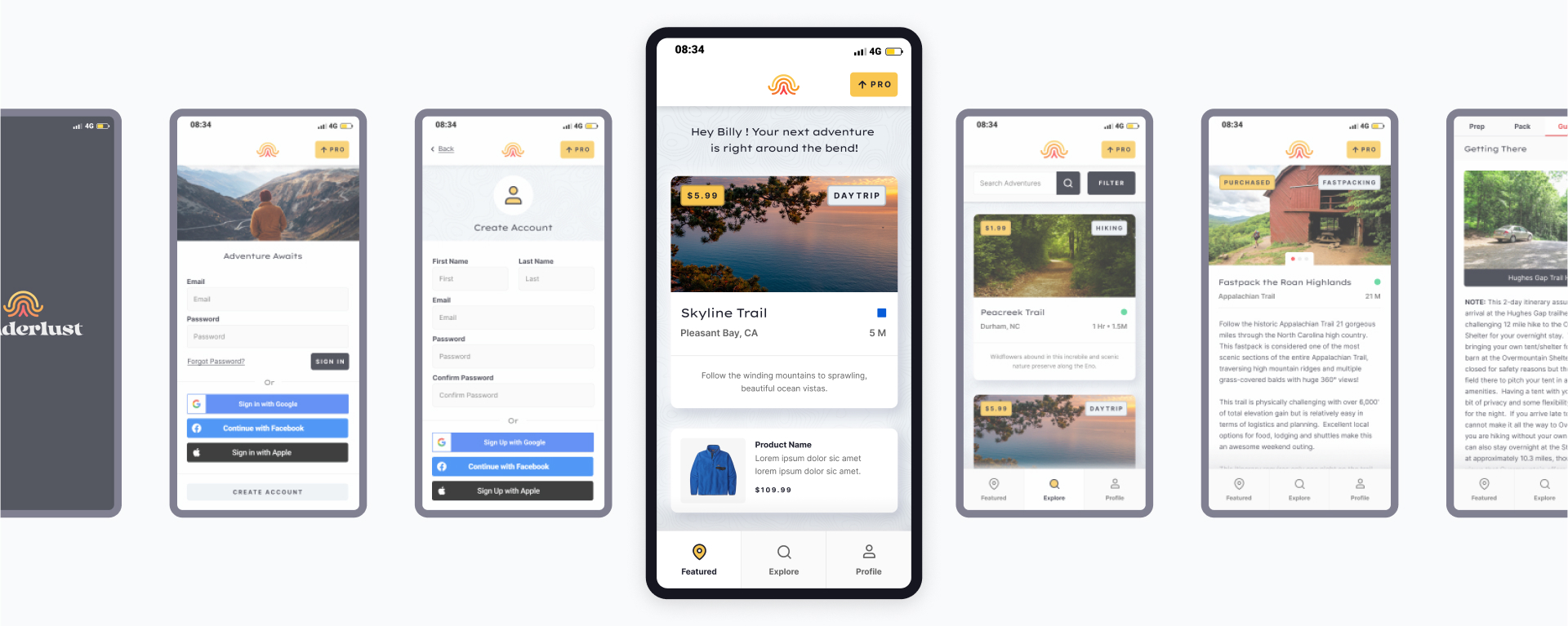
When the user first launches the app, they will log in to gain access to a variety of free adventure content and an introduction to several Pro level adventures available for a flat annual fee. Once users subscribe, they unlock access to all Adventures featured on the mobile app. Each Adventure includes detailed information, including difficulty level, distance, a detailed itinerary with photos and recommended waypoints to guide you through the experience, a packing list, and a map featuring the route and points of interest. The interactive packing list includes a custom list of recommended items. Also, it allows the user to add as many of their own items as they’d like to ensure the list is complete and tailored to their specific needs.

The app also includes a spot for custom advertisements with photos and links to specific products featured on the e-commerce site; this content is added to the WordPress CMS. Also, custom push notifications are enabled for both Apple and Android users who opt-in.
Building an experience for all types of users
Key to the experience is the detailed map included with each Adventure. Using MapBox to plot out the exact route and the coordinates of any points of interest along the way, a geoJSON file is then exported and uploaded to the WordPress CMS along with the MapBox map URL. The map featured on the app shows the route to follow and the user’s exact location on the map. The user can also click on Points of Interest, indicated with icons on the map, to explore locations for food, shelter, water, beautiful views, and other significant waypoints on the journey.
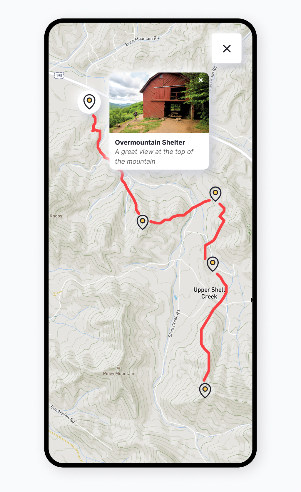
Savas knew we needed to make the map available offline to support all travelers, especially on routes that may take users off the beaten path. That way, if someone loses cell service, they also don’t lose their way! Utilizing WatermelonDB, we allow the map to be stored on the user’s device when they select the option to download. The user can then prepare in advance but does not necessarily have to store the data on their phone at all times before the trip. This feature is significant in making the app a safe and supportive tool for users on these journeys.
An e-commerce solution built for a brick-and-mortar location
Leveraging a foundational technology stack for both the eCommerce store and the app, Savas built a unique solution to support two very distinctive business goals for Yonderlust. By tackling both simultaneously, the team was able to create an interconnected system for a streamlined admin and user experience. Although the e-commerce store won’t launch until Spring 2023, the Yonderlust app is available for download on Google Play and Apple. Check it out!
Looking for a partner to develop your mobile application?
Our team will work with you to define your needs and devise a solution that engages users.

