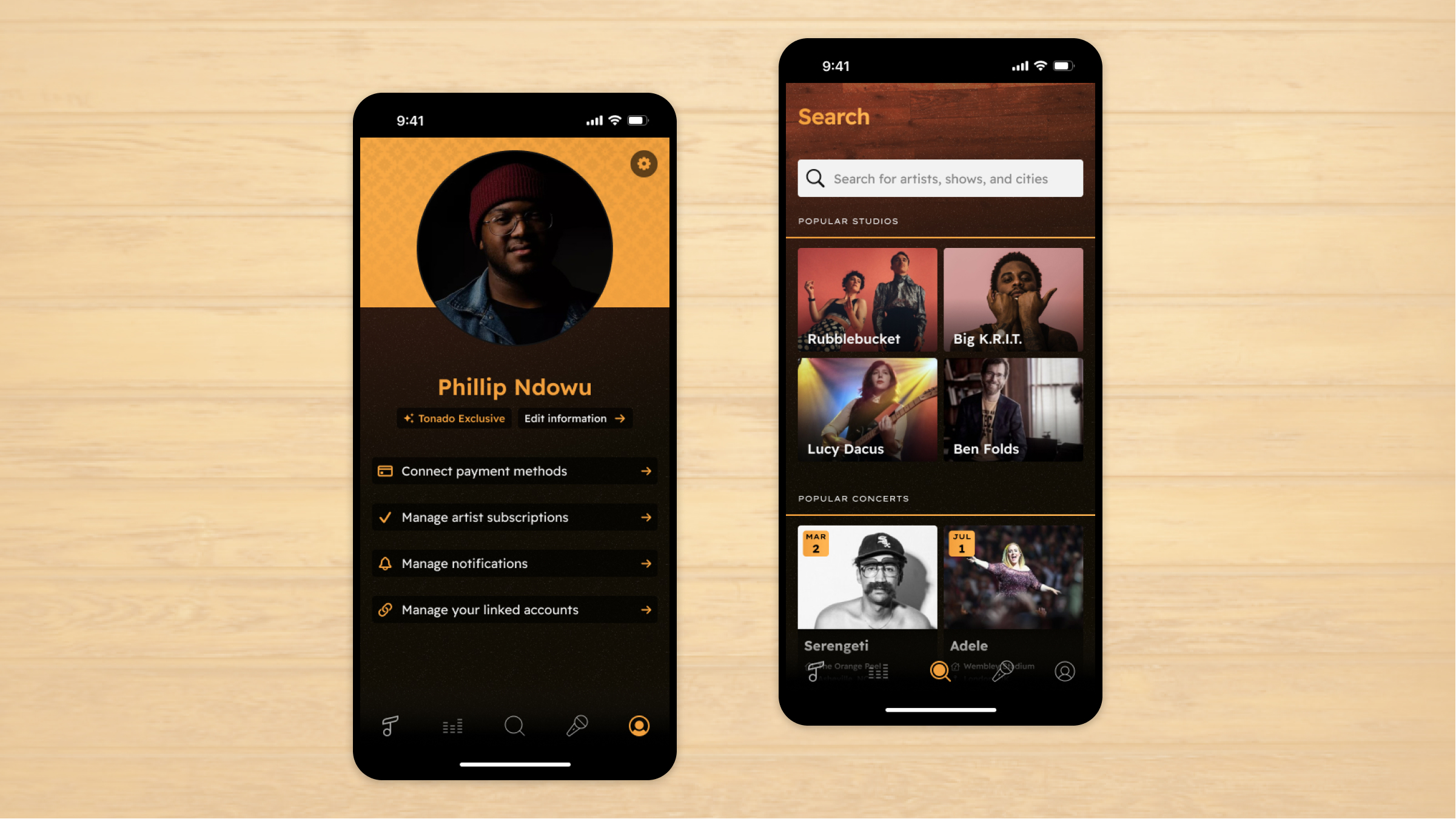
Phillip Ndowu was getting his master's in music at Emory University in Atlanta. Inspired by a recent Adele interview where she mentioned an unreleased song from her album that’s 15 minutes long, Phillip had an idea. He wanted to create a platform unlike any other mainstream music application where musicians and artists can post exclusive content - songs, interviews, demos, notes – and fans can subscribe monthly for access. Users would also be able to purchase concert tickets through the platform, with the unique ability to opt for a virtual ticket. Philip reached out to us to bring his idea to life through a professional mobile application user interface.
Tonado
Designing a Ground-Breaking Mobile Application User Interface

The Challenge
Music industry entrepreneur Phillip Ndowu needed our help building out a user interface for a mobile application featuring exclusive content released by musicians and artists.
Our Approach
We conducted a highly collaborative discovery phase where we documented the user flows and explored an initial design direction to define a minimum viable product.
The Results
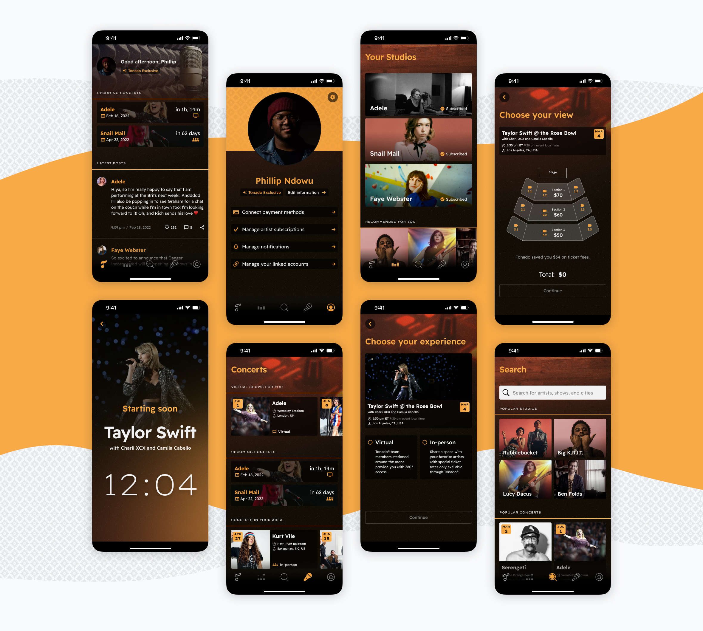
A clickable, dynamic prototype featuring a polished user interface that illustrates the full functionality of Phillip’s idea without involving a developer.
A new way to connect with artists
An opportunity for collaboration
During our first call with Phillip, it was important to us that we understood his vision and motivation behind the mobile application. We created a user flow to determine the number of screens that would be needed to incorporate the app’s key functionalities.
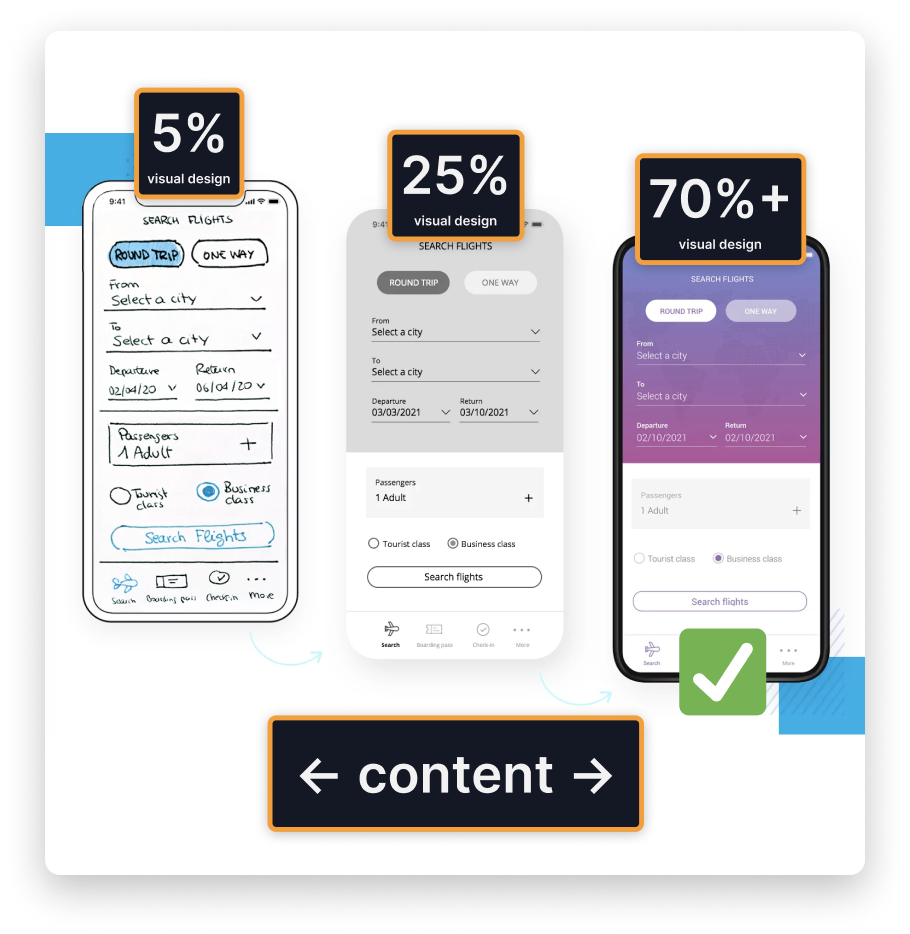
From there, we put together a low, medium, and high fidelity example of a single screen to show Philip the options for design detail of the final prototype. Low fidelity would be faster for us to put together but less polished. The high-fidelity option – and the one chosen by Phillip – was close to the final design.
RELATED READ
The Importance of Being Curious
Experience over everything
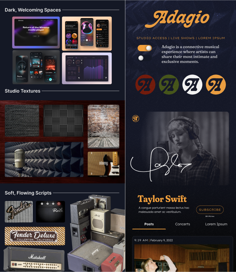
When it came time to create the mood boards, we wanted the app’s look to be as unique and innovative as Phillip’s idea. We gathered examples of music industry items such as amps, sound-dampening walls, microphones, etc., and examples of websites that matched the mood and tone of luxury that Phillip desired. One of our designers even went as far as to mock up a small section of a screen and an initial logo.
Phillip came into the project knowing that familiarity is one of the most critical aspects of user experience. We used wireframes to outline each screen's content and features and which specific actions the end-user would take. From finding and subscribing to an artist to purchasing a concert ticket, we wanted a seamless navigation experience.
Our time spent on wireframes was an excellent opportunity to collaborate with Phillip and ensure we met his needs before moving forward.

Not your average prototype
Once we finalized wireframes, colors, typography, and branding, we got to work building out fully designed screens. We wanted to make our static screens look and behave as if they were a fully functional mobile application without using a developer. To do this, we used Figma, our design tool, to turn those screens into a clickable user interface – including artist videos using GIFs – that would provide a preview of the app’s intended functionalities.

Their responsiveness, their creativity, and their friendliness were impressive!


