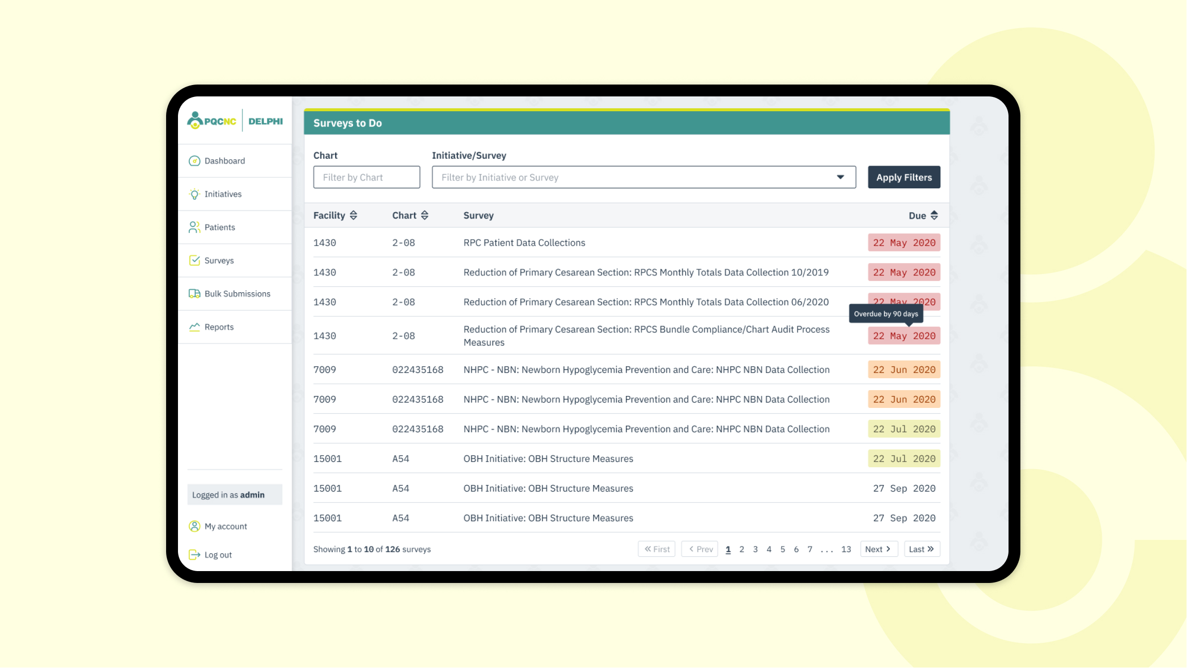
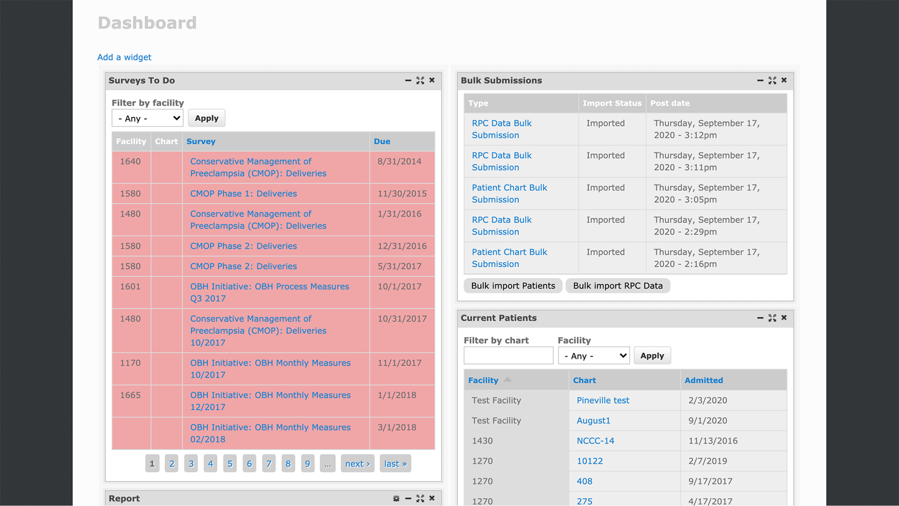
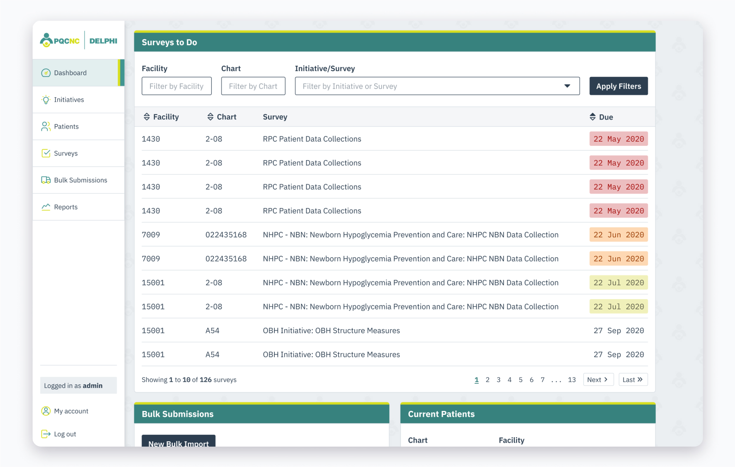
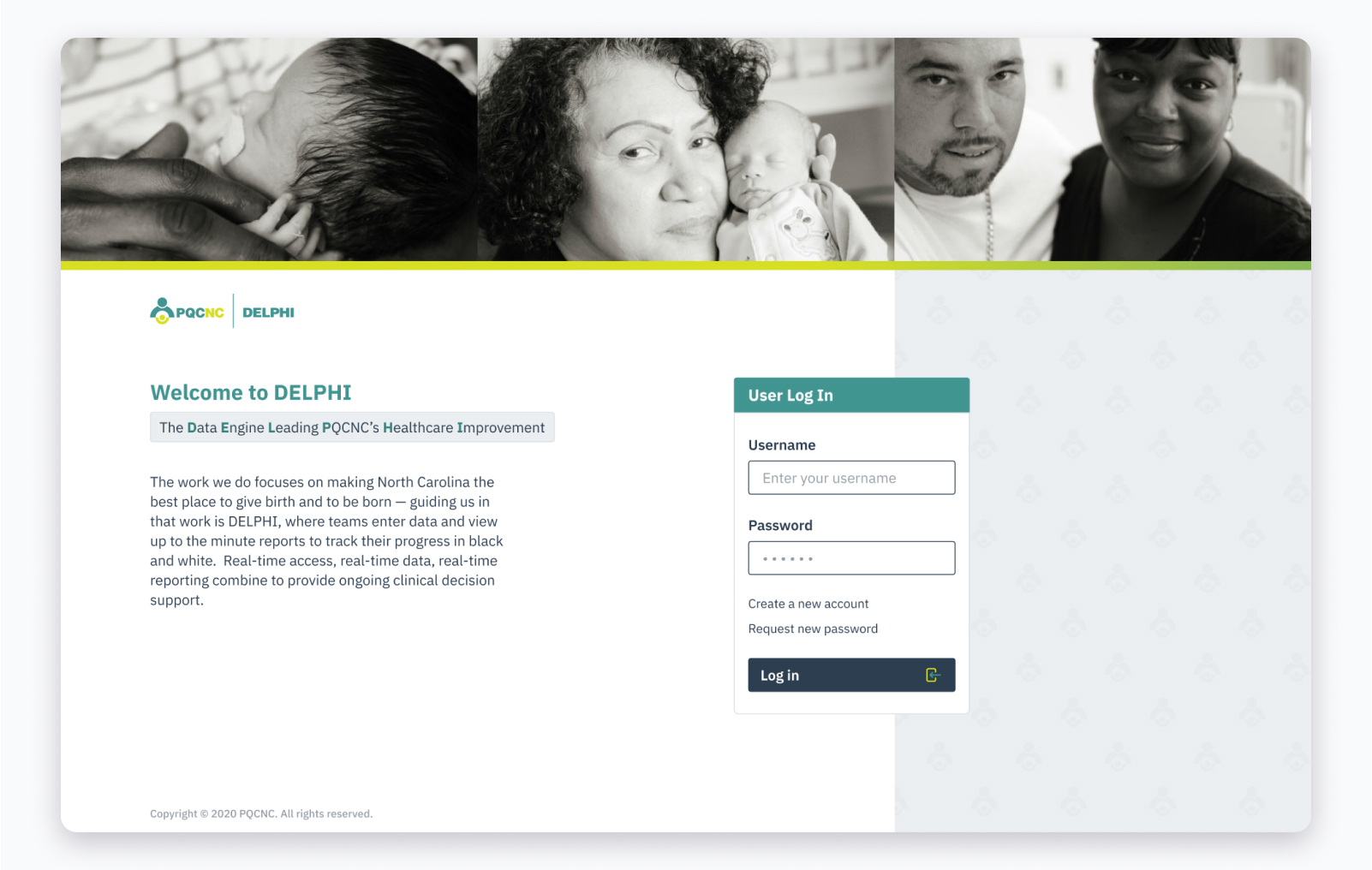
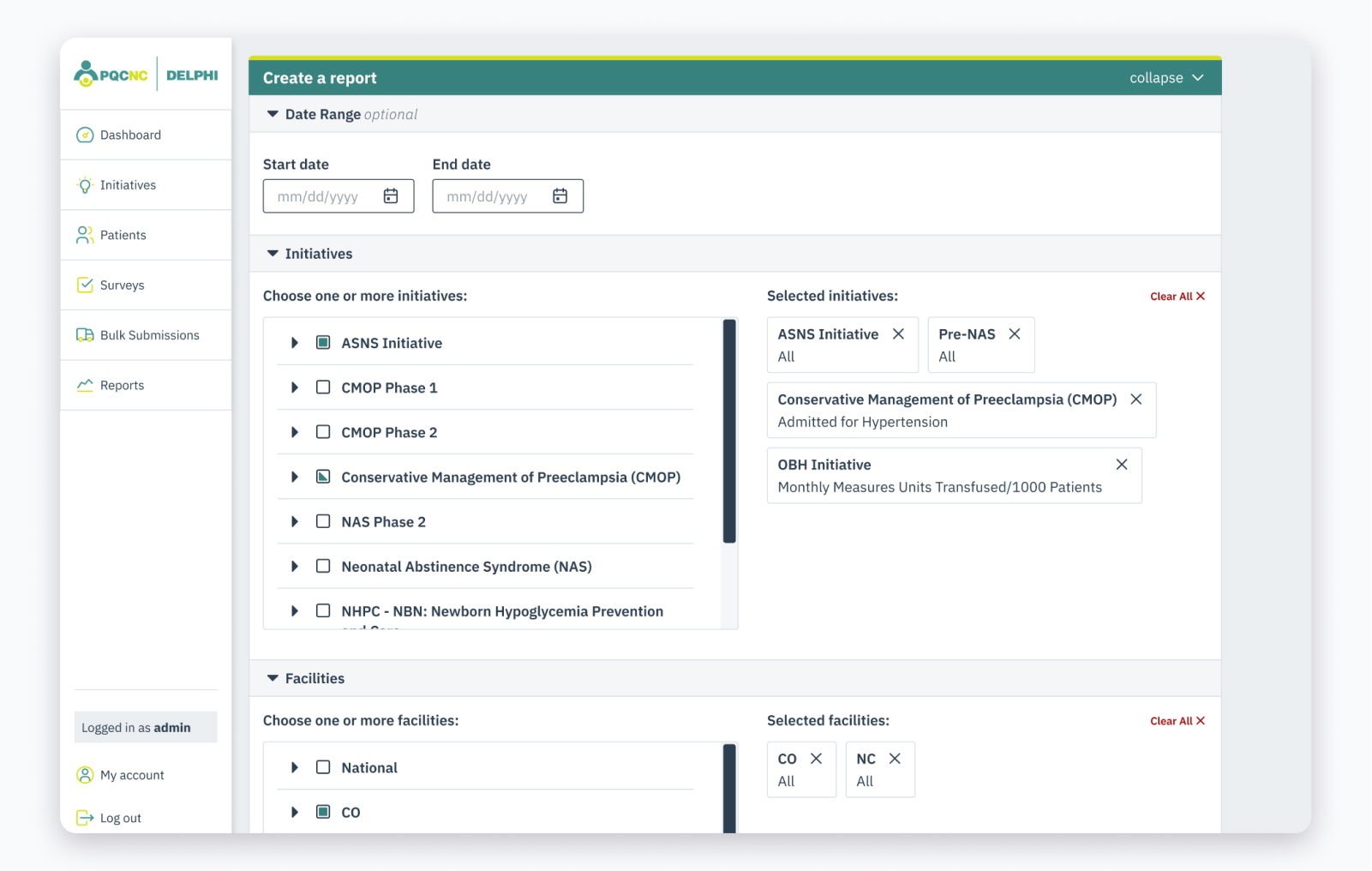
Difficult user experiences in healthcare technology is an unfortunate, common reality. At first glance, core features of the DELPHI tool were obscured by cumbersome and hard-to-use forms, fields, and tables given the decade-old technology.
After a focused UX audit, we decided to propagate a few key changes throughout the tool. We drastically improved usability by clearly defining form styling, and introducing breadcrumbs, selection chips, and proper accessibility affordances.
