The Linguistics Department at the University of Rochester researches under-documented languages in remote communities across the globe. Their researchers work with locals to better understand the nuances of their native languages. Their internally-produced tool, used to collect research data, was built piecemeal by research assistants and graduate students with varying degrees of development skills. The tool was very powerful, but presented a haphazard user experience that significantly hindered the work of researchers in the lab and in the field. Through deep dives into use cases, and direct, real-time collaboration with the URL team, we re-architected the tool from the ground up from a user-first approach. We delivered a working figma prototype that the URL team can use to demonstrate a clear vision to donors, and provide clear direction for developers when the time comes to build.
University of Rochester Linguistics
Creating a User-Focused Prototype for a Research Tool

THE CHALLENGE
The tool that supported the research of the University of Rochester’s Linguistics Department had multiple inconsistencies in its usability and lacked structure. The research team had quickly found that their needs outgrew their capabilities, but had a limited budget, encouraging us to think creatively to deliver impactful results efficiently.
OUR APPROACH
Through extensive user testing and collaboration with the client, we identified user pathways and their pain points to overhaul the user experience on both the front and back end of the app.
THE RESULTS
An interactive Figma prototype & app architecture that demonstrates a viable path forward, giving the UR Linguistics team a tool that can both be used for their internal development teams, and to secure funding to keep driving the UR Linguistics mission forward.
A Tool In Need

Console
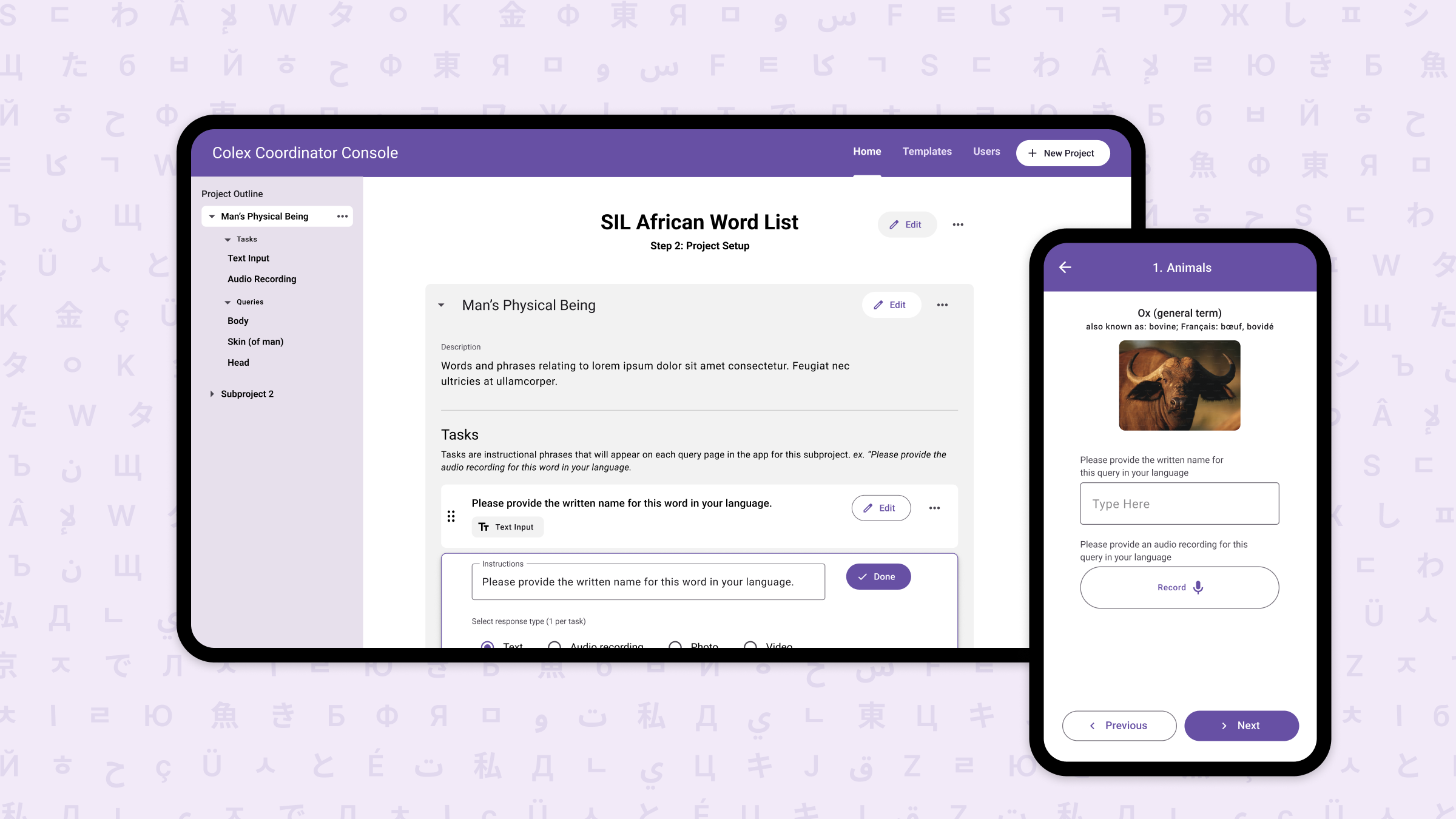
The admin console had very little UI framework. It was built piecemeal with custom, static styles for each piece of UI. Because of that, the best path forward was to overhaul the interface from scratch. We architected a new user experience starting with wireframes, streamlining the management of entries, projects and users. From there, we chose Google’s Material Design 3 as a UI framework, to make it easy to implement highly-consistent UI updates for developers of any skill level.

Mobile App
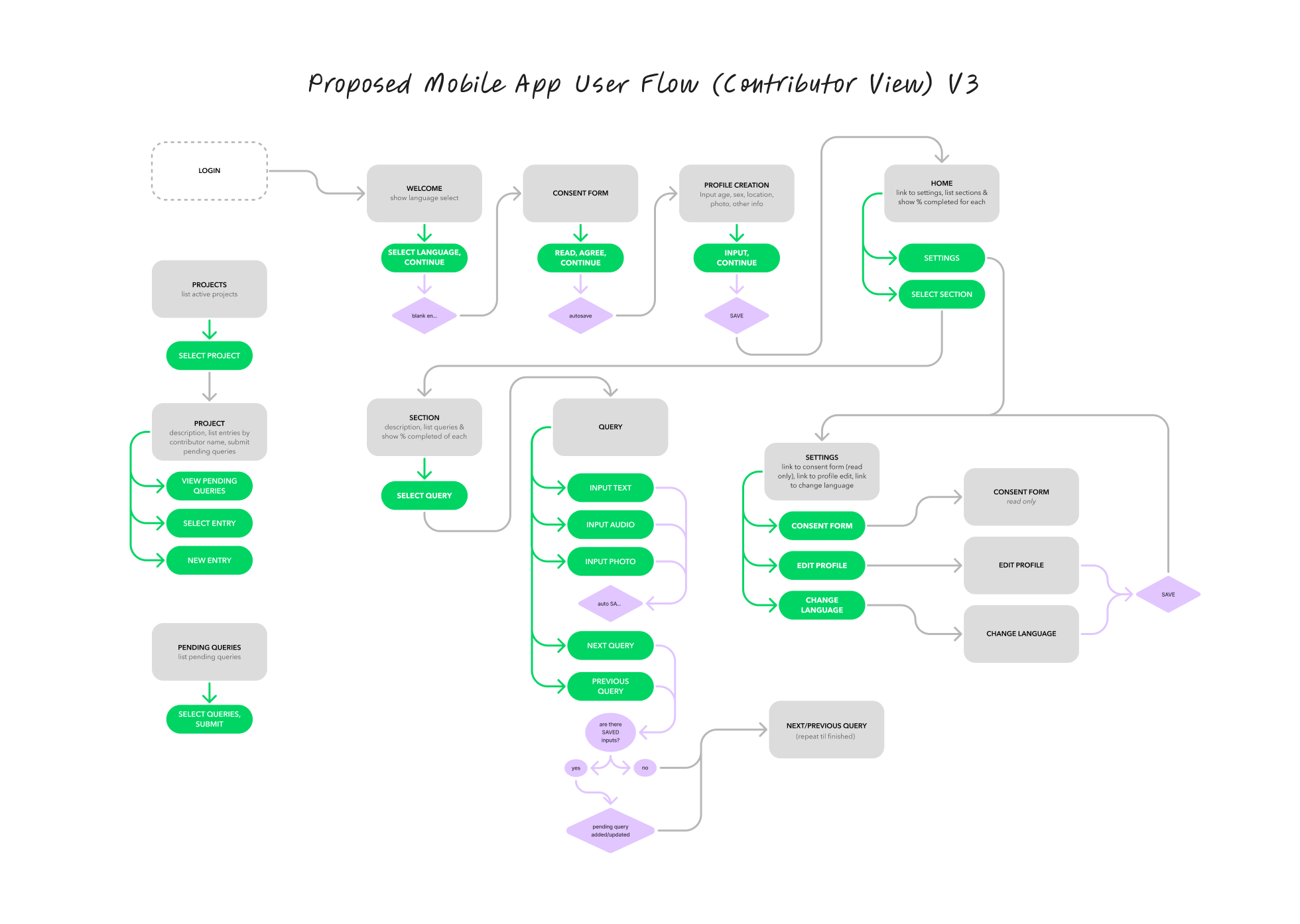
The mobile app had better visual consistency, but presented its own set of challenges. Network connectivity issues, repetitive user actions, and usability inconsistencies made working with the app very cumbersome, adding a level of difficulty to the field research process. We detailed thorough user flows based on real use cases, and simplified controls to eliminate unnecessary actions, all using Material 3 to reach a high level of consistency and ease of implementation for the development team.

Interactive Prototype
A key need for the Linguistics Department was to have a prototype they could bring to colleagues and potential donors to present advancements with their research and demonstrate functionality. We built an interactive prototype in Figma that covers the entire user flow, from entry into the app to the entering of data. This prototype both serves as a demonstration for folks to understand the challenges the Linguistics team faces, but also details specific interactions for developers when the time comes to build.
A Tool Built to Last
The Linguistics Department at the University of Rochester faced a number of usability issues with their ad-hoc built research tool. By collaborating with them to define user needs, we re-architected their tool to significantly enhance the user experience, ease implementation for in-house developers, and showcase functionality to potential donors.


