It was clear from the beginning that there were a significant number of teams involved in making WHHA the behemoth of educational resources that it is. With that in mind, it was a priority for us to get those teams involved in the redesign process. We held one-on-one interviews with each department head, and by using a standardized set of questions, we were able to create a network of priorities to cross-reference as we moved through the project. This not only streamlined our development, but also ensured that the entire WHHA team felt involved in the end product.
White House Historical Association
Redefining an Established Aesthetic for Maximum Usability
Challenge
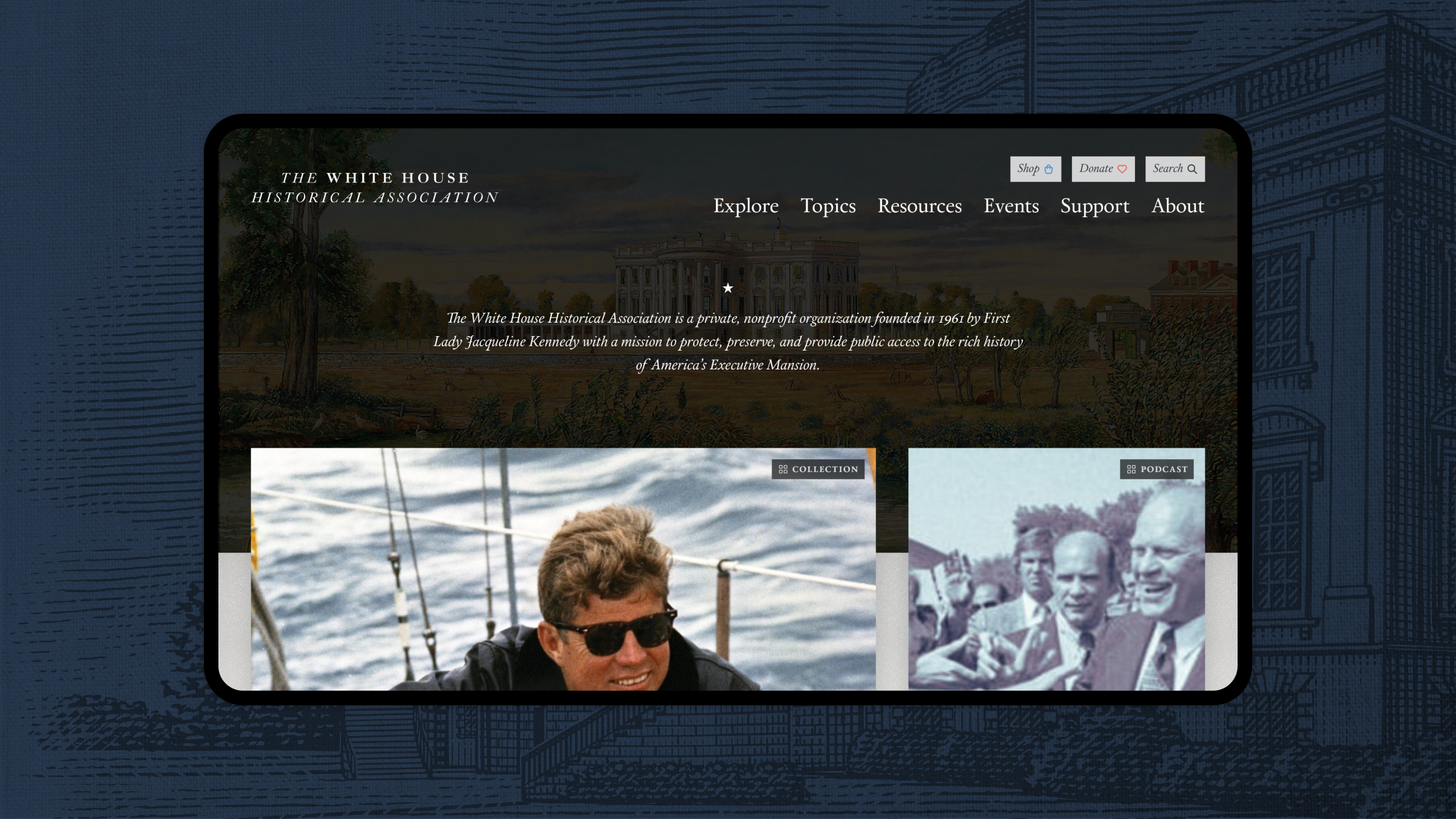
The White House Historical Association (WHHA), by its nature, serves two distinct user groups – explorers and researchers. Their previous site attempted to straddle the line between their needs, ultimately delivering an experience that was challenging and confusing to its users.
Approach
We saw an opportunity to streamline the navigation and search functionality on the site, while also refining and restructuring the well-loved visual identity to make it easier to discern key information.
Results
We were able to give whha.org the facelift that it needed – a website that is scalable, in line with the needs of its stakeholders and users, and will provide an excellent experience for years to come.
White House Historical Association
Assessing Needs Through Stakeholder Eyes
An Historic Refresh
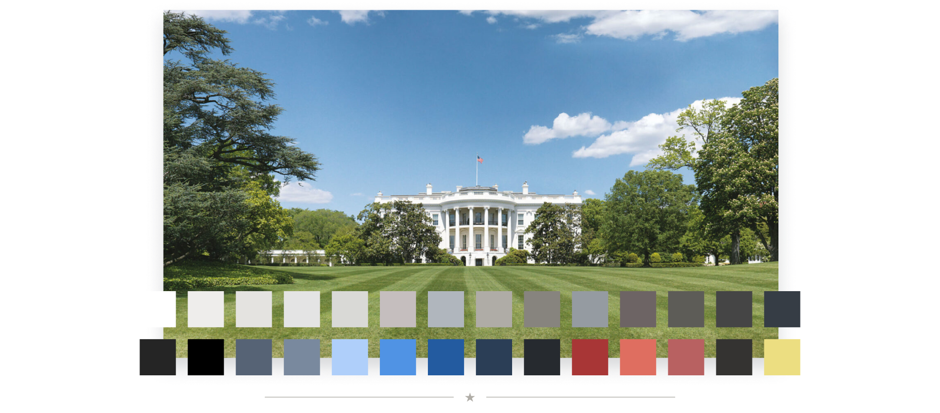
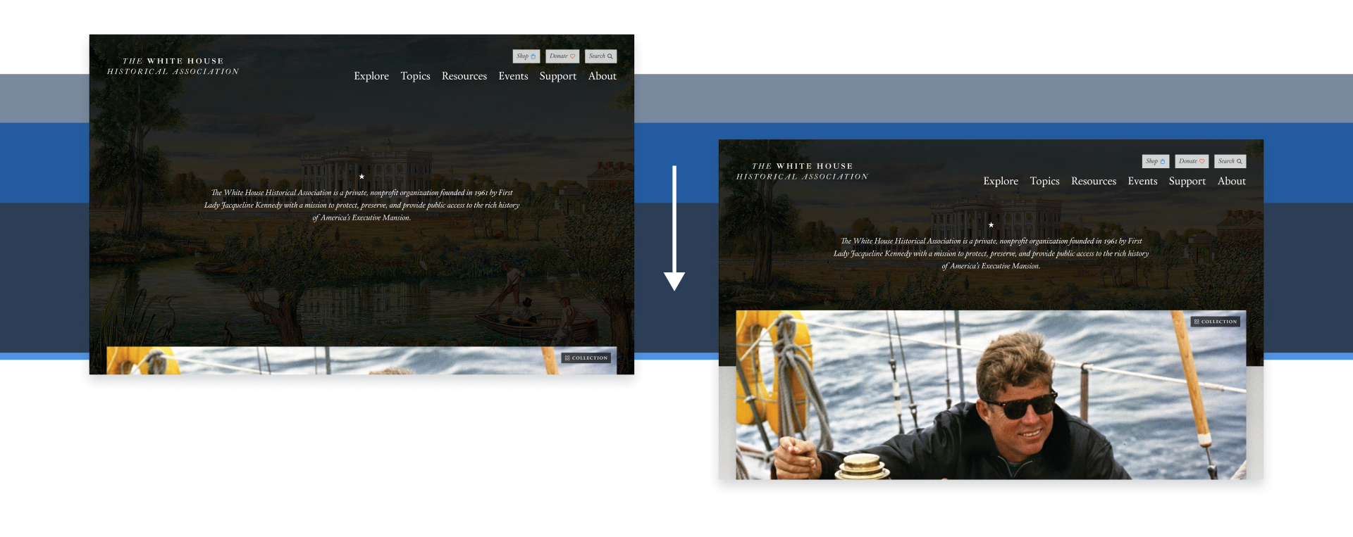
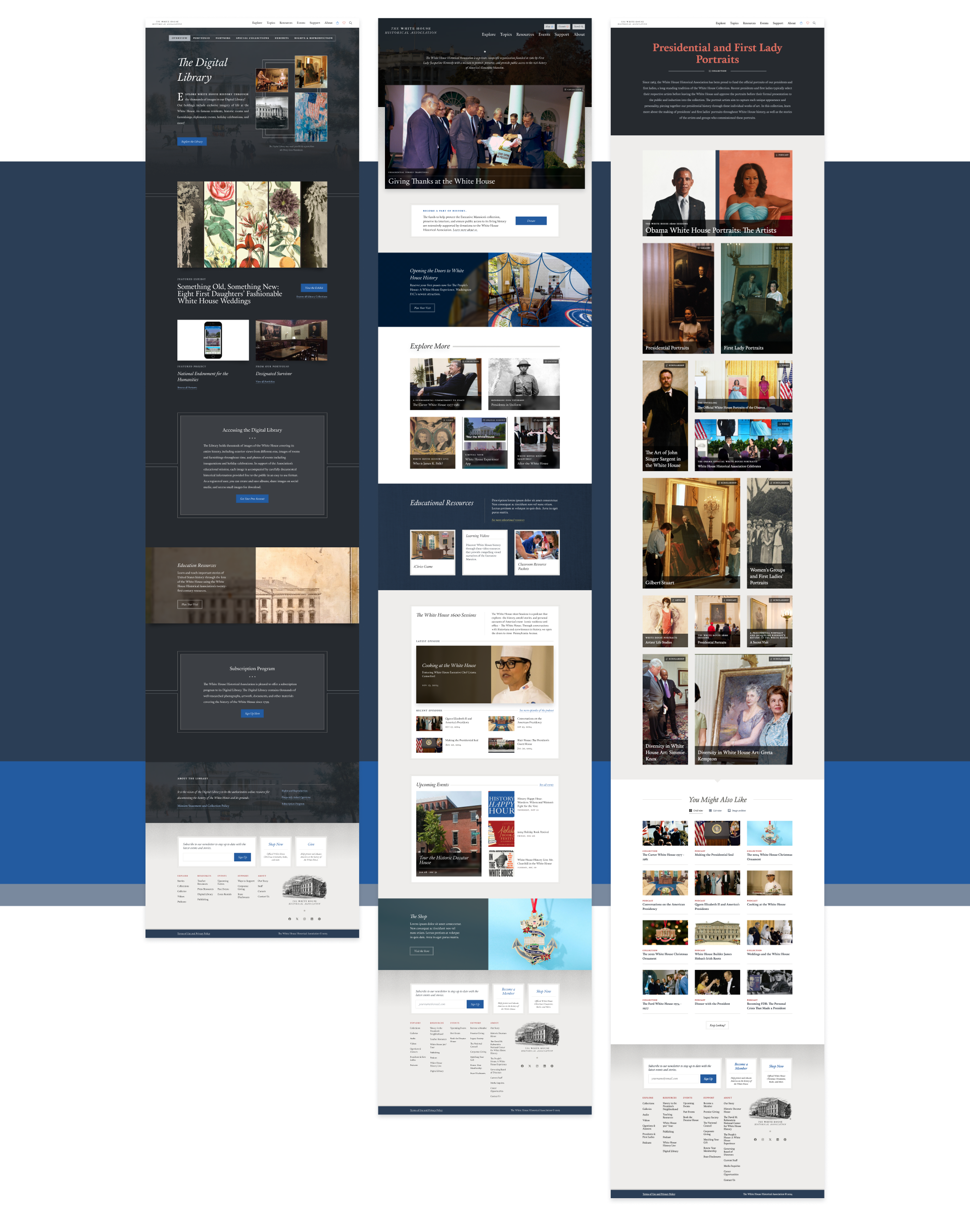
Through our various stakeholder audits and design exercises, it was determined that there was a deep affinity for the fundamental design of whha.org. Nevertheless, we saw an opportunity to rework the existing design system to enhance WHHA’s UX goals. We redesigned their content cards – a fundamental piece of how they communicate with their users – to make information easier to understand and provide clear pathways for exploration. There was a particular focus on the Homepage, where we implemented a parallax effect that showcases the fantastic digital assets that make up WHHA’s resource library and allows users to navigate them more naturally.

Navigation Built for All
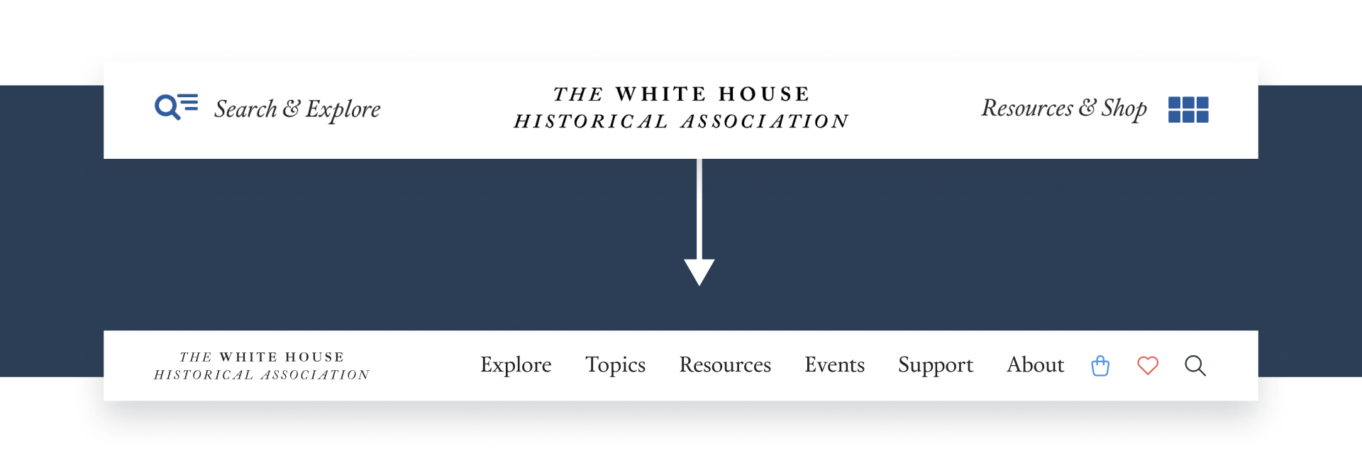
It was well understood when we began the project that researchers and explorers (parents, kids, curious folks) were the primary user groups on whha.org. Their previous website attempted to silo these users into their respective “buckets” to make their experience more streamlined. Unfortunately, this ultimately led to confusion for the average user. Moreover, the tagging system was limited, making it difficult for users with specific queries to search WHHA’s extensive resources.
To address this, we merged all of the navigation items into one unified location, reducing confusion around where each user should go. Implementing a mega menu also allowed us to include brief descriptions to further guide users through the site and ensure that they land where they intend to. Finally, we enhanced the tagging system, making accessing every resource that much easier.
Flexibility with Craft
WHHA was intent on sticking to their existing CMS – Craft. With our expertise, that itself was not an issue, however there were legacy code structures that added complexity to what might have otherwise been a straightforward development process. This required close collaboration with the WHHA IT team to better understand the work of the previous vendor – often without supporting documentation – and how it would fit in with our work.
We ultimately were able to do a major CMS update, upgrading both the capabilities of the CMS and the user experience, while preserving the familiarity for the staff. Once completed, we layered our own enhancements and updates on top of the existing site functionality. This created an environment where the WHHA team could continue their work with confidence and without significant onboarding.
Conclusion
Through extensive stakeholder engagement, upgraded legacy systems, and creating scalable design solutions, WHHA now has a website that serves their layered audience effectively while preserving their historical brand integrity. There is now a solid foundation for WHHA’s future web projects, ensuring that the website can evolve in lockstep with the organization itself.

