No Kid Hungry

Interactive Map Overhaul for Enhanced User Experience

No Kid Hungry Grant Impact service page

THE CHALLENGE 

The team at No Kid Hungry reached out to us to rethink the interactive maps currently featured on three of their service pages.

OUR APPROACH 

We worked with their stakeholders to understand the goals of each page and determine if an interactive map was the best method for users to explore the data.

THE RESULTS 

We effectively showcased the organization's location-based information by eliminating two of the three maps and substituting them with a robust card filtering system to ensure an optimal user experience.

Founded in 2010, No Kid Hungry (NKH) is a national campaign run by Share Our Strength, a US-based nonprofit committed to eradicating childhood hunger and poverty worldwide. 

For the past 13 years, their team has been dedicated to helping communities feed children. To further this mission, NKH offers online resources for families searching for affordable food options and partners with national brands to ensure kids receive the necessary meals for healthy development.

A need for a stronger foundation

At the beginning of the COVID-19 pandemic, different groups of NKH stakeholders quickly created three interactive maps powered by Mapbox for the primary service pages on their Drupal site. However, the maps required a significant investment of time and management because there wasn’t an easily accessible or consistent way to update the necessary data.

Despite these challenges, members of the institution understood the importance of their upkeep due to the visual impact on the page and pivotal role in social posts, campaigns, and other various outreach initiatives. Since we have worked with NKH in the past to rebuild their site, they reached out to us requesting our help reenvisioning the site’s interactive map structure in a more durable, long-term way.

The maps

At the start of the project, the NKH team expressed that they didn’t want us making any significant changes to their existing technology. However, maps are a notoriously tricky site component in terms of usability, especially on mobile devices. With both these things in mind, our first step was understanding why these maps existed and the data each presented.

Free Meals Finder

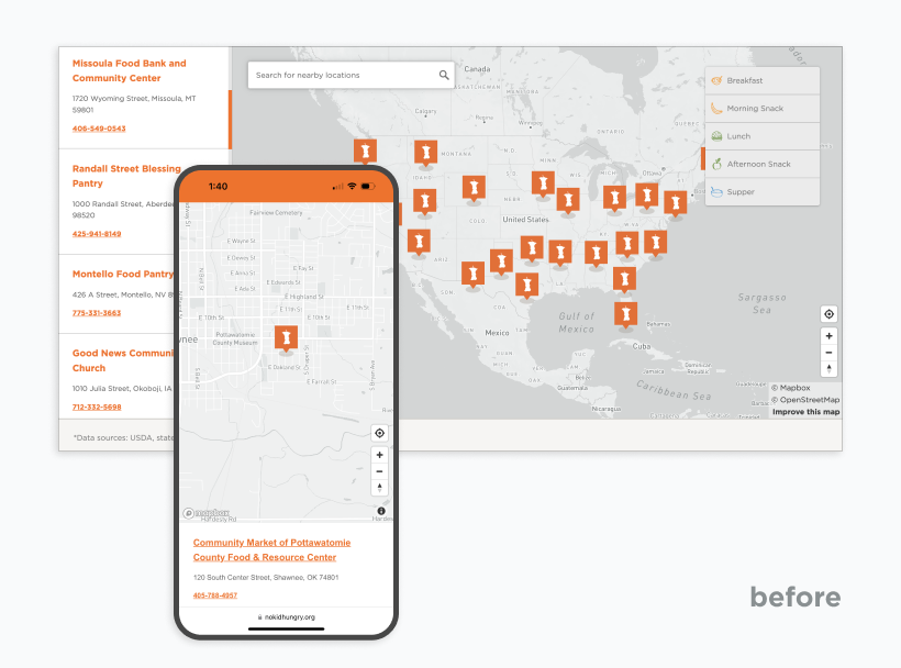
The Free Meals Finder created the most direct challenge for us: A smattering of locations that serve free, healthy meals to families in need, but a UI that created confusion - relying on a US Map as the form of navigation and without any sorting or filtering controls, the user interface left an incomplete and inaccurate picture of the meals available, to the point where many users had chosen to eschew the whole thing instead to use the text messaging service to the same end. Our goal was to get a user to a meal location as fast as possible.

Free Meals Finder interactive map

Grant Impact

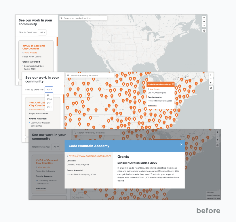
The goal of the Grant Impact Map is to provide donors with three mental pictures: No Kid Hungry's effect nationally, No Kid Hungry's effect in your area, and the effect of No Kid Hungry across different years and demographics. As seen below, solving this with a map as an interface failed to underscore the breadth of No Kid Hungry’s mission, so we rethought those objectives while still wanting to keep the US map for scale.

No Kid Hungry grant impact interactive map

Brands that Give

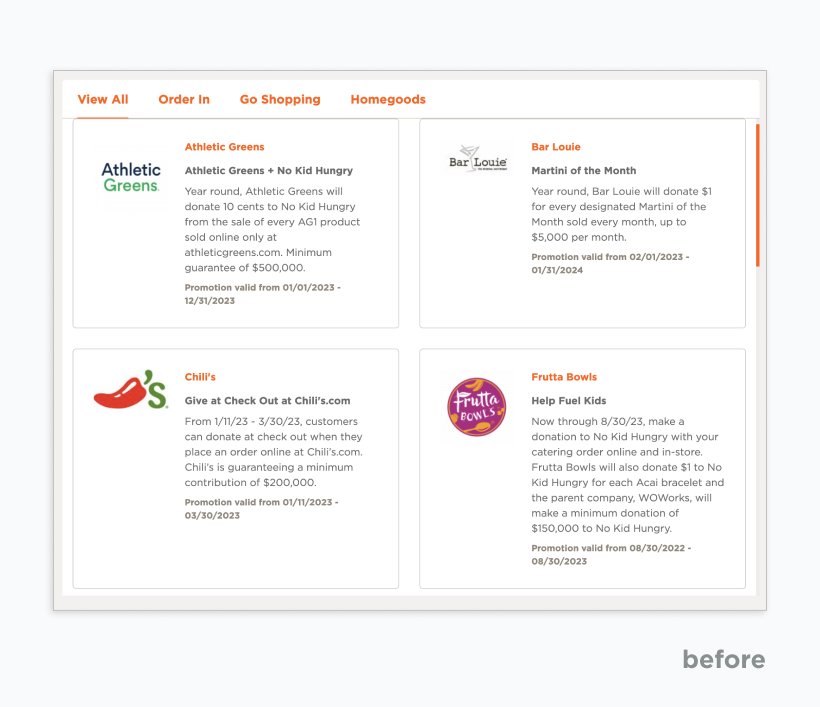
The Brands That Give service page provides an opportunity for corporate partners to prevent promotions that directly benefit No Kid Hungry. These promotions can be both online or at a location near you. The sorting across categories provided more confusion than categorization, and once again, the US map failed to be an actionable piece of UX. We wanted visitors to see what promotions are available (as well as upcoming ones) and then drill down into what promotions are available at locations near them.

Brands that Give original filter system

Changing the format

After identifying difficulties with the existing map features and aligning them with the organization's objectives for this project, it was clear that a more practical approach was needed to distribute NKH's invaluable resources and data to users. Working closely with their team, we discussed alternative solutions for depicting location-based information in a non-map format for each service page.

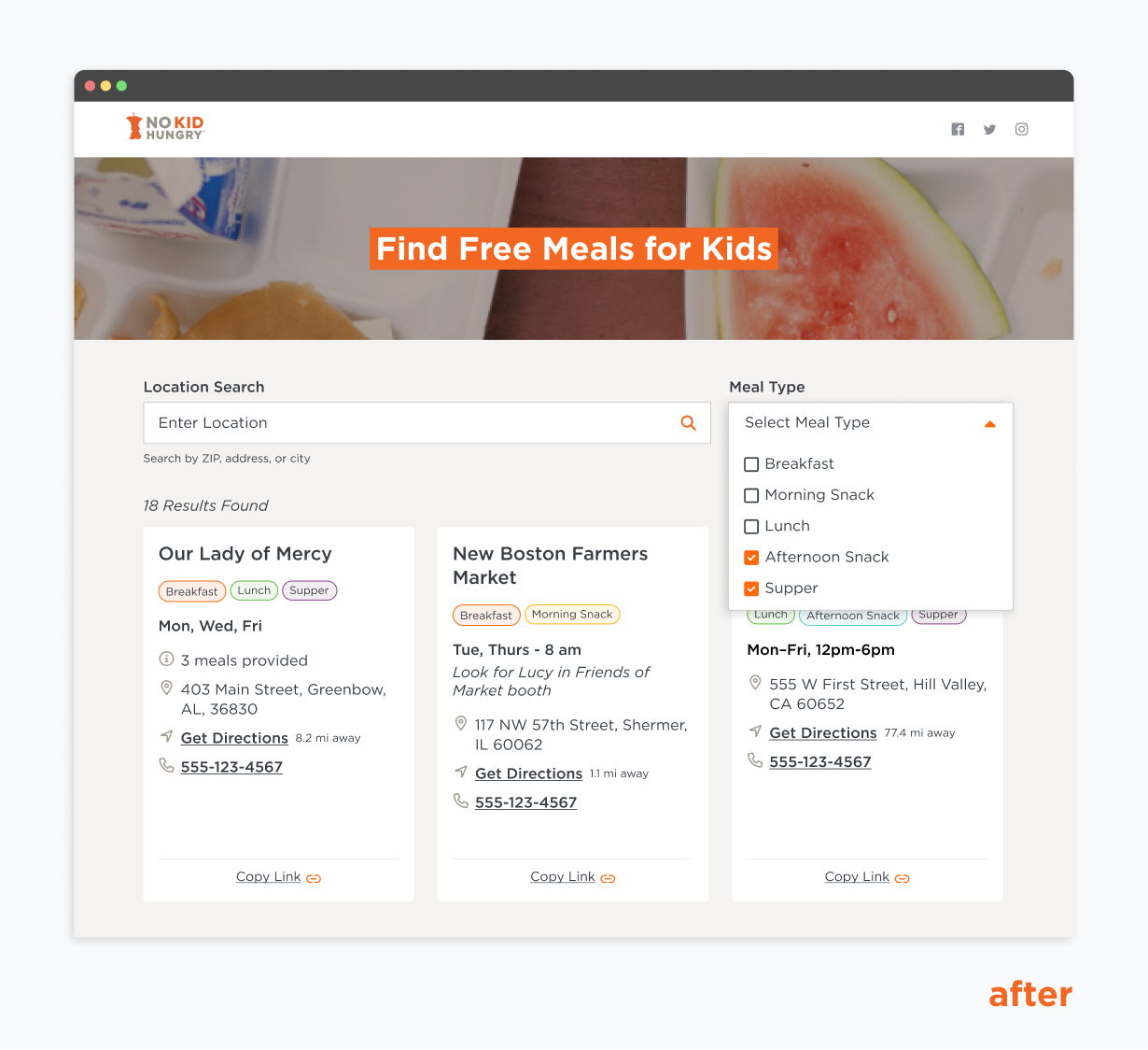
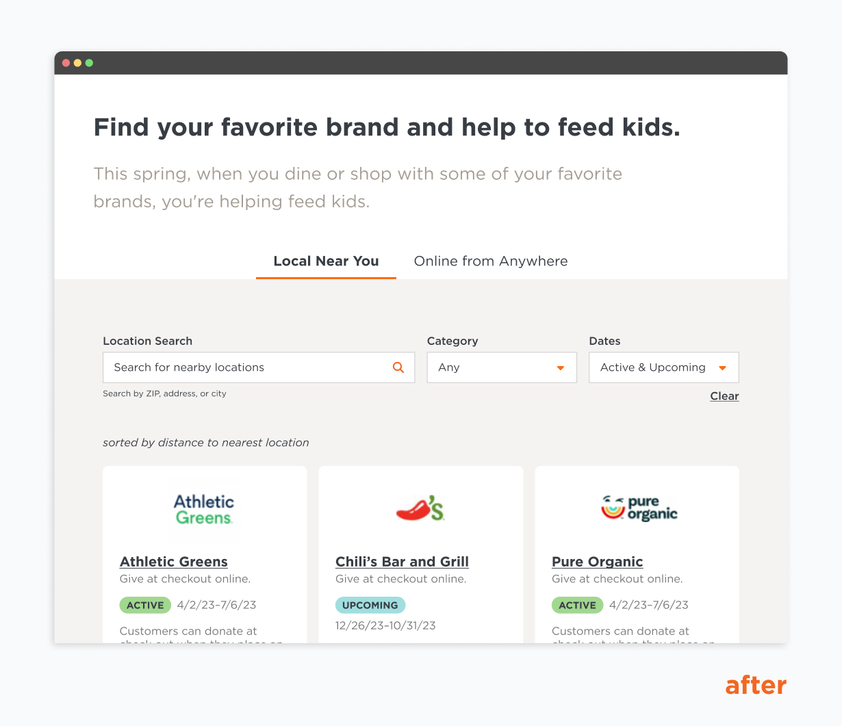
Starting with the Free Meals Finder page, we replaced the map with searchable and scannable cards. These cards can be filtered by both location and meal type, enhancing accessibility for mobile users, particularly those seeking meals while on the move. We implemented a similar filtering system on the Brands that Give page. Here, users can search by location for local in-store promotions or browse through active and upcoming promotions that aren’t bound by region.

Free Meals Finder new card filtering system
Brands that Give updated filtering system

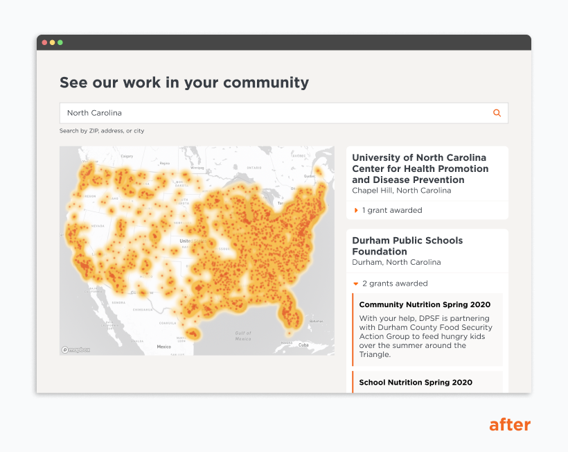
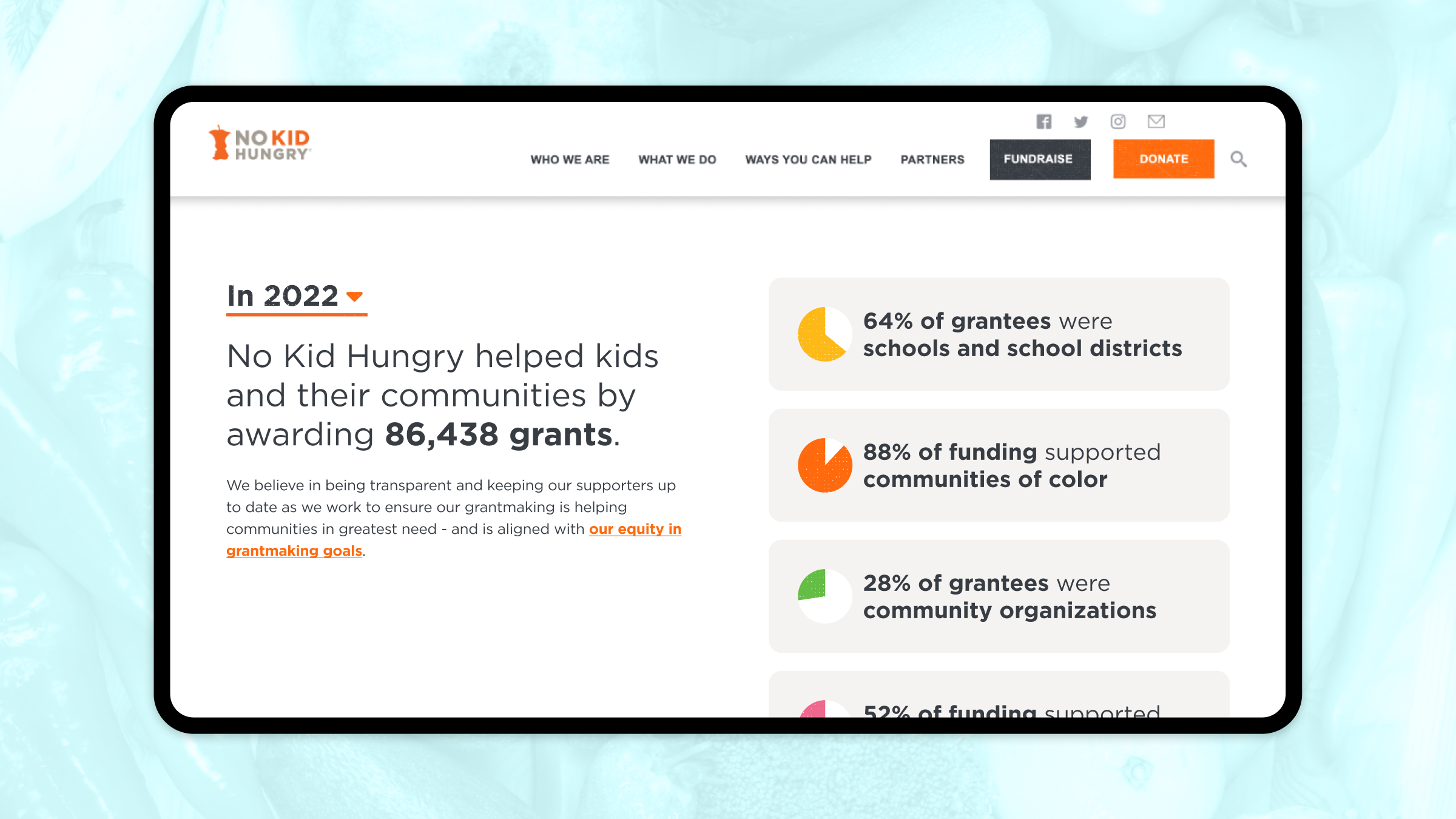
The original Grant Impact Map allowed for filtering by year, which didn’t accurately reflect the nature of the data. Recognizing this, we overhauled the page layout and introduced a new component at its forefront. This component displays cards that highlight notable annual statistics, which dynamically adjust according to the year selected by the user. To best capture the profound influence of NKH donors, we transitioned from the initial location markers to a more intuitive and detailed interactive heat map. This map also includes filterable cards that provide essential grant facts and information based on the location entered.

The updated Grant Impact interactive map

Building a better system

We needed to solve one commonality in all these cases: Get a location provided by the user and then provide meaningful results based on that location. For this, we used Mapbox’s location API to translate that location to a specific latitude and longitude. Once we had that lat/long, we solved the interface in three different ways:

In the case of the Brands That Give page, we took that lat/long and then searched through our Drupal 10 interface to see all active promotions. A Solr 8 search will query, “Does this promotion have a location within a defined radius of the specified lat/long?” We query those answers and sort them by nearest to farthest, sending those results to a filterable Vue model, which allows the user to see how they can raise money for No Kid Hungry by shopping for the brands they like.

In the case of the Grant Impact page, we use the Mapbox Studio with an API hook to start with a heat map of all the grants awarded throughout the Nation. Then, when a location is specified, we adjust the parameters to zoom into your area of the Nation, providing specific details for each grant within that location, including the years awarded.

Finally, in the case of Free Meals Finder, our tactic was similar to Brands That Give, but with an extra step of data hygiene: All of our locations are populated by a web scraper that dumps its findings into a data lake. From there, we find all the free meal locations within a radius to return to the user. However, because a web scraper populated all of this, this data is unavoidably messy. We can’t count on any normalization, and yet we want to provide the most meaningful results. Therefore, before sending the results to the Vue model, we use Regex and some switch statements to interpret the information collected to display everything to the user more cognizable. Once cleaned, we send all those values to a filterable Vue model for user consumption. The user can share specific results with people they know, allowing families and agencies to share targeted data with their audiences.
The cards from the Free Meals Finder filtering system

Collaborating with clients

Though the client originally envisioned a more robust map on each page, after thoughtful conversations with key stakeholders and discussion of the challenges of the map format, we designed and built a truly accessible, location-based solution tailored to match each use case’s specific goals and needs. 

Our ability to communicate and collaborate with each other is reflected in the success of the final product.