Residing in Carlsbad, New Mexico, is The U.S. Department of Energy's (DOE) Waste Isolation Pilot Plant (WIPP), the nation's only repository for the disposal of nuclear waste, also known as transuranic, or TRU, waste. It consists of items contaminated with small amounts of plutonium and other artificial radioactive elements, including tools, rags, residues, debris, soil, and even clothing.
Waste Isolation Pilot Plant
Modernizing WIPP's Digital Presence with Accessible Design
The Challenge
The Waste Isolation Pilot Plant's (WIPP) former website was outdated, and the absence of a CMS made it nearly impossible for administrators to upload and share content with their diverse audiences.
Our Approach
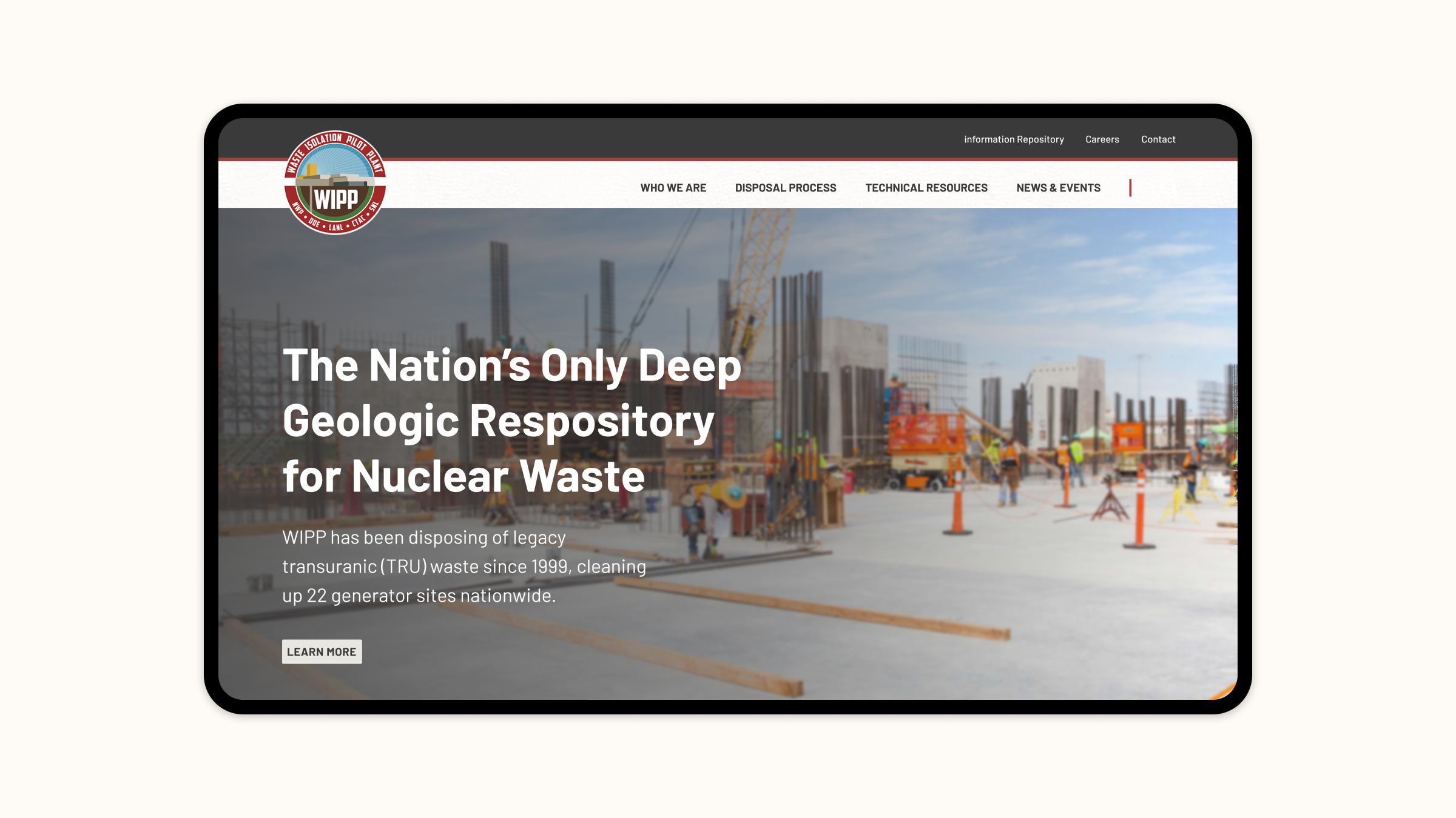
As a part of our routine discovery phase, we worked with stakeholders to reorganize the content, enhancing the site’s navigation for an intuitive user experience. We then leveraged a component-based design system, empowering site editors to create new pages that maintain a uniform appearance and meet WCAG 2.1 Level AA accessibility standards.
The Results
We helped a large, complex organization streamline its online presence by providing its team with a powerful content creation tool to craft a beautiful and compelling website.
Investing in the future
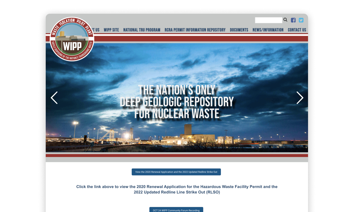
WIPP's former website was antiquated and had evolved into an unmanageable repository for information and documents. Further complicating matters, the site lacked a content management system, meaning that updates to the site required a developer to go in and modify the code directly. Moreover, the design didn't effectively represent the facility as the leader in TRU waste research and resources.
To ensure the website was easily updatable and compliant with WCAG 2.1 Level AA accessibility standards, a complete redesign was essential. Given our years of expertise in developing highly accessible websites, the WIPP team entrusted us with this endeavor.
From discovery to strategic planning
Our work began with a 1-hour video conference call with the team at WIPP to discuss design objectives, success metrics, and user needs. Based on what we learned during our initial meeting, we quickly moved into our standard discovery phase, where our strategists held focused conversations and conducted collaborative exercises with stakeholders. One of these exercises included organizing their content into logical buckets to define navigation and make it easier for users to find the information they were looking for.
The combination of these activities allowed us to fully understand project goals and functionality requirements to devise a strategic plan for redesigning the site.
Designing within constraints
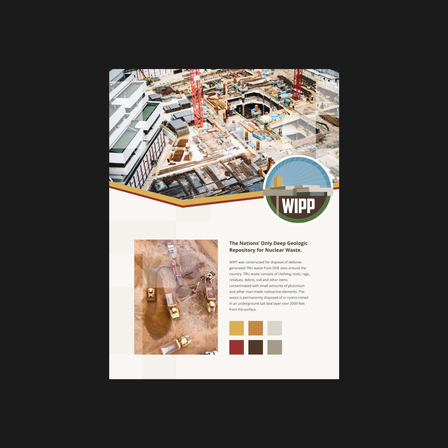
Because this is a government site filled with older documents (including PDFs), we needed to ensure that our UX strategy included the considerations for accessing this information and would align with our proposed overhaul of the site design. In addition, we were instructed to consider the existing aesthetic and treat the WIPP’s existing logo — and colors within it — as the organization's brand guidelines.
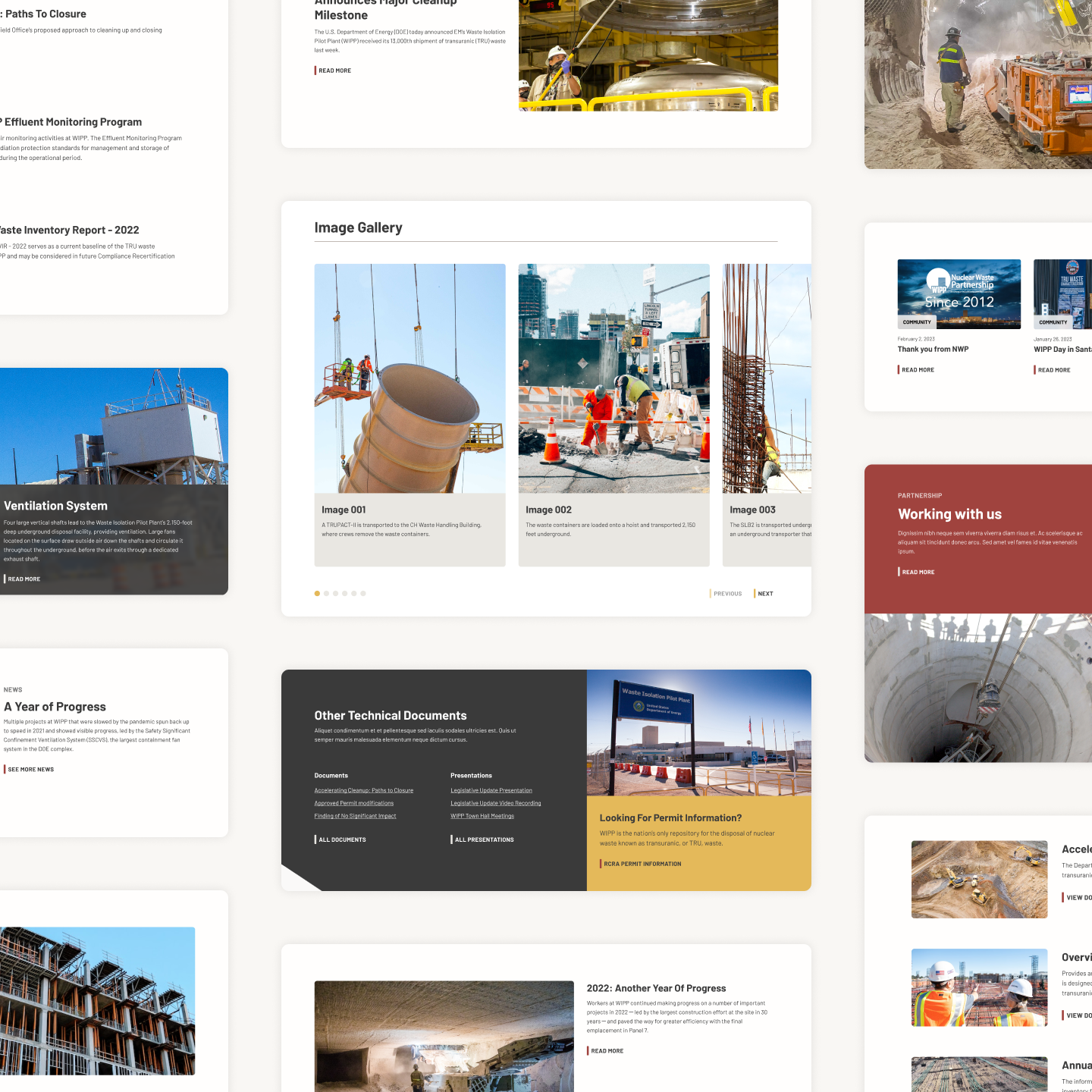
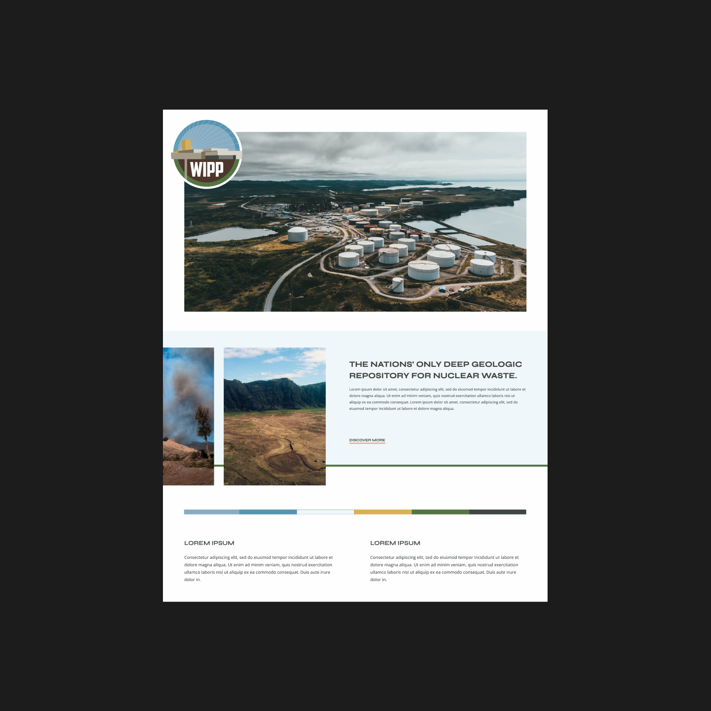
We performed a spectrum poll to craft two exploration boards for the WIPP team to review. The first leaned more towards warmer tones, taking the facility’s desert location as inspiration. The second was more rigid and traditional, using cooler tones to allow photoreal imagery to pop. From there, we met with their team and discussed which elements they liked versus didn’t. With this feedback in mind, we created a flexible design system that complements the site’s photography and the more text-heavy content areas.
Establishing a CMS
Content is the foundation of the WIPP website, so choosing the right content management system (CMS) was a critical decision. Given that WIPP was a governmental organization, it favored using Drupal as a CMS in our early conversations with their team — and was one of the ways they found/connected with us. As experienced Drupal developers, we knew it would meet every organizational need and comply with the stringent security requirements needed for a government site.
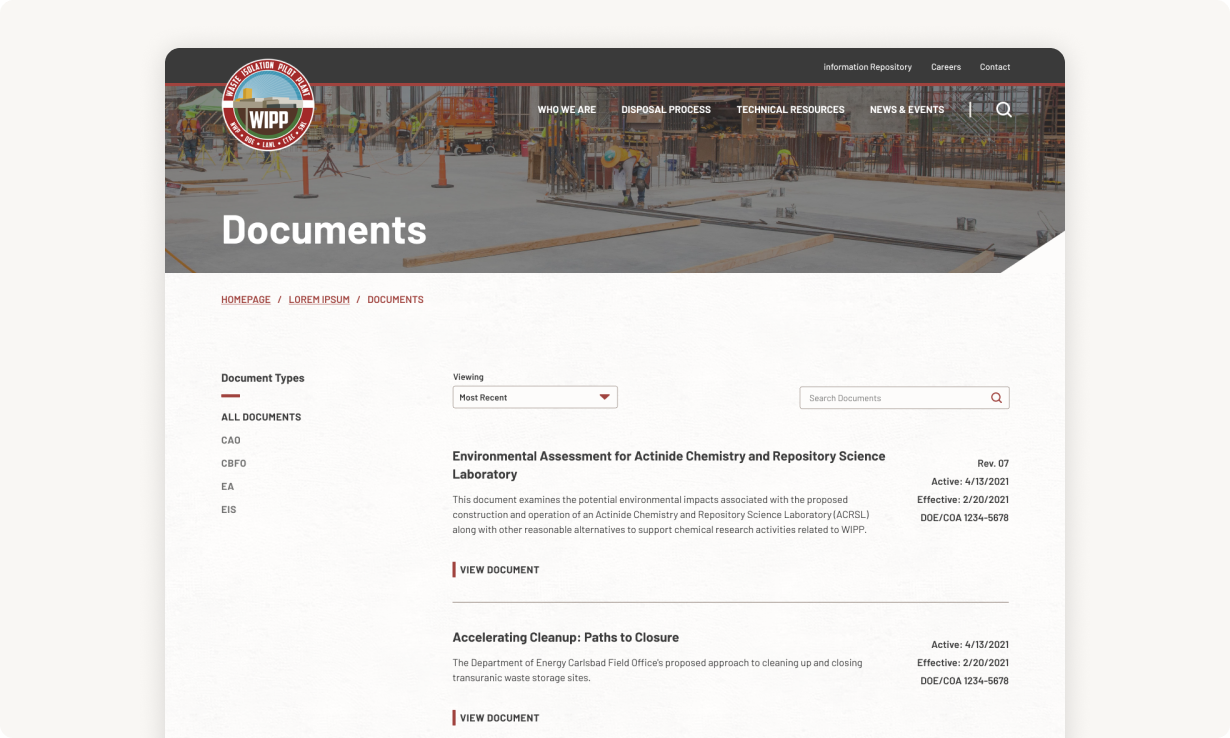
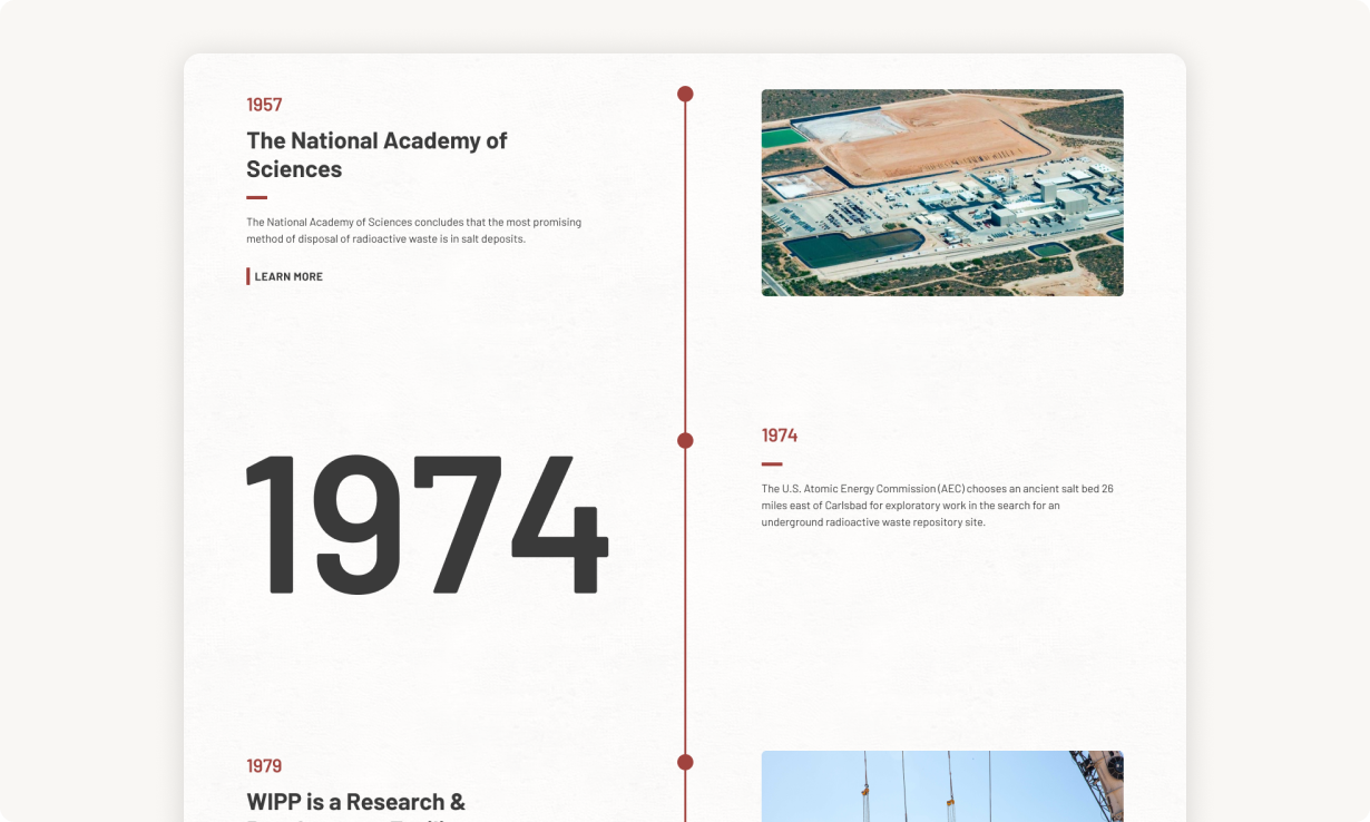
Like many of our CMS projects, we implemented a component-based system so that WIPP's content editors could easily add new accessible pages to the site without sacrificing design. For improved navigation, we built filterable search pages so it's simple for end users to find news stories, events/presentations, and documents.
Achieving a user-friendly website
We successfully built a modern website for the WIPP team that solves their historical problems with organizing content and engages users in the informative nuclear waste subject matter.
