Duke TIP

A Study on Usability

Duke TIP

The Challenge 

Help Duke TIP better understand how their audiences interact with tip.duke.edu through a usability study—investigating which features they use, where they get stuck, and how the site could be improved. Duke Tip sought to be more data-driven and to ensure they were investing in their users while laying the groundwork for a site redesign.

Our Approach 

Combine qualitative and quantitative research methods to identify where the current site was working and where it fell short.

The Results 

We presented our findings and made recommendations that fell into two groups: short-term fixes and longer-term imperatives. Recommendations included: Sitemap organization and information architecture, page naming conventions, and language support, to name a few.

traffic chart

Insights from analytics

Our first step was to look under the legacy site's hood by digging into the Google Analytics data. This helped us formulate new questions to follow up on with user and client stakeholders during subsequent phases of the usability study. It also yielded some actionable insights out of the gate. One of which is outlined below—

An important inflection point

Through the analytics data, we learned that the website had recently passed a major benchmark—within the last year, desktop traffic to the site had been eclipsed by mobile and tablet users. This inflection point was the product of a years-long trend in their data and suggested that mobile and tablet traffic would continue to grow over time.

Prioritizing the mobile experience

The legacy site’s design, while it was responsive, did not prioritize the mobile experience. The placement of menus, organization of pages, and overall information architecture was built with desktop users in mind.

Our recommendation was to prioritize the mobile experience when designing the next iteration of the website. In our report, we outlined specific ways to address many of the problems with the legacy interface.

Stress-testing the navigation

Our next step was to enlist the help of Duke TIP’s large network of educators, parents, and students to help us test the efficacy of the legacy site’s navigation and information architecture. We asked thousands of users to complete a survey that divided them into audience segments and then directed them into a Treejack test on the OptimalWorkshop platform.

Over 600 participants completed the navigation tree test, in which they were asked to complete tasks that are critical to the success of the website. Tasks that real users are trying to accomplish every day, such as:

  • Where would you find information about the advantages of participating in a talent search?
     
  • Where would you find information on preparing a 7th grader for an SAT or ACT test?
     
  • Where would you find information for teachers about how to identify students that qualify for the talent searches?
     
  • Where would you find a list of job opportunities at Duke TIP available during the summer?
     
  • Where would you find a list of important dates for students participating in Duke TIP programs?

Identifying Friction Points

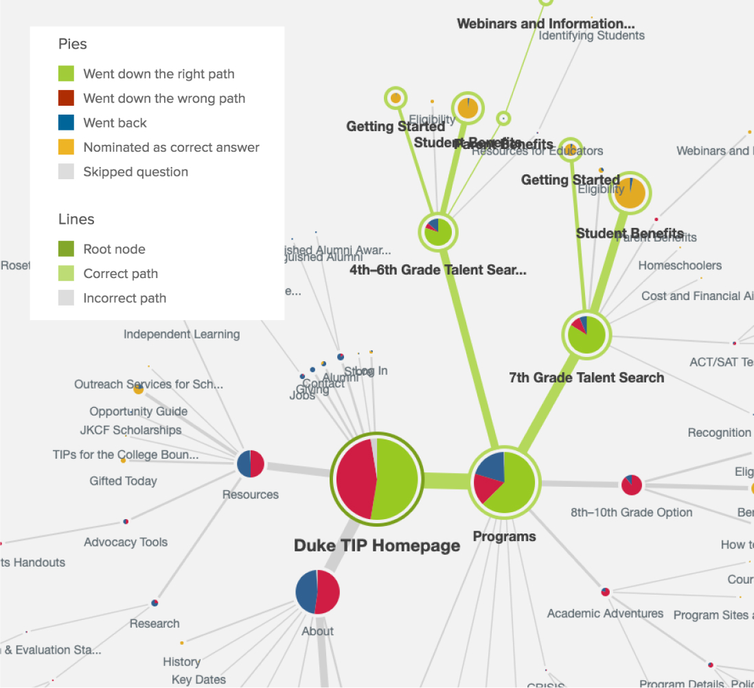
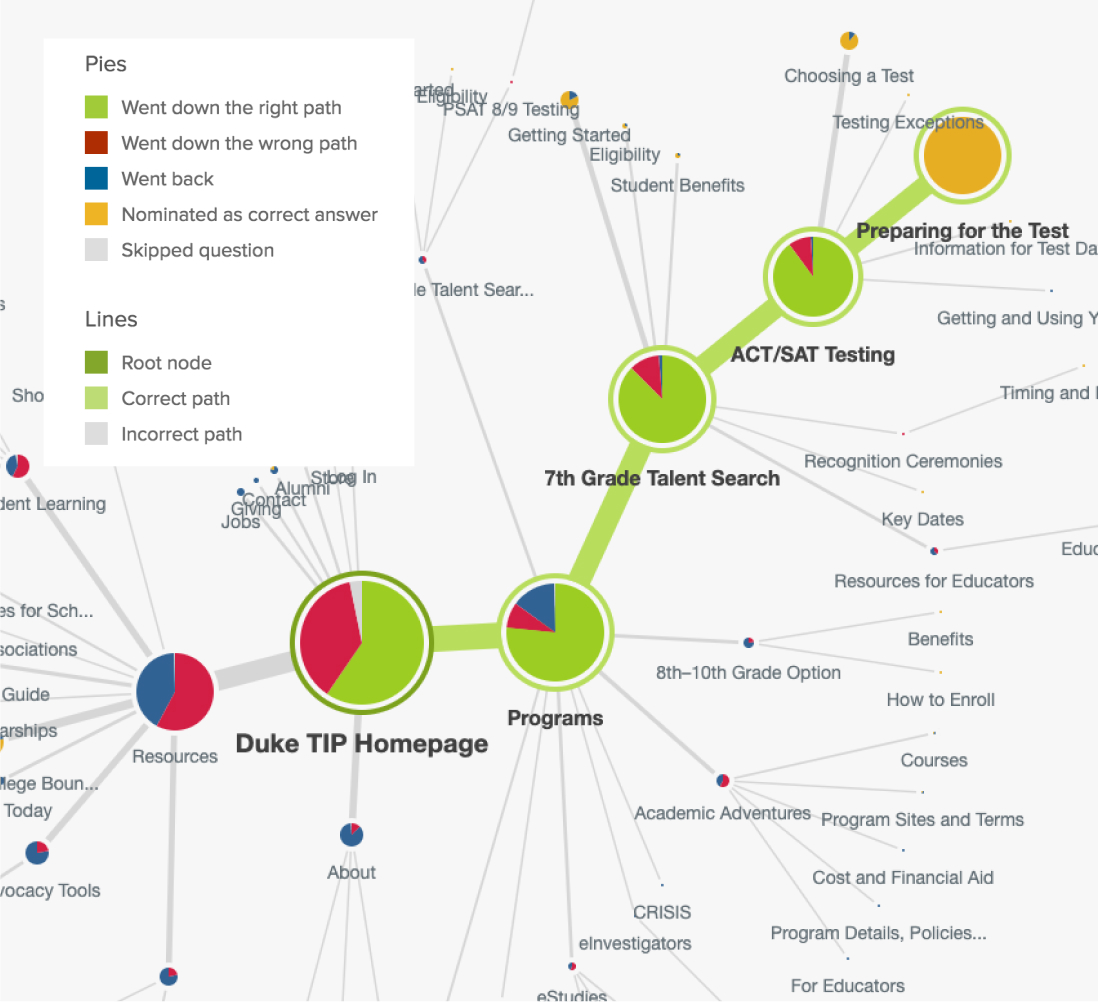
In reviewing the results of the navigation tree test, we identified several friction points where users were having trouble finding critical information on the legacy site. They would start down the wrong path, or choose the wrong branch at certain junctions.

Talent search tree
Testing info tree

These friction points were caused by the way pages and subpages were organized, and the way that certain pages were named.

In our report, we made recommendations for how to reorganize the site structure and rename certain pages in order to better facilitate these critical user paths.

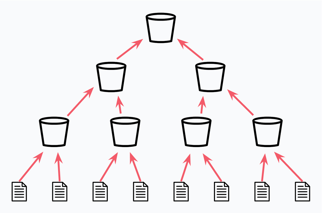
Bottom Up infographic
Bottom-up naming can make sense when organizing a site, but may lead to confusion for end-users.
Top Down infographic
Top-down naming focus on ensuring parent pages act like signposts for users, communicating information scent, and facilitating purposeful navigation.

Oh, I didn't realize those were links!

Parent / Duke TIP focus group

Sitting down with users

Additionally, we worked face-to-face with real users in two ways—through focus groups, and moderated 1-on-1 user testing sessions. Both research methods were deeply informative and surfaced poignant user frustrations and feature requests.

The insights ranged from feedback on small but critical elements to ranging beyond the website itself, spanning individuals’ full story arc across multiple touchpoints as they interacted with Duke TIP.

Our report included over thirty quotes from parents, students, and educators that changed the way Duke TIP thinks about their website and how to resonate with their audiences.

overview 1
overview 2
overview 3

Details matter

It's problematic if users find your site difficult to use or can't locate the information they need. It's time to find a solution.