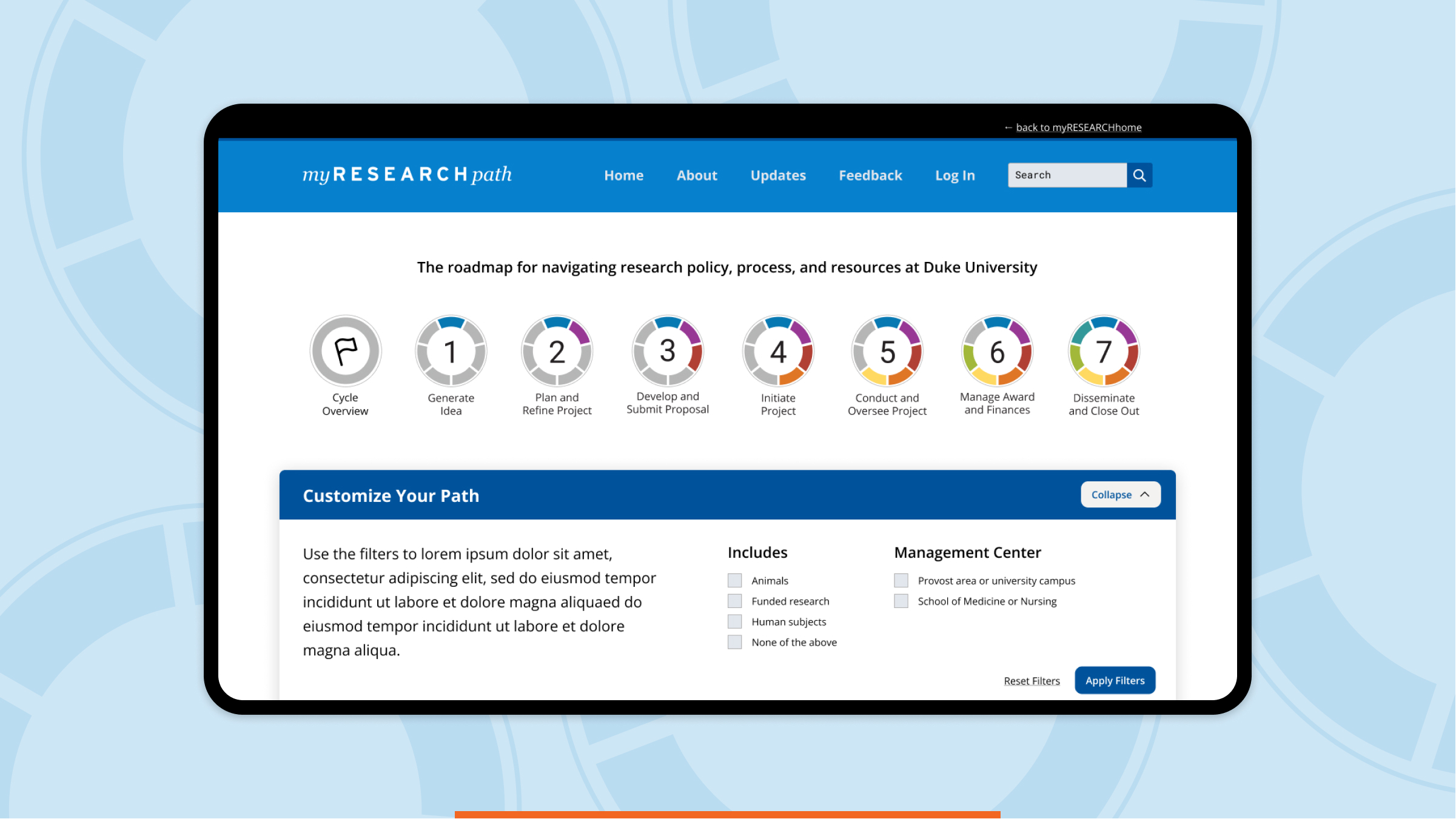
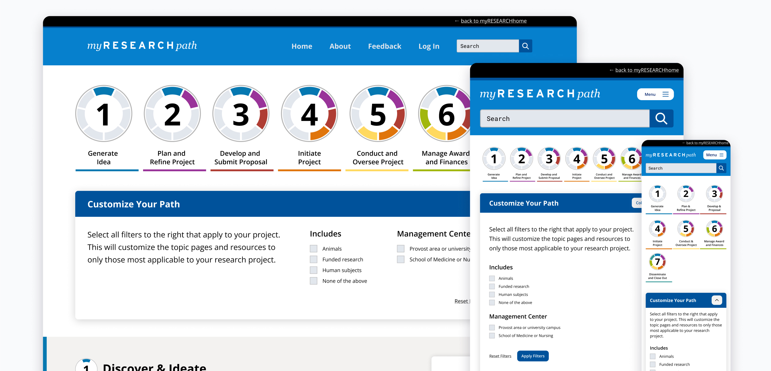
The myResearchPath tool needed to be adaptive to a myriad of use cases in one place as a user’s research path will vary depending on their research discipline. We leveraged React to quickly tailor the displayed information based on the researcher’s input. Simply put: if the content is not relevant to a user, they won’t have to see it.
Duke Office of Research Initiatives
Building a Multifaceted Research Navigation Tool

The Challenge
Connect current and potential researchers at Duke University to key information throughout their research project lifecycle.
Our Approach
Build a scalable platform that leverages decoupled components to present a multifaceted interface showing users exactly what they need along the way.
The Results
A popular, user-friendly interactive roadmapping tool that’s facilitated access to student researchers across an entire university. The platform has received numerous accolades from university users.
Leveraging dynamic solutions

Designing with components
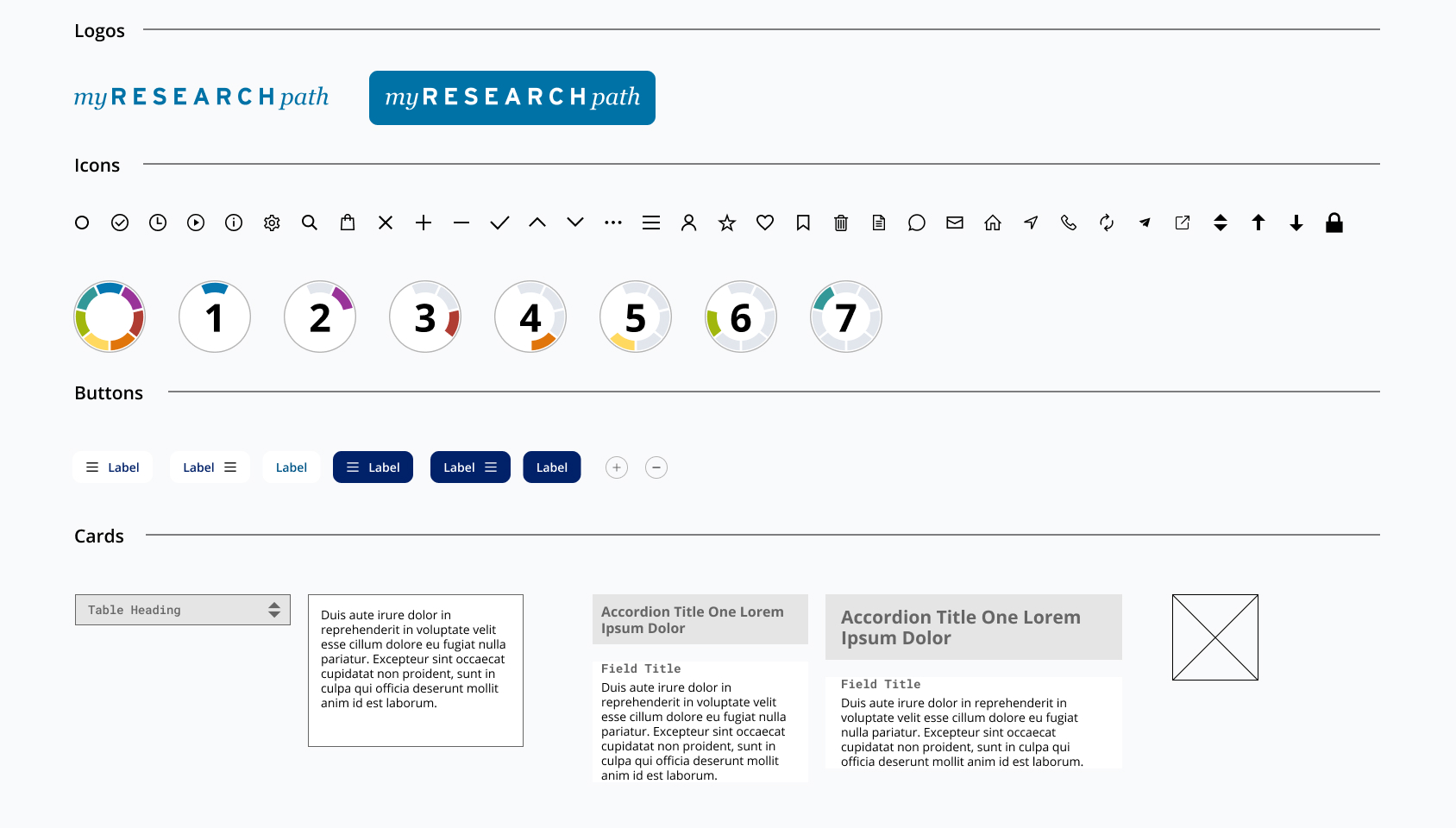
In early business development conversations, our client partners provided us with a rough wireframe of what they envisioned for the product. Analyzing the wireframe enabled us to strategize around key features. Leveraging Figma components, we built out an iteration of the wireframe in a totally modular fashion. Each component was entirely configurable (to toggle on and off) and aided our collaborative discussions, reflecting the adaptive nature of the myResearchPath tool

An app-like approach
Leveraging React, we developed myResearchPath with an app-like experience in mind. With the focus on dynamic user content, it proved to be the most appropriate approach. This dynamic experience is used by active researchers at Duke, and open to folks interested in conducting research or looking to support other projects within the network.

We build intuitive, user-centric interfaces
Let's build an elegant interface and technical solution together.


