Duke University

Building a Flexible Microsite for Duke University

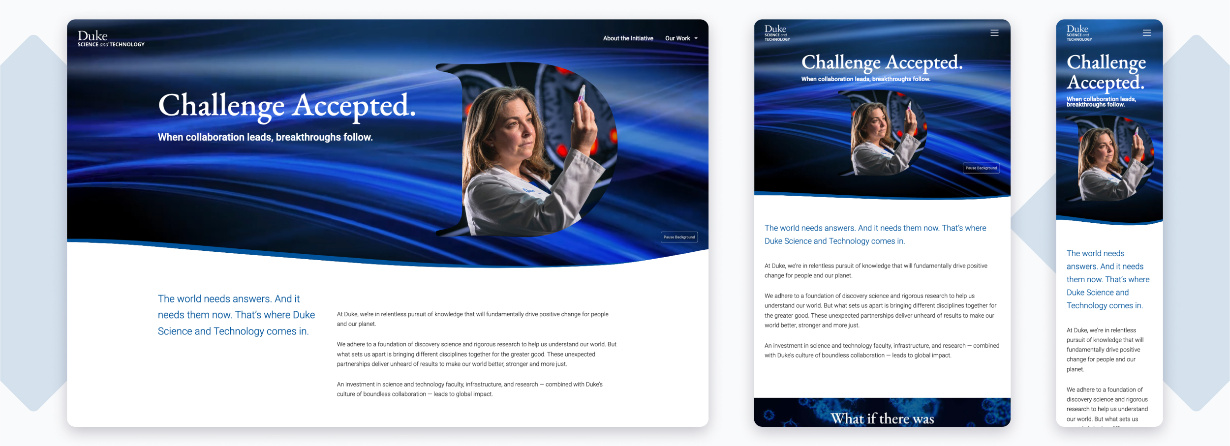
Duke Science & Technology homepage

THE CHALLENGE 

Design and build an engaging and innovative site to showcase the science and technology work happening at Duke.

OUR APPROACH 

Integrate custom-built blocks with standard WordPress features to harness a desire for flexibility.

THE RESULTS 

We delivered an award-winning, elegant site that provides a platform to establish a new gift-giving initiative that will grow in the years to come.

Working in WordPress

During our discovery process we found that the Duke Development team was very familiar with WordPress’ Gutenberg editor. We leveraged that experience to plan an appropriate design approach with considerations for the technology.

The sheer amount of configuration possible in the Gutenberg editor meant that theming every element would far exceed budget and timeline for the project.

A cardsort exercise was the cataylst in determining specific components to best support the team’s storytelling needs. From our initial list of 13 components, we narrowed it down to 5. These custom components established the design language of the site which we implemented throughout the Gutenberg editor.

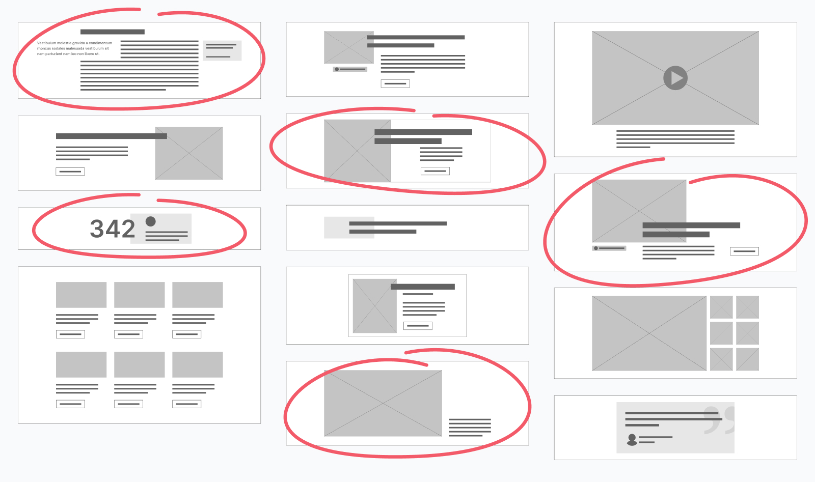
An array of wireframed components with red circles around 5 options, representing the chosen elements to design.

A content challenge

Because the Duke Science and Technology initiative is brand new, we were designing the site while our client partners were actively developing its content; meaning we only had rough ideas or topics of potential content which was challenging.

To attack the fuzziness, we put these content questions front and center while wireframing. While we didn’t have actual images and stories to use, we could develop an outline of those items to piece together. We created our own taxonomy of content terms inspired by content from similar initiatives at other universities as well as other content produced by Duke, and established a baseline for what content to expect, where it should go, and how it should interact with other pieces of content.

Duke typography aesthetic
Duke brand colors
Duke typography

Making waves

With just light brand direction to follow, the canvas was wide open for our design team. To provide a dynamic flow throughout the site, we utilized responsive SVG masks to create interesting and engaging interactions of shapes and content.

Through custom shapes using CSS clip-paths, we delivered a site that beautifully presents stories of breakthroughs happening at Duke University.

Duke Science & Technology homepage on different screen sizes

Custom design for your organization

Let's create something beautiful and functional.