Transforming a Digital Identity for an Innovative Credit Union


Coastal Credit Union faced several hurdles: an abundance of unstructured content, a dated brand image lagging behind competitors, and a restrictive content management system maintained by a niche development partner.
We began by conducting user and stakeholder interviews to align business goals with user needs. Our research phase included collaborative meetings with Coastal's team and sessions with their marketing agency, informing our overall strategy.
Coastal's new site is a testament to their innovation in the Credit Union space. Our strategy-rooted design work has positioned them to attract a younger demographic while reflecting their true identity. The updated design system is focused on scalability and ensures consistency and ease of use, paving the way for future growth.
A history of innovation
Founded in 1967 in Raleigh, North Carolina, Coastal Credit Union initially served the local IBM community. By 1991, it expanded its membership to include employees from other businesses in select North Carolina regions. Coastal Credit Union has a history of innovation, particularly in tech advancements. However, their website failed to convey this identity. With close collaboration, we crafted a user experience that authentically reflects their innovative spirit, aiming to attract a younger demographic to the credit union. The outcome is a visually stunning website that effectively communicates Coastal Credit Union’s forward-thinking approach, driving engagement and excitement among prospective customers.
Reinvigorating the brand
Coastal Credit Union had a clear vision for their new site design, bolstered by research of their direct and aspirant competitors. They were able to articulate and appreciate the visual and UX decisions made by those competitors, tying visual themes to marketing and positioning direction.
Best of all, they were internally closely-aligned. This solid foundation allowed us to quickly iterate and build momentum. With a few simple exercises, we were well on our way to delivering a fresh, modern, and innovative look-and-feel that focused on and celebrated the parts of their identity that held the most brand equity.
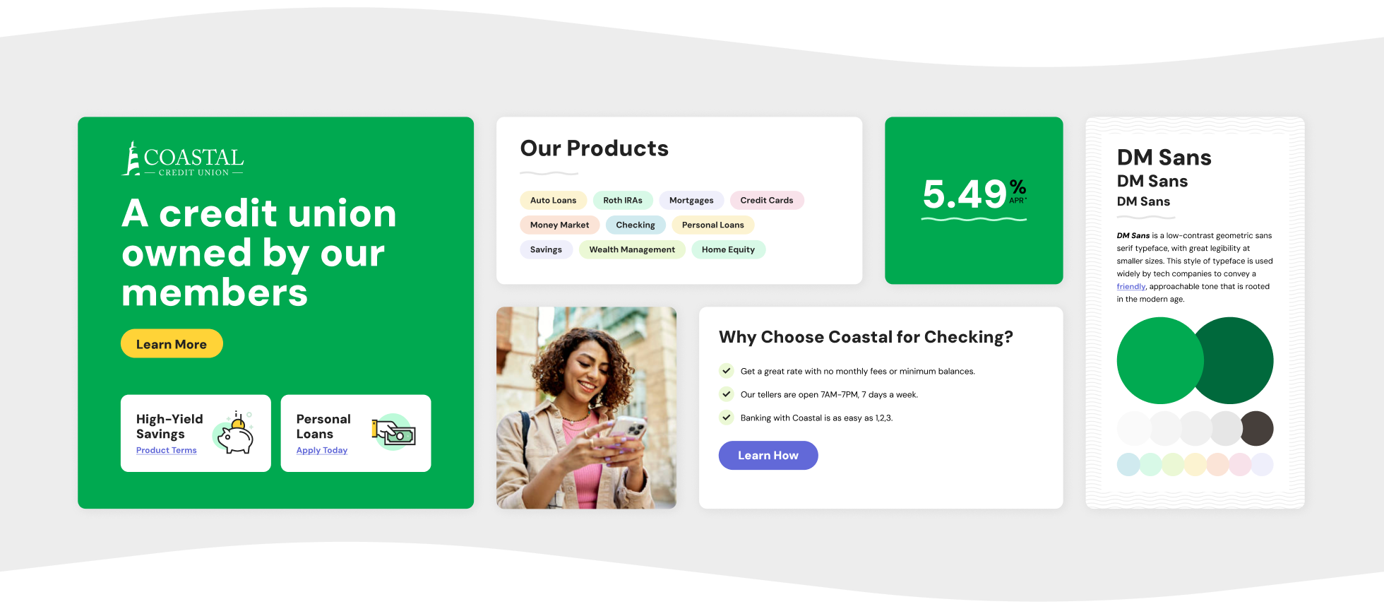
A typeface for an innovative future
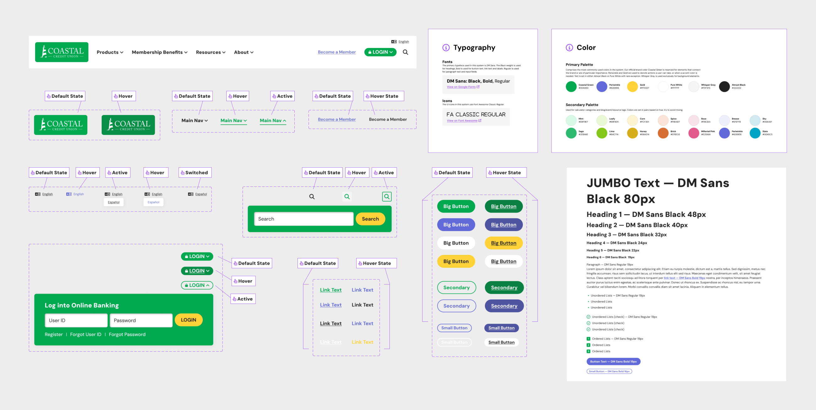
Their existing site followed a legacy brand guide that conflicted with their goals. We conducted a simple exercise: to compare their current serif typography with a modern geometric sans. The contrast vividly highlighted the issue. Their longstanding typeface Adobe Caslon Pro, dating back to the 1700s, starkly contrasted with the contemporary DM Sans, designed in 2019. The realization led to the decision to retire the old font, opting instead for a typeface better aligned with their innovative, modern brand image.
A web-first palette built around the icon green
Much like with their typography, Coastal’s existing color palette presented a few challenges to their goals. Primarily, the colors were not web-first and reflected an older, legacy identity. We proposed new, vibrant colors that appeal to a younger audience while complimenting their iconic bright green. The palette is designed for web-first application, ensuring a cohesive and engaging user experience for both new and existing customers.
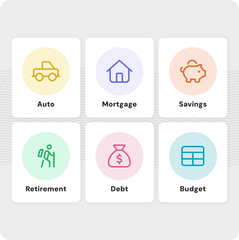

Effortless navigation
The navigation on Coastal’s website had grown organically, and over time, leading to a significant cluttering of content. We guided them through the process of organizing their site content and overall structure, making the user experience simpler and the navigation much more intuitive, helping users find what they need quickly.
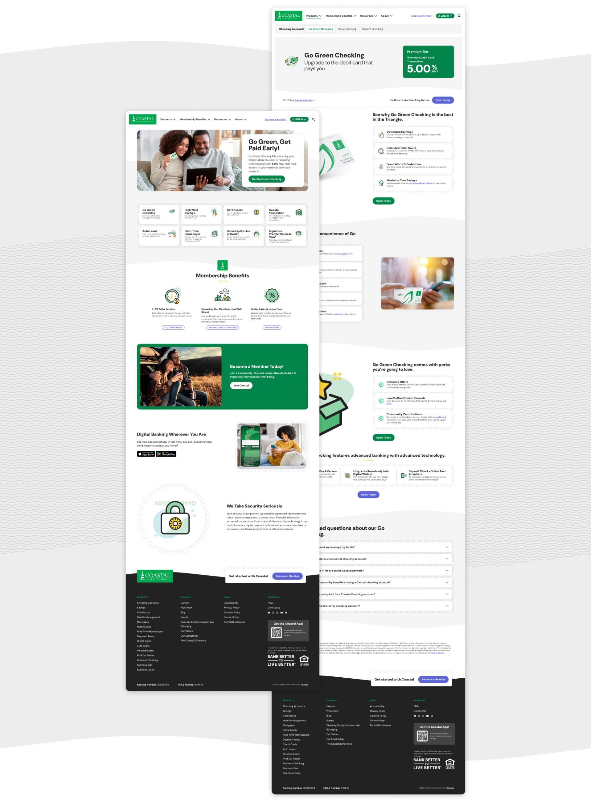
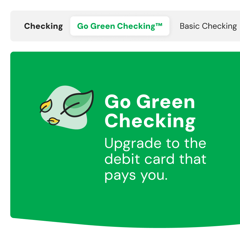
Product pages
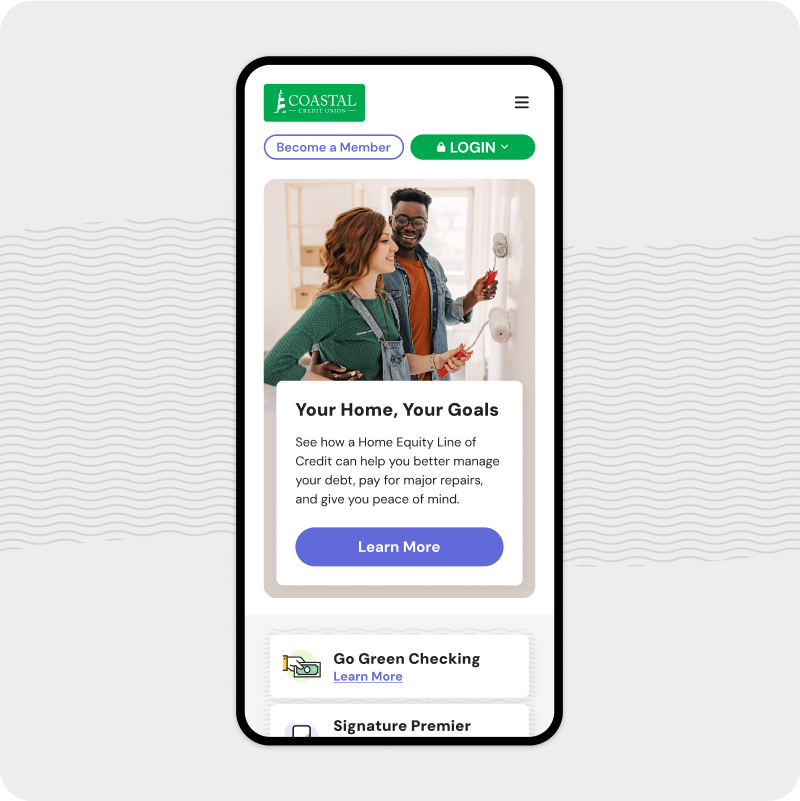
Coastal faced challenges with their legacy system, struggling to quickly create effective marketing pages for new products. They often resorted to building separate microsites, notably for their flagship product Go Green Checking™. We created a unified product page focused on aligning user needs with business goals. This streamlined approach allowed for easy updates and effective communication, enhancing conversion rates.
Design system
We emphasize effective communication in design, crucial in our ongoing relationship with Coastal. Given their established third-party development partnership, we prioritized transparent collaboration to ensure alignment on CMS capabilities, achievable design proposals, and shared expectations. Our ultimate deliverable was a comprehensive design system delivered via Figma, meticulously detailing every feature, style, interaction, and more. This empowered the development team with all necessary resources for a successful build.
A foundation for future growth
Coastal Credit Union faced significant challenges including unstructured content, an outdated brand image, and a restrictive CMS. Through detailed stakeholder interviews, and close collaboration we identified major pain points and strategized to provide a site that aligned business goals with user needs. The result is a redesigned website that showcases Coastal Credit Union’s best-in-class innovation, appealing to a younger audience while authentically representing their identity. Our scalable design system ensures consistency and usability, setting the foundation for future growth and success.


.jpg)
