Attain Data

Collaborating with a Growing Startup to Craft a Future-proof Site

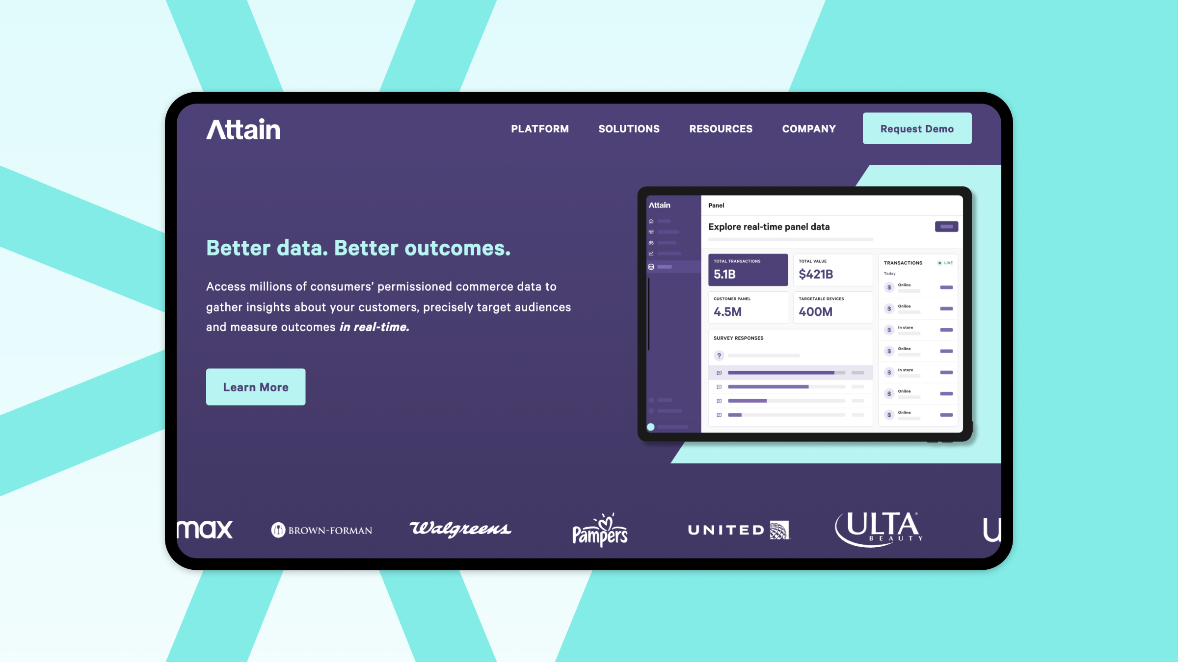
Attain Data homescreen

The Challenge 

Attain Data found themselves contending with the technical limitations of their lightweight CMS. They urgently sought a more robust system to meet their growing needs, all while staying within their allocated budget. In addition, they desired to expand their existing brand, to be more flexible and reflective of their organization’s initiatives.

Our Approach 

Preserving Attain's original logo and color palette, we explored alternative type treatments and introduced custom imagery to cultivate a new brand identity. Following this, our designers and developers worked hand in hand to construct a component-based system that allows the Attain team to create bespoke pages for their website.

The Results 

Despite the project’s constraints, we swiftly delivered a custom WordPress site that will allow Attain Data to extend their online presence and support their ever-changing needs and aspirations.

Revolutionizing the data-sharing landscape

Attain Data, a visionary company, is committed to creating a more equitable and efficient data-sharing ecosystem. In 2019, their co-founder and CEO Brian Mandelbaum developed a platform that empowers consumers to capitalize on their most valuable asset—their data—by offering them modern financial services such as savings tools, early wages, and rewards without hidden costs or fees. In return, consumers allow Attain Data to use their real-time data for research, insights, and targeted advertising.

In pursuit of a more robust website that could accommodate growth and provide a competitive edge, Katie Berry, the VP of Business Operations at Attain Data, reached out to us for our help transforming their existing one-page brochure site. However, Attain Data had a strict budget, presenting us with the challenge of balancing superior design quality and cost considerations. As a result, our joint objective was to craft an inventive solution that would not only align with Attain’s budgetary limits but also guarantee the future scalability of the website.
Streamlining collaboration and narrative-driven refinement

The Attain team entered the project with a well-defined vision. Before meeting with our UX designers, their team had already prepared documentation for the new website’s information architecture, content-block wireframes for each page they deemed necessary, and meticulously planned how they wanted the navigation functionality to work. This clarity and preparation underscored their commitment to the project and made our collaboration more efficient.

Building on the solid foundation laid by the Attain team, our UX designers got to work. Serving as expert guides, we fostered a constant dialogue, asking insightful questions to ensure that both teams remained aligned with the project's objectives. The most impactful point of our collaboration came when we evaluated their proposed homepage wireframe. We encouraged the Attain team to step back and think about the narrative they wished to convey. After some reflection, it became apparent that the existing wireframe did not quite encapsulate this story. To rectify this, we initiated a content-blocking exercise, leading to the creation of a new homepage. This revised version was tailored to address the specific needs of their sales team and customers more effectively, thereby encapsulating the core narrative the Attain team wanted to express.

To ensure a smooth transition to the project's remaining stages, we focused on two crucial aspects to stay within budget expectations: extending the brand without building something from scratch and balancing the development of a custom website without limiting content editors' flexibility.

Expanding the branding toolbox

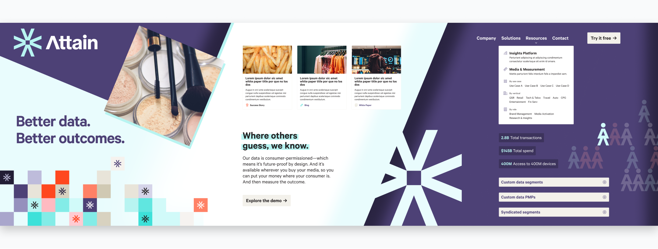
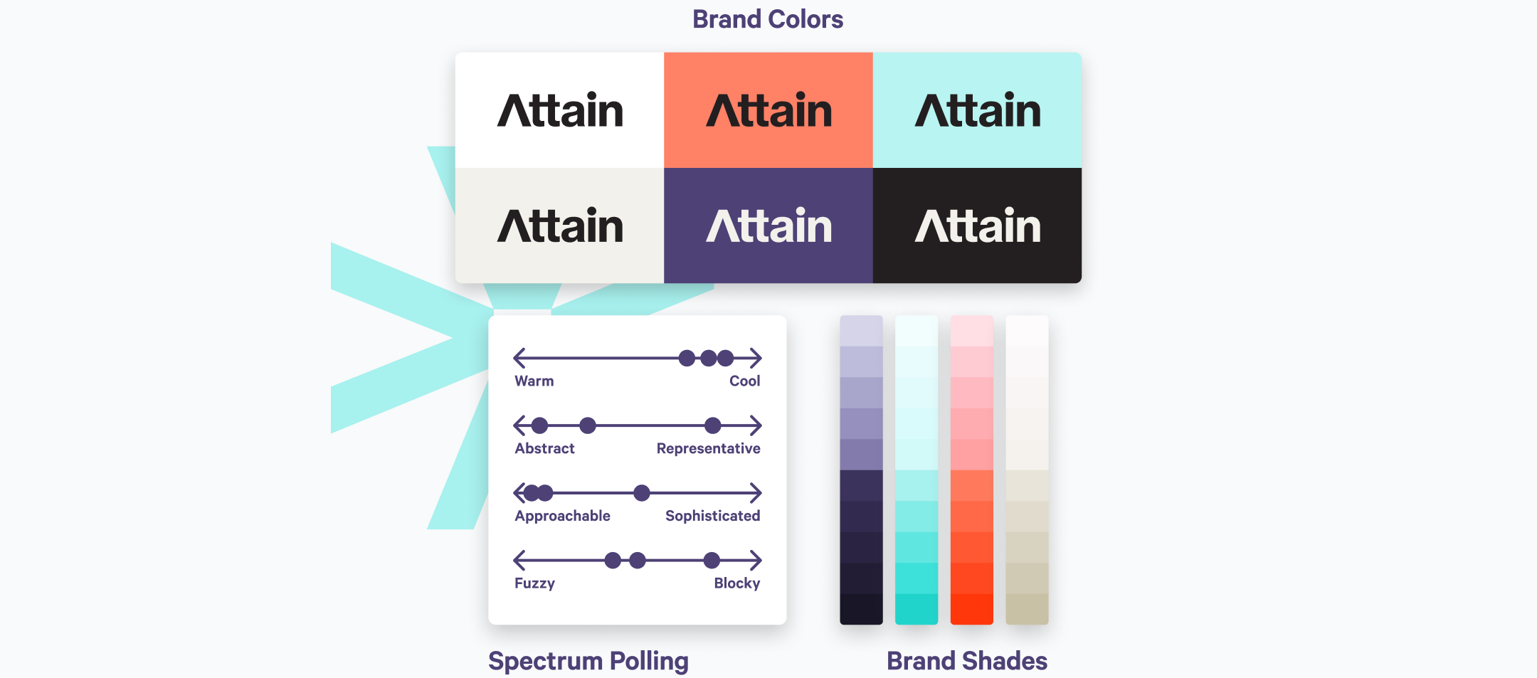
Although Attain Data came to us with a pre-existing brand, it lacked the breadth they desired. Their previous use of fully opaque brand colors resulted in a youthful, toy-like aesthetic. To address this issue, they produced an expanded color palette with a range of shades. Concurrently, we conducted a thorough assessment of their other brand elements, pinpointing which aspects to keep, modify, or replace.

Attain Data brand assets

We created two design exploration boards to showcase different design approaches to fulfill the need for a more comprehensive and versatile brand identity. Both approaches considered the client's existing brand but intentionally diverged in their use of color, type treatment, and other design elements. For example, one direction utilized a data-pixel-grid graphic, while the other featured a daisy chain of Attain icons. 

In the end, we decided to iterate on the data-pixel-grid device throughout the remainder of the design phase, refining it into a mono-color, smaller pattern blended with a gradient. We devised this specific design element to represent the data Attain collects and how they transform that data into valuable insights for their customers.

Attain Data exploration boards

Crafting a user-centric website experience

The Attain team's solid groundwork and understanding of design were instrumental in the project, allowing us to allocate additional time to the development phase. 

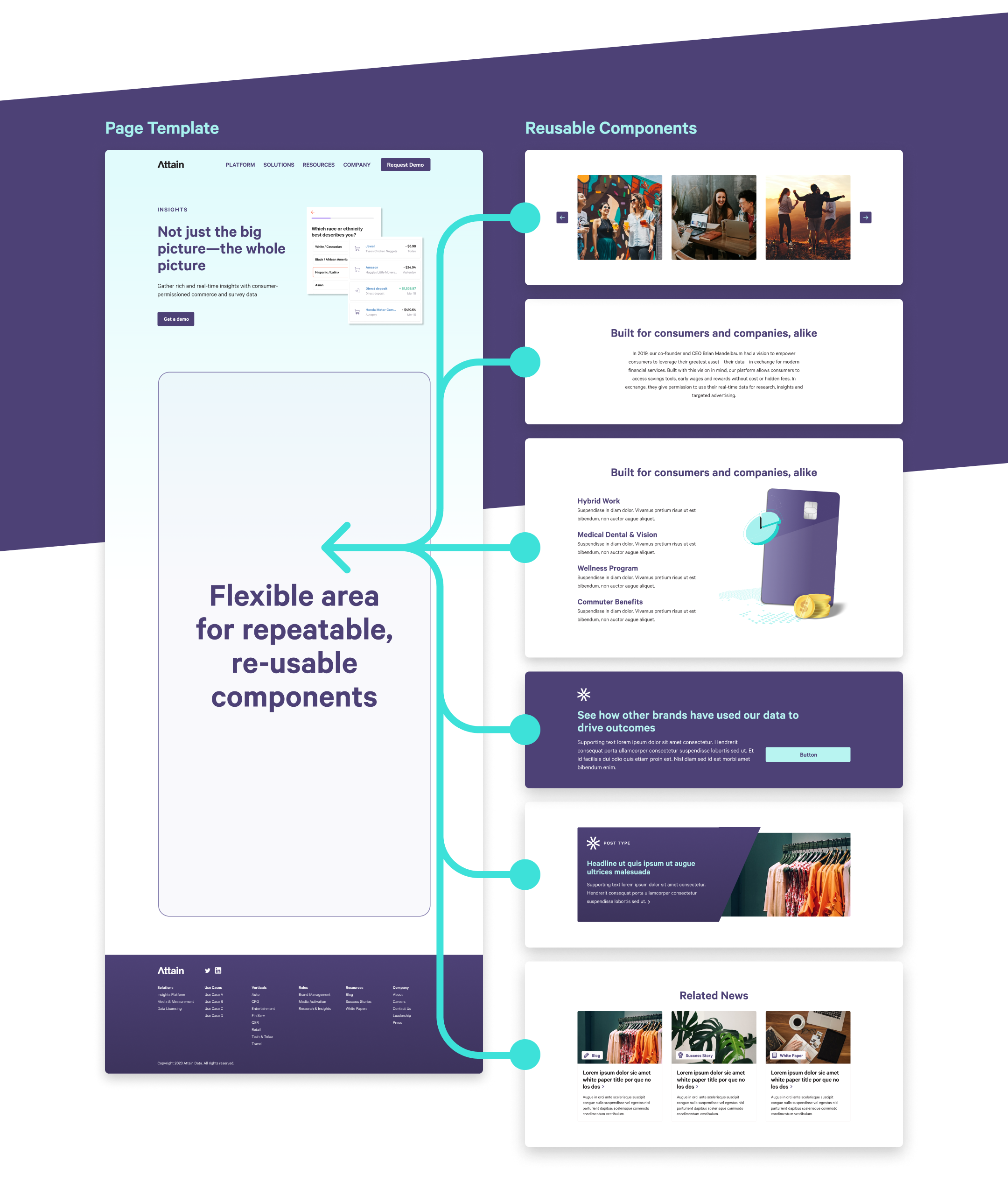
To create the new Attain website, we harnessed the power of WordPress and integrated our proprietary component-based system. This system uses flexible components, which serve as customizable building blocks within the page templates that can be effortlessly manipulated or replaced by content editors to construct custom pages tailored to their specific needs and objectives.

RELATED READ

Designing a Component-Based System for our Clients
Attain Data component library

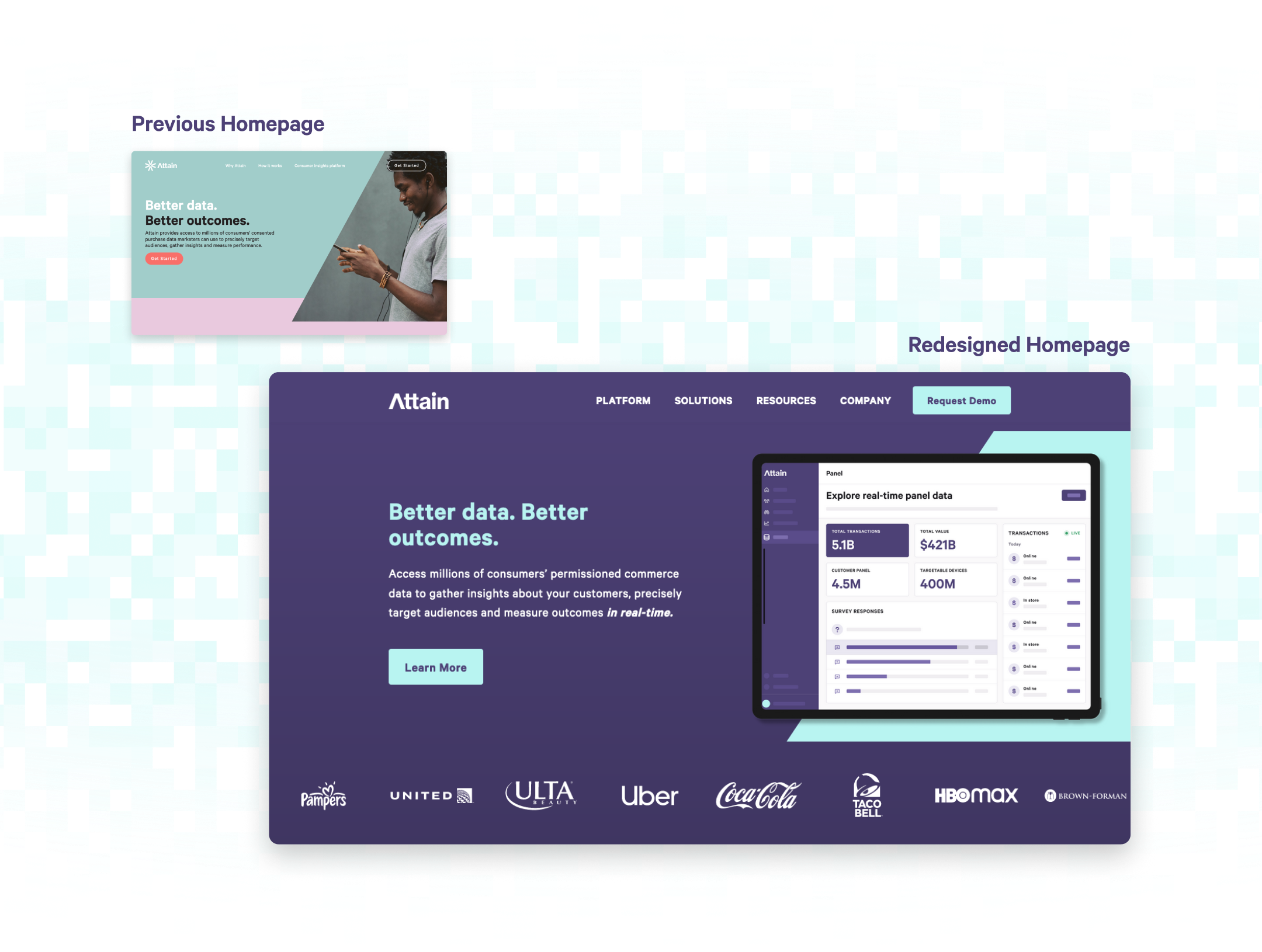
Our efficiency in building the bulk of the site allowed our developers and designers to work in tandem to embed custom features, elevating the overall user experience. The homepage, the major standout bespoke page on the Attain website, reflects this collaboration as we opted for a more intricate layout, incorporating eye-catching elements to capture the user's attention.

Among these standout elements is the parallax roundel scrolling section. Its creation required a delicate balance of timing, scale, and subtle visual changes to deliver a satisfying and engaging experience for the end user.

Attain homepage before & after

Stepping outside the confines of the homepage, we brought our customization skills to other segments of the site. For instance, we introduced fully custom header and footer layouts, with the header featuring three distinct dropdown styles. Notably, one of these styles accommodates a sub-menu complete with unique hover and tab states, significantly improving the navigation experience.

Lastly, we enhanced the website's index pages by integrating custom filtering and pagination through the use of ListJS. This improvement fosters a lightweight, seamless navigation experience while ensuring minimal effect on page load times. As a whole, the harmonious blend of design efficiency and customized developmental elements in this project led to the creation of a dynamic, user-friendly website for Attain.

Embracing constraints

As we pause to reflect on this project, it’s become clear to us that limitations and challenges can be powerful drivers of creativity and innovation. Our dedication to maintaining the highest standards of design and user experience, combined with our client's support and trust, has resulted in a website that we are incredibly proud of.

Whether you're launching a new website or looking to revamp your existing one, our tailored branding solutions will elevate your online presence to new heights.

Don't miss an opportunity to leave a lasting impression.

Final Thoughts

Test