Using Your Website to Communicate in Crisis Situations

Alex Manzo on background

Alex Manzo —

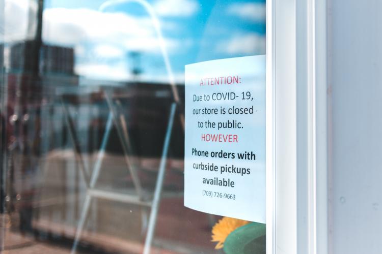
Sign in store window stating store is closed, but curbside pickup available

Note: This post largely uses restaurants as an example, but the advice spans across any industry.

It’s stating the obvious to say that we’re living through an unprecedented time. Entire countries are on lockdown, many of us have transitioned into working from home, and our routines have been thrown into chaos.

Something many of us at Savas have tried to stay cognizant of is the impact of this crisis on small, local businesses, and to continue to support them as long as possible. Many restaurants have closed dining rooms and transitioned to carry-out/delivery/curbside pick-up while others have closed altogether for the time being. What the best course of action is today might entirely change tomorrow, but one thing remains critically important: communicating with customers.

As we all continue to navigate these challenging times together, here are some tips from our team to yours on how to use your website to communicate information in times of crisis:

RELATED READ

How to Work Remotely (and Still Be Productive)

Make information easy to find

Just recently I had hoped to grab lunch from one of the many great local restaurants in Durham. In what has now become routine, I started pulling up websites for places I was thinking of going to see if they were open. Some places made it easier than others. Here are some tips for updating your site with this kind of information:

Crisis information trumps other content

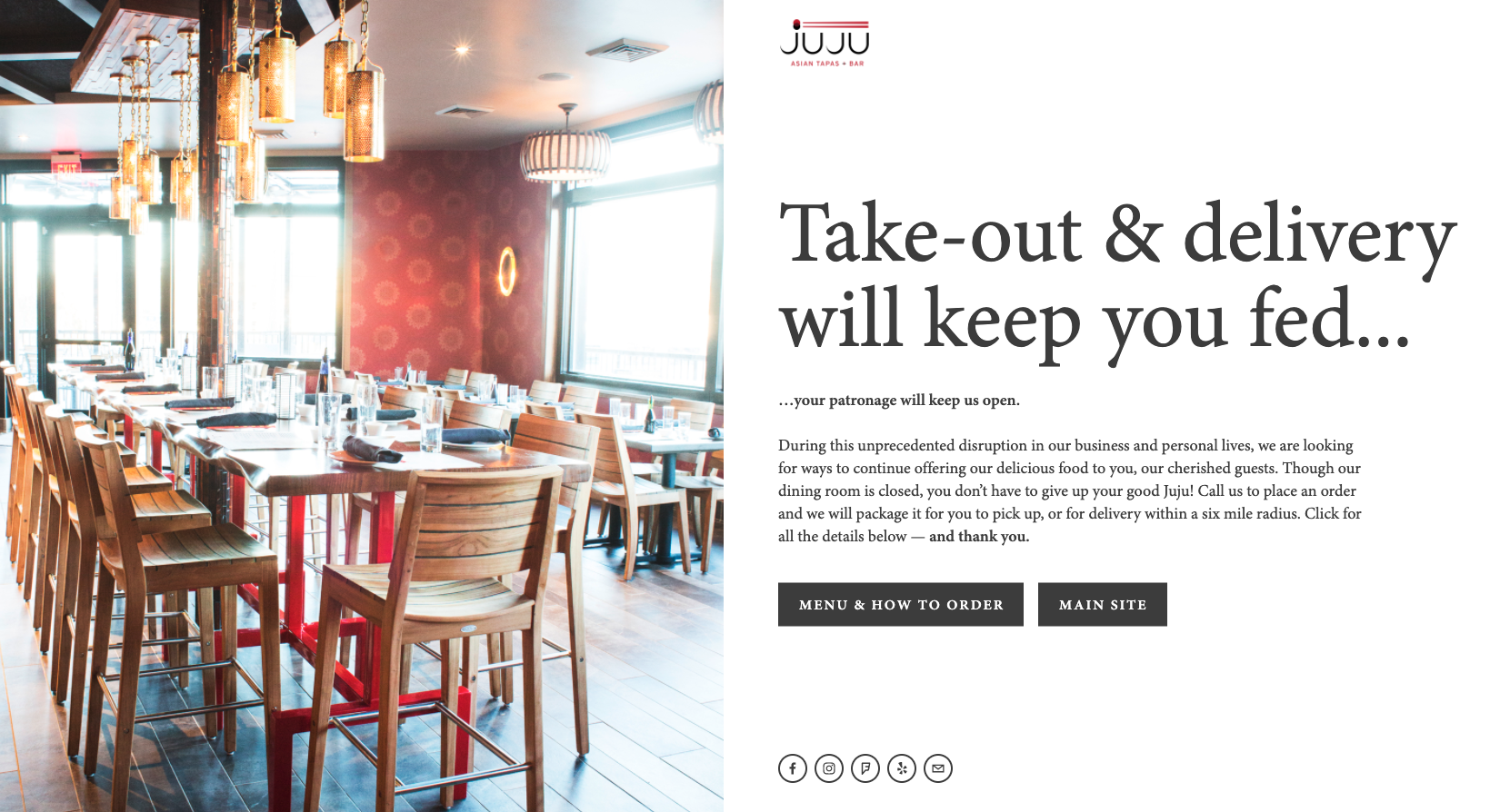
When hitting your site’s landing page, information related to the crisis should be front and center. Some local Durham restaurants like JuJu and Dos Perros are two great examples of putting information front and center.

screenshot of JuJu Durham's landing page
Juju's simple landing page includes an authentic message a call to action on how to order, and links to social media.
screenshot of Dos Perros website
Dos Perros updated their site with a simple message letting customers know they are closed for a period of time.

I also ran across a couple places that hadn't updated their websites at all. I had to go track down information on social media instead. Ideally, try to give your potential customers as little friction as possible in finding the information they need.

Consider an FAQ section

Adding a section to your site for frequently asked questions is an easy way for people to get information they might be looking for. Some of these questions might be:

  1. What are your updated hours?
  2. Where do I park for curbside pickup?
  3. What precautions are you taking to ensure sanitation?
  4. Is there a way to support you while you're closed?

Make the information clear

Here’s one example where information on the restaurant being closed is there, but it’s not immediately obvious. While the Durham Now Open graphic would normally be appropriate, it sends a mixed message since information below that states that the store is temporarily closed.

screenshot of page that says both Durham Now open and temporarily closed
In addition to updating the information on the page, updating the layout might have helped make that message more clear.

Establish new procedures

Many businesses have added online ordering and curbside pickup as options for customers during this time. We helped a friend in a pinch to more prominently feature delivery options in La Farm Bakery’s navigation. Cocoa Cinnnamon adapted their existing online store for coffee beans into one that allows customers to order drinks for pickup/delivery.

Even if establishing online ordering doesn’t feel realistic, adding instructions on how to call and order carry out helps customers support your business.

Be consistent across platforms

If your business has temporarily closed, don’t forget to update your hours on your Facebook page and other social media accounts. Any announcements made on your website would be great to add as a “pinned” post on social media as well. Claiming your Google business profile and keeping it updated is another way to keep information up to date no matter how customers are finding your business.

Prepare for the future

As developers, we work as hard as we can to make sure site designs are flexible enough to handle future changes and situations. Here are a few ways to take an audit of your site and make sure you’re prepared for the future.

  1. Make sure you can update your navigation

    Whether it’s adding a link to a COVID-19 response page or linking to online orders, being able to change your site’s navigation on the fly is important.
  2. Make sure you can change your homepage/landing page

    A few examples we shared here have updated homepages/landing pages on their site. You should easily be able to change the front-page of your site to communicate information as needed
  3. Building new pages should be easy

    We often favor a modular, component-based approach when designing new sites. Doing this allows ourselves and our clients to be able to create several unique pages based off of one template. For example the services, about, contact, and careers pages here on savaslabs.com all use the same base template, but each have a unique look and feel. This component-based approach can be a huge asset if you need to make a new page “from scratch”.
  4. Consider having the option for an alert bar

    Having an alert banner on the top of your page is an easy way to grab a user’s attention and concisely convey information. Bootstrap’s alerts demonstrate a lot of ways alerts can be configured and used.

As always, make sure your site is accessible for all users.

Other resources

The World Health Organization and CDC continually provided updates on the virus itself and guidance for individuals and business to follow alike. Here are some additional resources that may be of help:

Let us know if we can help!