Oh Hello, New Savas Labs Brand

Drew Glover on background

Drew Glover

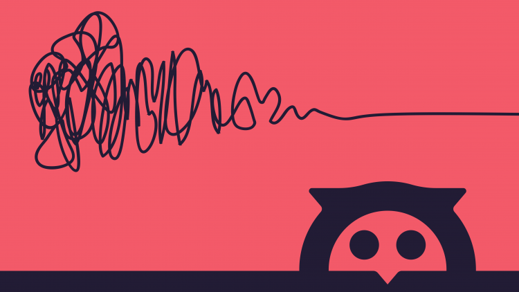
Ava the owl peeking out underneath a squiggle

Last week we rolled out the new and improved Savas Labs brand. It’s been an exciting (and busy!) time for the entire team as we worked together to make the new brand and vision come to life in a matter of just a few months. Actually, that’s where my journey at Savas Labs begins. Everyone has an origin story — let’s take a quick detour through mine.

Hi, I’m Drew, UX/UI Designer at Savas Labs. I’m also a sim racing enthusiast. Way back in 2003, I wanted to make my own racecars — to make that happen, I taught myself how to use Photoshop. Years later, I went to college for mechatronics engineering but ended up graduating with a degree in multimedia arts. I eventually moved from Asheville to Durham, and a few years later I found a home at Savas Labs on October 1, 2019. A few days later (literally) I was asked to start working on the rebrand. A little over four months after that, we launched the new brand at our fifth birthday party. The opportunity to walk in the door and remake a company doesn’t come around very often. Here’s how we did it.

Process

It’s worth saying upfront — my process is not “the process.” Process implies a gradual progression through a series of steps, but design (as a whole, and especially in my experience) traverses a path that Damien Newman defined as The Design Squiggle. The squiggle is a representation of the creative process from ideation to final concept. There isn’t a set way to get from the beginning to the end — it’s kind of a mess.

step 1, step 2, and step 3 with an X over them compared with a squiggle, representing design process
The design process does not typically follow a rigid series of actions.

At this early stage, I had several things working in my favor:

  • Experience: my background is in print and digital marketing design. Re-thinking identities and logos is something I like doing and have done before.
  • Time: there’s a pretty loose timeline in place and no pressure to rush forward.
  • Excitement: how many people get to say the first thing they do at a new job is stamp their mark on it?

On the other side of it:

  • This is a pretty big task to bite into, along with all of the other things that come with starting a new job, within your first 24 hours in the office.

Exploration

Blank canvas syndrome is real. My strategy to overcome the weight of beginning is to be loose and irreverent. There is a time for careful pruning and consideration of ideas, but the first mark on an artboard (physical or digital) is not that. I collaged images, text, ideas, and design samples to establish myriad directions to work with. Outside of a computer, I try to learn more about Savas’ history and culture from my new teammates. Essentially — what’s the vibe here? What’s the best way to represent that? The goal of this phase was to assess as many options as possible — chase all the threads. Some parts of the squiggle are ambiguous. How refined does this concept really feel? We’re still very much in the chaotic beginning.

a zoomed-out screenshot of a busy illustrator artboard
The first exploration artboard, attempting to capture as many ideas as possible.
a zoomed-out screenshot of a busy illustrator artboard
The second exploration, attempting to combine and stress test design elements.

Hello, Ava

A lesson I took from my first design professor was the importance of pencil (or pen, if you’re confident) and paper sketching. Ideally, every idea should start on paper. Obviously, that doesn’t always happen.

Off-screen sketching is a great way to overcome a mental block or stagnation. When I felt an impasse, I tried to sketch anything on paper. Instead of moving a letter five pixels to the left or right and feeling unsatisfied with both options, just start scribbling. Even random doodling feels like progress. It’s a chicken and egg scenario, but most of the things I made the time to sketch out on paper became core elements of the new identity. The act of sketching trips some sensor in my brain that crystallizes an idea as worth it (or not!).

a sketch of two lowercase "a" characters
Deciding between a single story or two-story "a."
an early sketch of a savas labs logotype
Quickly sketching out type lockups.
an early sketch of a savas labs logo
Branding the rebranding process.

The First Cohesive Presentation

Once I established a satisfactory range of options (read: ran out of space on the artboard), I began to revisit ideas with more critical intent. I loosely organized the first round of ideas into type studies, color palettes, and design elements. These moodboards tested the interplay of all the elements created in exploration.

The moodboards were the first presentation of ideas to the head honchos. I also leaned on Sean for feedback on what worked and what didn’t. The first version of Ava appeared in this collection of ideas and received a positive response.

screenshot of several slides of savas moodboards

Round Two

Feedback from my first look helped further narrow my focus. This stage is where stronger connections between visuals and concepts are formed. Savas is committed to fostering open source development, so finding a workhorse open source typeface was key. Inter met all qualifications — it’s designed for screens, multiple languages, and has a multitude of weights for versatility. The new Ava has been refined from the first look and I was feeling more and more confident in her as a mark; however, there was a void of design elements beyond color blocking that needed to be addressed.

At some point, constant focus on an idea becomes detrimental to the process. It’s counter intuitive, especially in a time crunch, to give yourself a brain break. It feels like wasting time.

It’s frustrating to get blocked without a solid plan for resolving that block. For better or worse, that’s when a lot of my breakthroughs occur. The plan isn’t to follow a series of actions, but to create an environment for your brain to wander in while mulling over a larger task in the background. It lands somewhere between shower thoughts and lateral thinking.

Switch to another project for the rest of the day. Make some random line intersections and color in the shapes. Literally, take a shower. While conditioning my scalp I was thinking about the Ava mark. Constructed with squares, circles and triangles, she could be broken down into simple shapes. “Savas” is a sequence of geometric letters that can also be broken down into simple shapes. Savas Labs is an organization that designs systems of components to build digital products.

a sketch of circles, squares, and triangles
Sketching out a visual representation of components.
"savas" represented by circles and triangles
"Savas" represented as simple shapes.

The squares, circles, and triangles that made up the new Ava weren’t just simple shapes, they are her component pieces. It reads like an aha moment but it was really a culmination of the work I’d done to that point. I already knew what the answer was — I just hadn’t identified it yet.

By embracing the connection of visual components and digital building blocks, we’ve aligned the core premise of our brand with a core philosophy about what we do. We’ve moved further to the right on the squiggle.

component based design leading to component based branding

Vignelli

Great! We’ve got a logo and the beginning of a new brand. A second presentation to the bosses had us well on our way. However, a new logo was just the beginning of the original ask. Savas needed a new website, and I was responsible for designing that, too.  

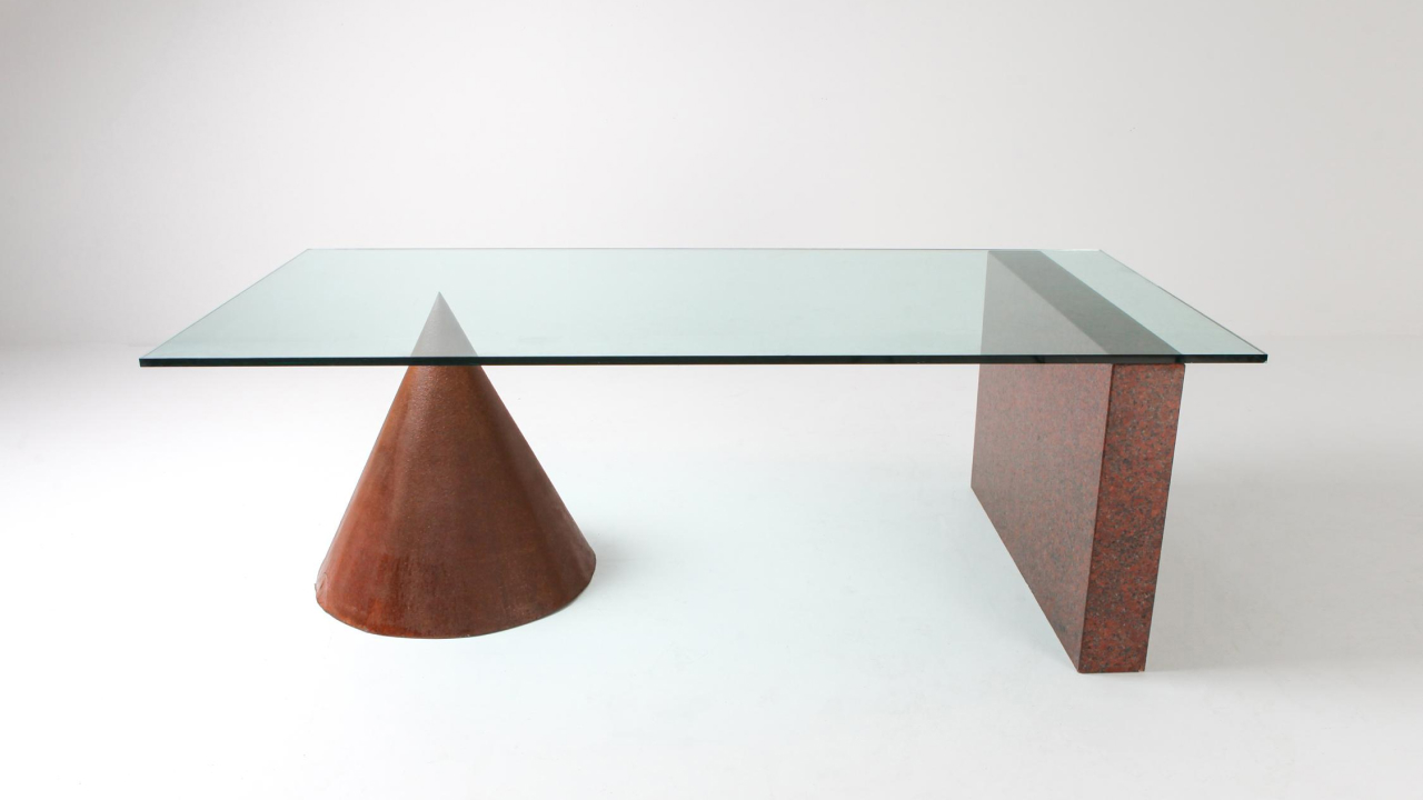
My own bio talks about the “commutative nature of design.” It’s another way of saying that the knowledge of how to design anything, whether that’s brochures, houses, or websites is transferable across disciplines. It’s much more elegantly put by renowned late designer Massimo Vignelli: “if you can design one thing, you can design anything.” I buy into the spirit of Massimo’s quote much more than the literal reading. Web design is something I was actively learning, but with guidance on best practices (again, from Sean) I already knew what I needed to know — the design squiggle.

If you can design one thing, you can design anything.

a geometric table designed by vignelli
Vignelli for Casigliani, 'Kono' table, 1984

Savas Labs Dot Com

At this stage, the things working for and against me have shifted.

Helping me:

  • Concept: the new brand has a solid concept and is ready to be adjusted and expanded for the web.

Hurting me:

  • Inexperience: I don’t have a lot of experience designing for interactive spaces yet.
  • Expectation: since so much work has been done, there’s an expectation to extend the brand with consistency.
  • Time: with holidays on the horizon and a solidified launch date in mind, time was less of a luxury.

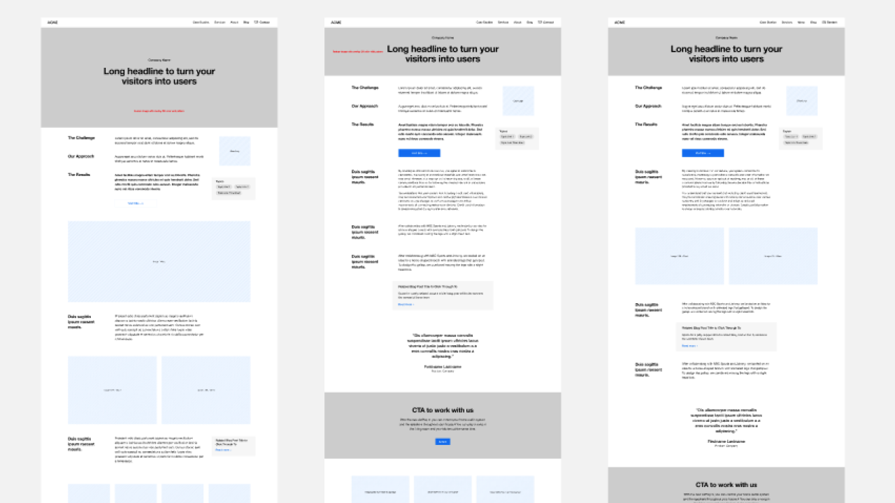
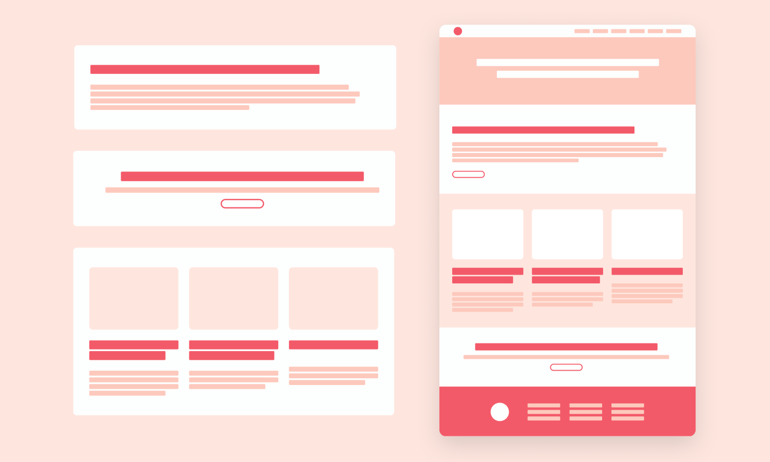
By picking a few key pages to wireframe, we built an inventory of components to cover design and content needs across the site. Meetings with the bosses and our marketing coordinator helped identify what we needed to design for. What didn’t exist on the previous site that we’d want to add? What could be done better or thrown out altogether? Since this was unfamiliar territory, I grounded myself in a familiar process. I began exploration with a pencil and paper and drew out ideas before moving them to Figma.

Sketched wireframes
Early wireframe sketches for the new case study page.
Digital wireframes
Digitized wireframes in various combinations for the new case study page.
A design composition
The new case study page as a design comp.
A range of designs of interior pages of the new Savas Labs website
Utilizing and expanding a design language across other interior pages of the site.

And That's How It's Done

The brand elements developed so far combined with the wireframes to quickly take shape. Sean and I were able to divide up design tasks to double our effort. Coming from a background of being The Designer on staff, it was tough to let go of the reins. Feelings of unease were quickly supplanted by gratification as Sean was able to run with my work so far and take us across the finish line. As we began development and content migration to the new site, we realized additions and changes we’d like to make. To keep us on track for our deadline, we kept a running list of tasks for the next iteration of our site.

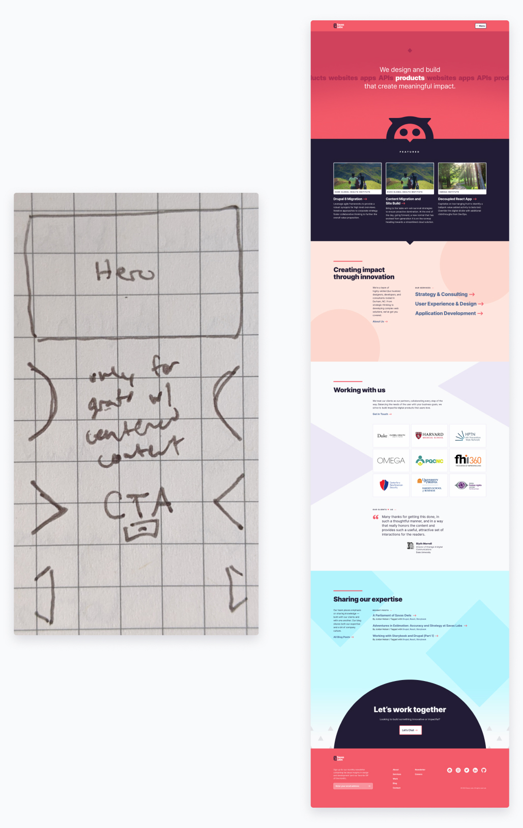
a side-by-side showing a sketch of the homepage and the finished design composition
The home page as a quick sketch, showing ideas that carried over into the final design comp.

Takeaways

In around 132 days, we went from zero to launch. That’s not to say we’ve reached the right end of the squiggle, though. We have that whole list of nice-to-haves to begin developing for the next phase, not to mention distilling our work to-date into a full design system that will inform future development. Now that we’ve launched, we can take a quick inventory of what went right. If you’re thinking about a rebrand, these are some core ideas to help you through your process:

Remember to sketch. Analog sketching proved super valuable throughout this process, it's a low-cost way to generate and refine ideas.

Done is a state of mind. Balancing your list of core needs with your list of nice-to-haves is key.

Progress doesn't always feel like forward movement. Revisiting an old idea or digging for something you liked from an earlier exploration are important actions that can provide clarity and a stronger overall concept.

Find the balance between structured and unstructured time. It's good to give your brain a break.

Make it look good on a racecar.

Trust in the squiggle.


animation showing the transition from the old savaslabs.com homepage to the new


Savas labs brand expression


Savas labs brand expression


Savas labs brand expression