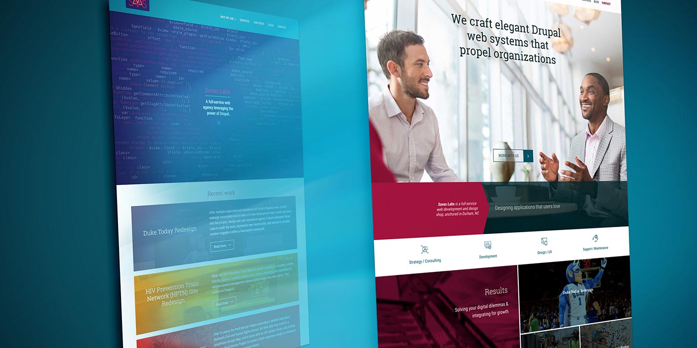
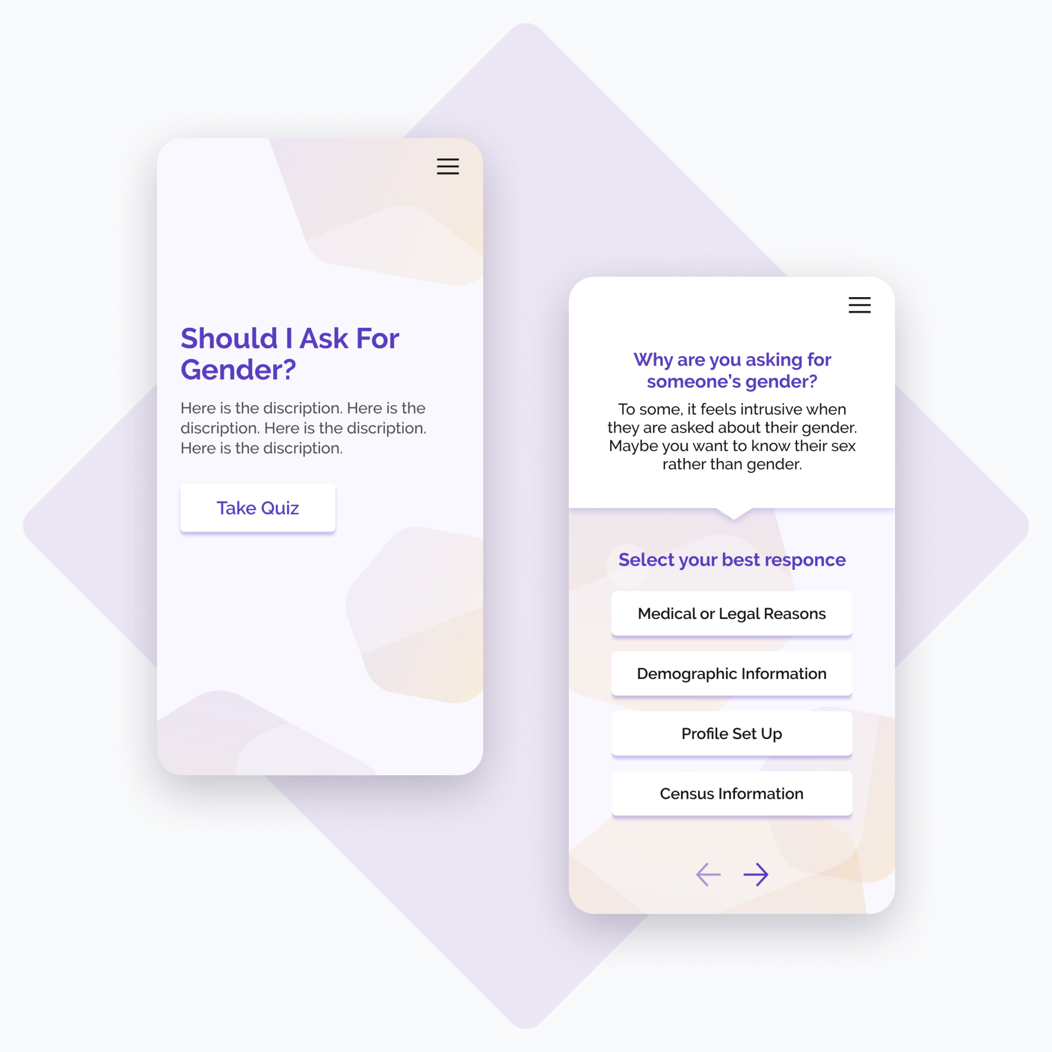
Earlier this year, Savas Labs redesigned DurhamNCSports.com (you can read our case study for more about the effort). Outside of working on our rebranding effort, it was my first time leading redesign efforts on a website project. I'm pretty proud of it, and I learned a lot! Here are some of the things I learned in the process.
Knowledge translates
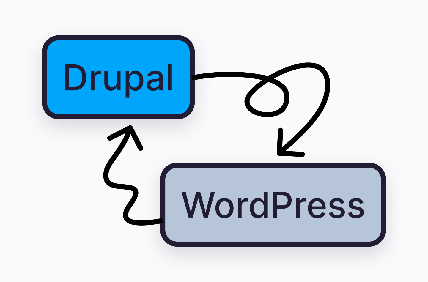
At the onset of the project, I was still learning Drupal terminology and structure from my previous project, designing savaslabs.com. So, I encountered a bit of a curveball when we employed WordPress, which meant another set of intricacies for me to get up to speed on. Fortunately, our team has a substantial amount of WordPress and Drupal experience, meaning I could utilize them as a cipher to learn where the two converged and diverged.
Presenting
Most of my design career to this point has been a bit behind the curtain, working mostly on in-house teams with internal stakeholders. So, sitting in front of folks and justifying my design decisions was a new and slightly unnerving experience. Again, I was able to lean on my colleagues for advice, and after sitting back and observing for a couple of meetings, I began taking the lead.
Presenting goes so much further than a simple show and tell. You're not just showing off visual assets; you're using them as a tool to generate conversation, gather feedback, and push toward consensus. Depending on what information you're looking for, you could present alternate versions of a comp or purposefully leave an area ambiguous. I enjoyed utilizing Figma's (then newly-released) auto layout feature to make changes on the fly.
A little prep goes a long way. I found that I felt best prepared to go into a client meeting after jotting down a to-do list of notes to have up on my screen alongside my presentation window. If I didn't have that list as a touchpoint, I'd end up glossing over items and not realizing it until the end of (or even after ?) meetings. I also found it useful to thread all these meetings together into a larger narrative. Design reasoning can easily shift from personal opinion to specifically addressing feedback from previous meetings and larger project goals.
I had to strongly fight against the urge to have an answer to every question. It's OK to be unsure when getting feedback! In fact, it can be flipped to your advantage. Being upfront and willing to assign yourself homework instead of committing to a potentially unwise direction on the spot is an easy way to establish trust and avoid wasteful work.
RELATED READ
Leading Effective Client PresentationsDesign to scope, unless...
Over-designing is an easy trap to fall into for any designer, especially for those pushing to do their best work on their first client project. But without understanding and working within constraints, you're doomed to run up against time and budget barriers. Before even thinking about putting pixels on the screen, I had to seriously consider the scope and schedule as I developed a design approach. In the end, it was a matter of frequently checking in with the project manager on the timeline of deliverables.
That said, always keep an eye out for opportunities to have stretch goals. In this project, that opportunity manifested itself in a small mark at the bottom of the homepage, affectionately referred to as "little bull." The little bull lives there not due to any UX justification, but as a subtle and elegant touchpoint for the Sports Commission's brand. Always, always, always prioritize function over form; but it's OK for designers to have fun, too.

We had a wonderful experience working with Durham Sports Commission, and received pleasantly positive reactions early on in our design phase. That could have been good enough, but the team pushed me to look for areas to improve within the constraints. This nudge circles back to finding different ways to present visuals to generate different routes of conversation. Additionally, it's perfectly reasonable for clients to need time to digest what you're presenting. It wasn't enough to just send over files after a meeting — sending visual assets along with follow-up questions and thoughts to ponder provided valuable feedback on things that didn't come up in our face-to-face conversation.
Pictured below: the ideal Venn diagram of Savas goals and client goals.
Communicate!
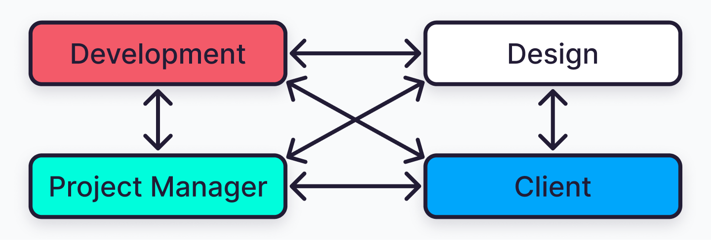
Expectations from the client, designer, developer, and project manager interlace throughout the project, and rarely does an adjustment of expectations affect only one party. It is so important to communicate intentions and probe for understanding. Obviously, right? It can't be "set it and forget it," clear communication must be maintained, questioned, and pushed to improve over the life of the project.
Instead of working towards a singular design/development handoff, we worked in a constant state of explanation. During the wireframing process, I'd pass wireframes along to my dev counterpart in advance of client meetings. They could flag something that didn't make sense and get clued into design intent well ahead of the final handoff. This arrangement meant that I could keep refining my understanding of designing for WordPress, and we avoided any big formal information dump at the end of the design phase.
Reflecting on the journey
Your colleagues are resources. Utilize them! Throughout this entire redesign, I was double and triple-checking on my next steps, the best course of action forward, and soliciting feedback and suggestions for how to improve my work and working process. There's always more to learn, but with every project comes an expansion in experience and skill set. I look forward to sharing more of these learnings down the line. Until then, I’ll always be proud of this project experience — go team!


