When's the Next F1 Race?
Our Senior UX/UI Designer shares his creative process for building the graphics for 'The Next F1 Race,' a single-page website featuring the 2023 Formula 1 schedule.
I’ve been a big racing fan for as long as I can remember. I started with watching NASCAR, but over time I found that it didn’t really matter what the track or cars looked like — I’m drawn towards racing in all forms, and by the early 2010s, I was waking up early on weekend mornings to watch F1.
The 2023 F1 season is the longest ever in both its span across the calendar and the number of events. One of my hobbies is keeping an open Figma or Illustrator document specifically to type different words in different fonts. Earlier this year, while perusing the upcoming schedule of races, I started to write down some of the countries and circuits; at that moment, I began to think about different ways to approach designing this information. The season is all about twists and turns on and off the track; how could I portray this globally-known information in my own way?
For this project, I wanted to create a design-forward calendar while keeping the bare essentials present.
Formula 1 is a truly global championship. Races, or Grands Prix, take place on almost every continent, and each circuit has its own unique attitude based on the track itself and the culture surrounding it. Starting at the base level, I wanted to find a way to showcase the circuit names (often the country or region where the track resides) as well as the official event names, which are much longer combinations of sponsors and organizations and local languages. The international nature creates an interesting set of letters with which to work.
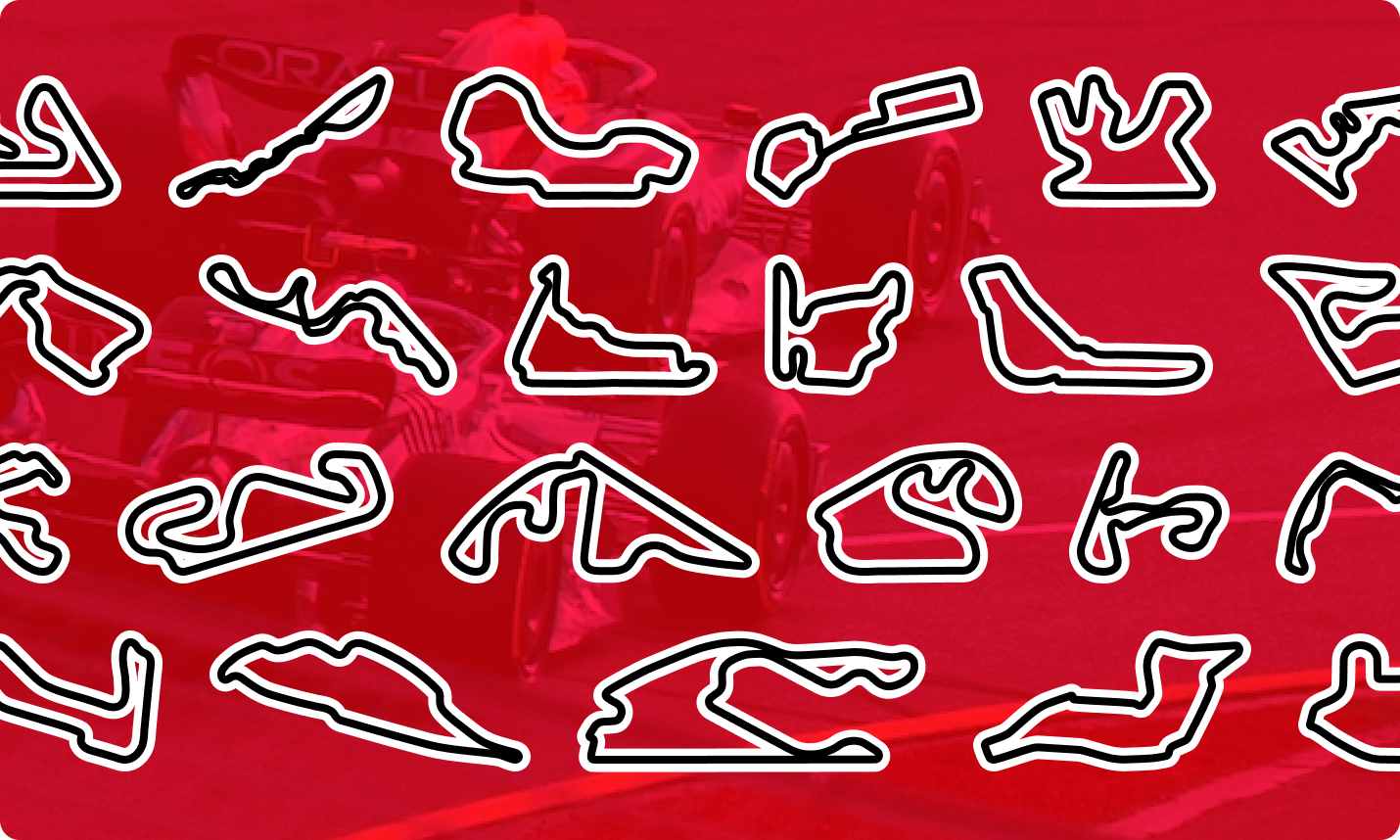
The next thing that came to mind was the tracks. F1 circuits incorporate a mix of high-speed straights, tight chicanes, slow corners, and fast sweeping bends. When it comes to calendar graphics, I’m familiar with seeing the track as a small outline, but in a conceptual sense, the varying little lines in each track are where everything happens. Why diminish them to just a tiny detail?
I'm no stranger to blank page syndrome, where the potential possibilities for a design are endless and become overwhelming. I've found that implementing constraints, whether it be something like timeboxing, color use, etc., helps narrow down those possibilities so that you can work in a smaller, more comfortable sandbox.
In this project, I set constraints to arrange each event within a card layout that would uniformly accommodate every track map and circuit name. The process then evolved into considering the length of the location name, the intricacy and shape of the track, and how these elements could cohesively fit within the defined space.
The typeface
People who make typefaces often create specimens — logos for fake companies, just a lot of words together, anything to display the traits, vibe, and qualities of the font they've created. I'm not a typographer, but I love looking at/buying/using/hoarding new fonts, so I often dive in and immediately type as many different words and letters as possible to test them out.
With the country names of the various race locations playing a significant role in the design of each graphic card, I knew I wanted big, bold letters that feature a typeface. I'm a subscriber to David Jonathan Ross' Font of the Month Club, which is where I learned of the variable font Nickel Gothic. I chose to use a variable font because it offers the flexibility to tweak details at a super-fine level. This allowed me to adjust the font weight to accommodate country names, ranging from as few as 5 characters to as many as 14 characters.
The tracks
I sourced and traced the track maps for the 2023 schedule to create the tracks for each of the different races. I pulled some of the maps from older video games that other people had extracted previously, and some I redrew parts of to match the current track configurations. I then turned these drawings into figma components and scaled them all to match the letter height of the country names.
Additional information
After getting the biggest design elements locked down, the graphic cards needed tertiary information to fill out any negative space within the layout and establish an information hierarchy. There are plenty of other tools to find out the exact times of each practice and qualifying session, so my focus wasn’t on trying to create an all-inclusive utility. With the race location and track taking center stage, it felt pertinent to add the date(s) of the race and how many laps to the top of each graphic.
Because I fancy myself an amateur vexillologist, I knew each nation’s flag needed to be on the card. This decision was mostly because I like flags, but the presence of a national flag helped create a structure within the card and gave me an additional element to use for alignment.
The last bit of information I incorporated is the entire grand prix name, which gives a hint of levity within a very serious-looking design. The full names are such mouthfuls and are almost never used in normal conversation around a grand prix, but they’re a whole type specimen unto themselves.
Flash-forward to a couple of weeks, I showed my designs to the team during one of our Friday Labs™ meetings. It was then that Lemon and I started bouncing around ideas on how to take the variable fonts I had used further. They’re a fun bit of new technology that we have yet to use a lot of in our work, and the design constraints that I’d used to create this so far lent themselves to being able to play in a new space.
He and I quickly converged on the idea of constructing a simple single-page site in which the individual event cards would stack on top of one another. As the user scrolled down the page, the location name would expand or contract when it was the primary card in view.
Lemon’s first iteration of this animation turned the wacky knob to an 11. However, during a subsequent pairing session, we toned it down to maintain its technical demonstration quality while achieving a level of refinement that aligned with the overall design aesthetic.
After Lemon and I had gotten the digital version into something close to final, he asked me if I’d be ‘OK’ to go into some of the code to finish data entry and tweak the more minor design details. I said ‘yes’ because I thought it was something I could probably figure out, and I knew I’d have support if I got hung up on any of the steps to get the site set up locally.
In the past, I’ve tried to start My Coding Journey a few times in my career and either haven’t found the right mindset to approach it or I didn’t have the right project in mind. I still haven’t started that journey, but the experience I had with coding and this project was surprisingly fun and satisfying. Lemon provided a user-friendly readme and step-by-step process, along with building the .json files that hold each card's information in a way that made it simple to edit, save, refresh, and repeat until satisfied with the results.
To clarify, I’m definitely not calling myself a coder in any way, but I did not expect this as part of the process, nor did I expect to be able to handle it. It helped me learn a little more about the practical implications of using variable type and animating it
Once we had completed the development of the site, all that remained was figuring out a fitting name. Lemon and I talked about gimmick URLs like “.race” but ultimately decided to keep the basic “.com” TLD. It was when we showed the site to Savas’ COO Ben, who officially coined the name The Next F1.
The journey of creating The Next F1 has been an immensely fulfilling experience on multiple levels. Although I was content with the prospect of a static design, collaborating with Lemon to bring this site to life, both in aesthetics and functionality, was an exciting and unanticipated bonus. I’m happy that this project turned into an invaluable learning experience that resulted in a personal tool that I’ll keep in my bookmarks over those lengthy inter-race periods. Most importantly, The Next F1 allowed me to combine visual design and racing, which are basically my two favorite things and could just as easily describe my whole personality.