Creating a Design System to Empower Our Client

Drew Glover on background
ian-headshot-building-bg

Drew Glover & Ian Curran

RevBoss custom illustration example

Topics

At Savas Labs, we believe that design should be accessible to everyone, and what we create should empower our clients to have the ability to continue to produce content even after our engagement with them is over. To achieve this, you must first lay a solid foundation. We had the opportunity to do just that on our project with Revboss. It all started with revisiting their core branding elements and then establishing a design system to guide us (and the client in the future) in applying their brand across their digital assets.

This article will explain how we used a design system to create custom illustrations for our client, Revboss, that broke the cliches of marketing imagery and provided a step-by-step guide for them that puts their new look in their own hands.
 

Updating the brand

As your business evolves and matures, so must your brand. When we first met with Revboss, they expressed discontent that their brand mainly consisted of a logo and a color. In order to put on a new face and lean into their growth, the team at Revboss needed more tools in their toolbox.

The tool kit 

Brand colors

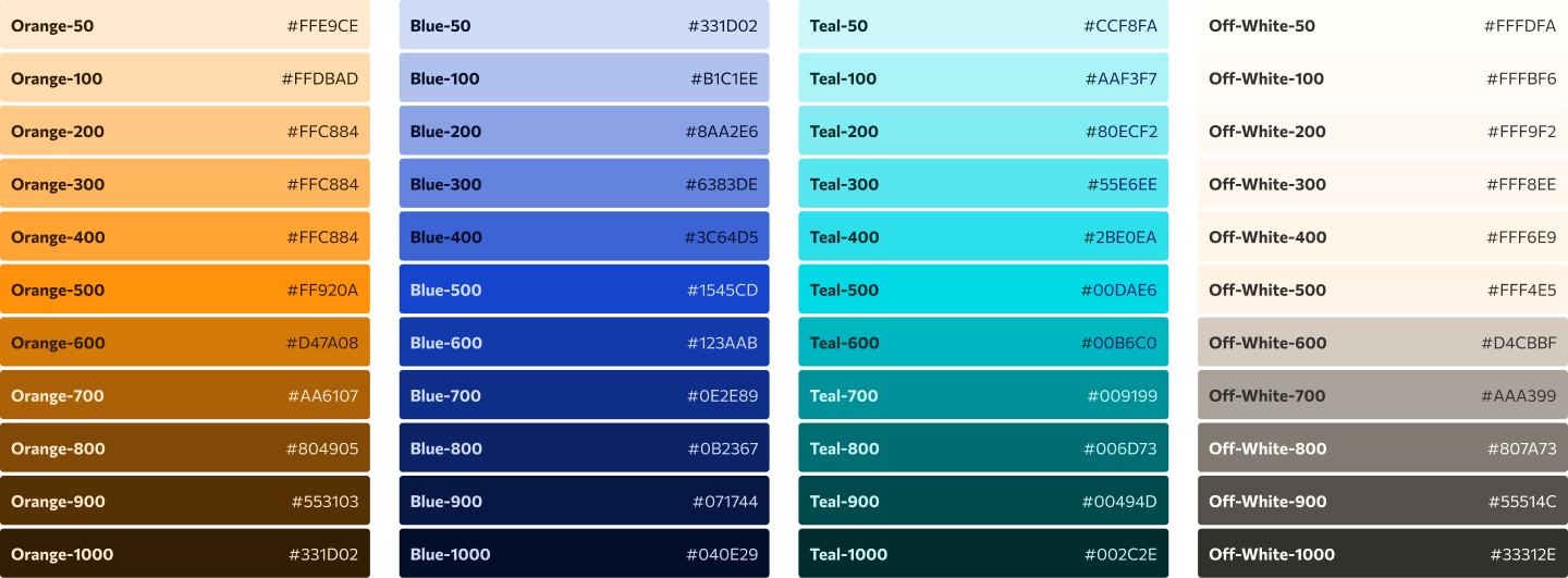
The first step was assessing RevBoss’s current brand colors. This step is crucial in the design process because understanding how colors can affect perceptions and choosing colors that communicate your brand's personality are key elements in creating a successful brand experience. For RevBoss, their only established brand color is orange. Unfortunately, orange is notoriously tough to work with, especially when designing for WCAG compliance. We quickly defined accent colors and color gradients to establish a system that would allow us to incorporate new associations.

RevBoss secondary brand colors
RevBoss brand color gradients
Revboss old button color compared to the new button color

The current RevBoss logo was a great jumping-off point to introduce a new pattern element. Through some geometry, we turned their icon into a subtle texture that can be used as a background element, a photo overlay, and more. Our reasoning behind this design decision is that patterns created based on logomarks serve as inherent branding wherever they appear in the digital space.

RevBoss Pattern


Typography

Next, we chose a new typeface to lead the way, Commissioner. With more variance in strokes and letter construction, it communicates a sense of humanity that helped our client come across as more relatable and open.

RevBoss Typography

Iconography

When revising iconography, we wanted to avoid reinventing the wheel nor crafting a solution that tied RevBoss to a specific set of icons. Using cheap-to-license, modifiable icons, we customized a set of icons that reinforced the new color and composition system.

RevBoss Iconography Library

Custom illustration

One of the major design components of this project was custom illustration. During the initial planning process, we received a specific directive to avoid cliched imagery and stock photos. RevBoss strongly leans into not being like its competitors, and avoiding these visual cues would help further that differentiation. However, while RevBoss had an existing small repository of custom illustrations throughout their site, with the timeline and scope of the project, providing a full library of redesigned illustrations wasn’t possible. 

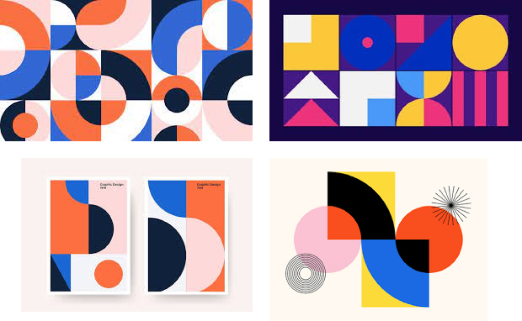
To get started, Revboss provided Bauhaus imagery as an inspiration for their revamped look, and we immediately began pondering ways to systemize this approach.

Bauhaus inspiration picture

Custom illustration without custom illustrating everything individually was a specific byproduct of the budget and scope of this project. Using Figma’s variable components feature, we created a “build your own illustration” kit by breaking down the Bauhaus-style inspiration into individual blocks that could be placed, moved, and rotated around. From there, we designed squares with RevBoss-specific colors and shapes. We then put them to the test and created compositions that would fulfill their needs.

Bauhaus tile set inspiration
RevBoss tile set

One of the major lessons we learned from this approach is proper documentation and instructions. We meticulously documented our creation process to ensure the RevBoss felt confident to move forward independently.

RevBoss custom illustration example

The inner-workings of a design system

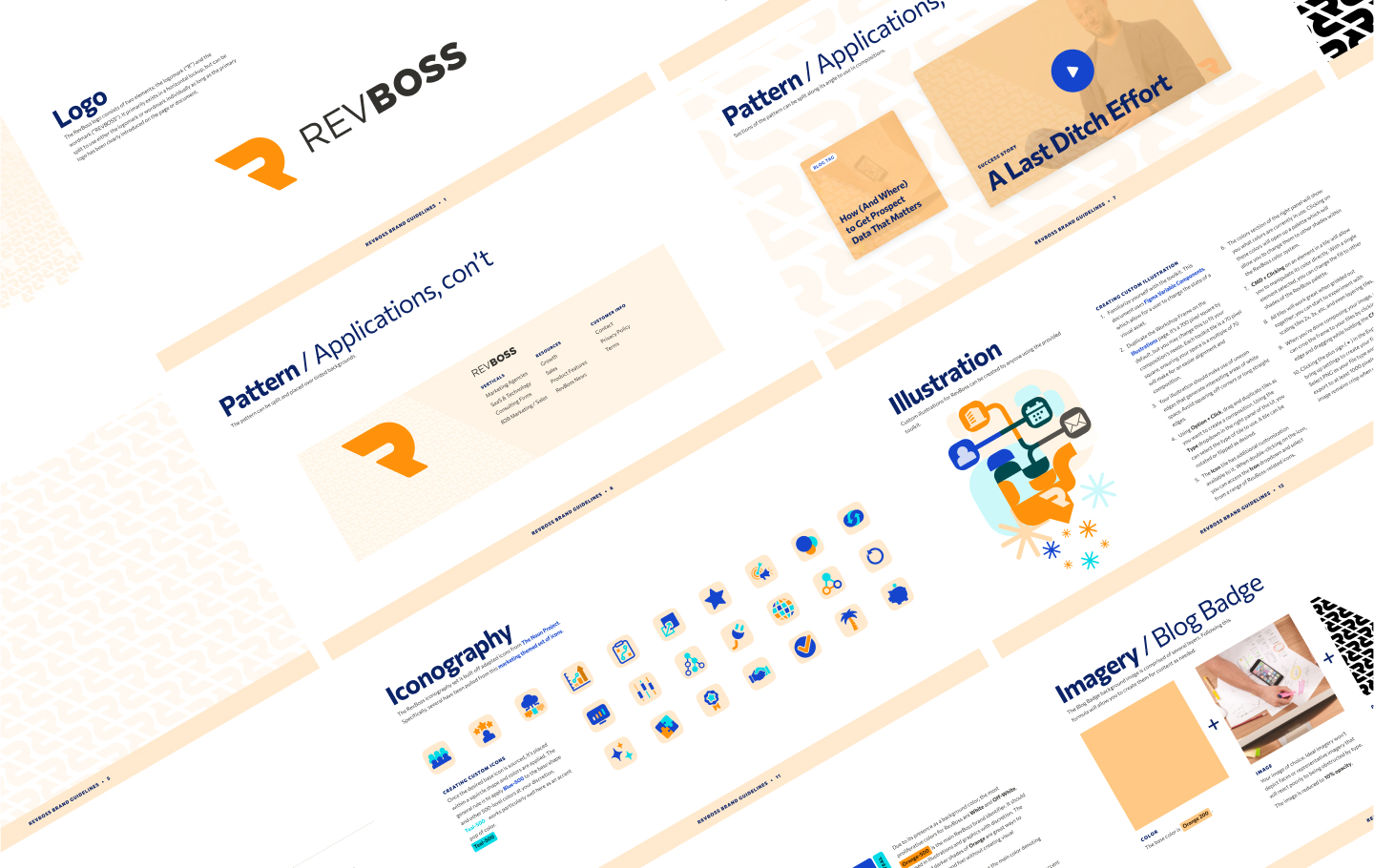
Despite agreeing on new brand guidelines as a deliverable, the RevBoss website update was the primary objective. As we worked on their website, we poked, prodded, and iterated the brand. Once we were sure the new site design would work as intended, we codified those changes into the first version of a brand guidelines document.

A design system shouldn’t be restrictive. There will likely be exceptions to the rules that arise in different scenarios. By building the system and guidelines based on real examples, we aimed to capture the new design decisions while leaving doors open for the client to fill in any blanks within the context of the rest of the system.

RevBoss brand guidelines

Our Design Team's ethos

Design is a service we offer at Savas, but we see design as a way to push our clients to reach their goals. A client shouldn’t have to have a crash course in web design to understand what’s in front of them. When we put a design before a client, we act as translators. Knowing what color theory, x-heights, and white space are isn’t critical, but knowing how a chosen design approach helps them fulfill their project goal is. 

With this mindset of empowerment and partnership, we help our clients align their image with their business goals.

Is your brand in need of a refresh?

We'll help you create a design system to make your brand stand out from the crowd.