How to Embrace Practical Limitations in Design

Drew Glover on background

Drew Glover

A road on the side of a river with a swirl graphic in the sky

Do you remember having to write a paper in grade school that was totally open-ended, and you could just write about whatever? In my experience, the hardest part was starting. Overwhelmed by opportunity, it was difficult to simply pick a direction and move forward. The same could be said about design. It’s rare in my career that those no-strings-attached opportunities arise, but there is always that similar feeling at the onset of a project, and you’re starting a blank figma page. 

For me, an unlikely place of inspiration can come from accessibility. When it comes to designing accessible websites, there are many constraints that we need to consider, such as the typeface and its legibility, color contrast, the use of texture, and other various secondary design elements. Taking an accessibility approach to design has taught me a lot, and I want to take a moment to invite you to think about constraints as helpful and not hindering.

Getting from point A to point B

If there’s anything I want you to take away from his article, it’s that working with your constraints rather than against them can promote a greater sense of creativity — design is a problem to be solved, after all.

Staving off blank page syndrome

Constraints provide a clear direction and focus for designers. They help in narrowing down the options in projects with endless possibilities, making the design process more manageable and goal-oriented.

Encourages innovation

Oftentimes, working within constraints forces us to think outside the box to develop innovative solutions. Through our ability to overcome limitations, we figure out how to use our resources more strategically, which, in my experience, has led to more unique and inventive designs.

Provides a barometer

To gauge the success of your design, you can see how well it has adhered to the constraints provided alongside the ability to solve the problem uncovered in the strategy phase of a project. In short, your work is successful if you can meet these two benchmarks: the problem you’re solving and your ability to design within constraints.

Applying constraints to client projects

Recently, we redesigned the site for DREDF, the Disability Rights Education and Defense Fund. The design process exemplified the importance of design constraints and how they can be used to our advantage.

It’s generally a healthier practice to hold accessibility considerations in high regard and treat them as things you can use to create better websites rather than obstacles to skirt around. After all, the people who use the sites we create deserve it. When it came to DREDF, our accessibility objectives were driven by two factors — our own internal north star of creating accessible websites and products and the nature of our client’s work. Taking these into consideration, we evaluated all of our design choices in terms of accessibility and inclusivity.

Design inspired by accessibility

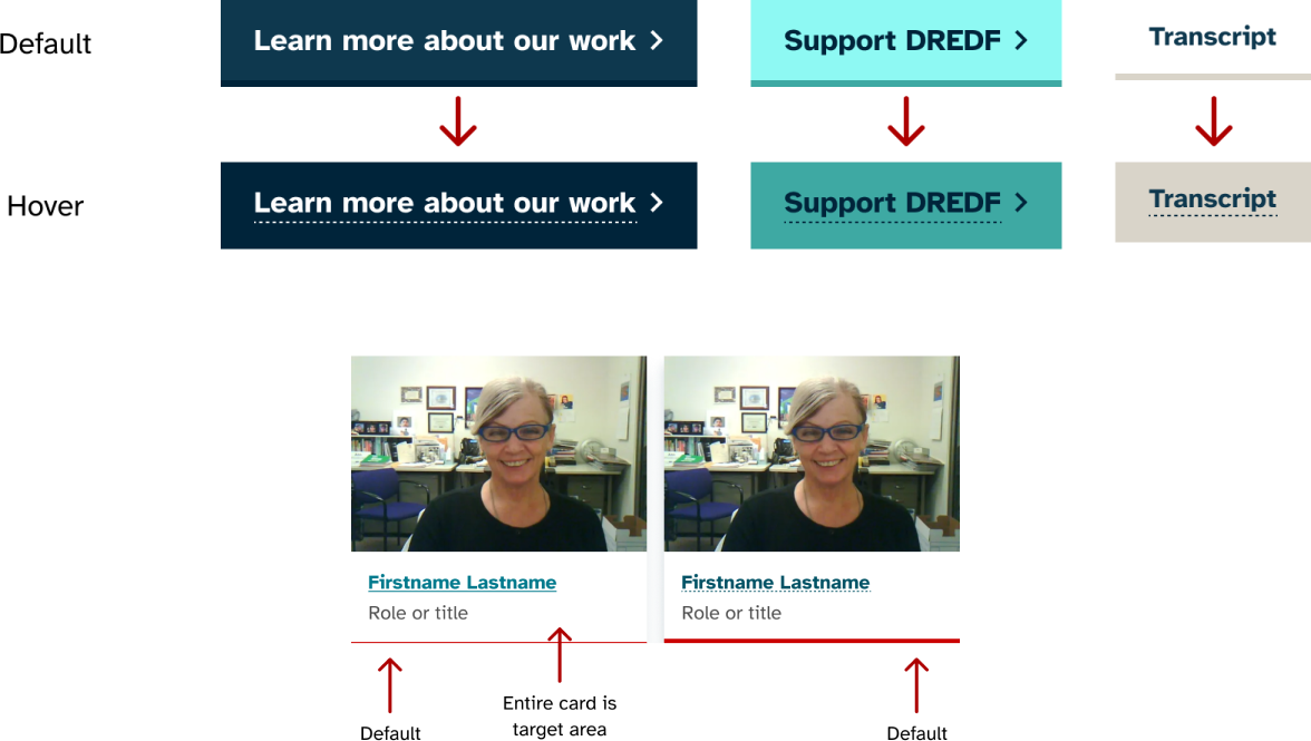
To me, in visual design, accessibility strongly correlates to disambiguation. Clarity in which elements are interactive, where things are, and generally making sure users know what they’re looking at. This idea or theme of disambiguation became the driving force behind many of our design choices for the new DREDF site.

Design elements that were created for the DREDF site that demonstrate disambiguation

The type

We made a special effort when choosing a main typeface for the new DREDF site. When it comes to disambiguation in typography, it boils down to being able to quickly discern which characters are which. Fortunately for me, a font nerd, there are approximately forty billion typefaces available to use - so I had a large amount of inspiration to pull from. The classic example, which we used in our evaluation, is the numeral 1 vs. an uppercase I vs. a lowercase l. Through our own study and consultation with the client, we decided to go with the typeface Atkinson Hyperlegible. It was a logical choice since it was created specifically for readers with low vision and to improve comprehension. Other good candidates we evaluated were Lexend and Public Sans.

The word 'Illinois' in the Atkinson Hyperlegible Typeface

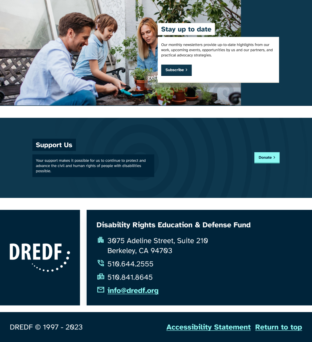
Boxes and layer motif

The DREDF site is loaded with so much useful content. Therefore, our team wanted to establish a clear hierarchy in content relationships — what headings go to which areas of text and calls-to-action, etc. We came up with a flexible and multipurpose motif — using areas of solid color to bind content together. Visually and hierarchically, this creates a direct relationship among content that can be easily visually distinguished and implemented in development. Moreover, it’s a visual tool we could establish as a key element. These solid blocks of content, prioritizing legibility, could be placed over other areas of color and images without impeding comprehension or creating tough-to-comprehend situations for users with visual impairments. Again, the hallmark is disambiguation — above all, ensure that what’s meant to be read can be read, and built around that.

The boxes an layer motifs created for the DREDF website

Color systems

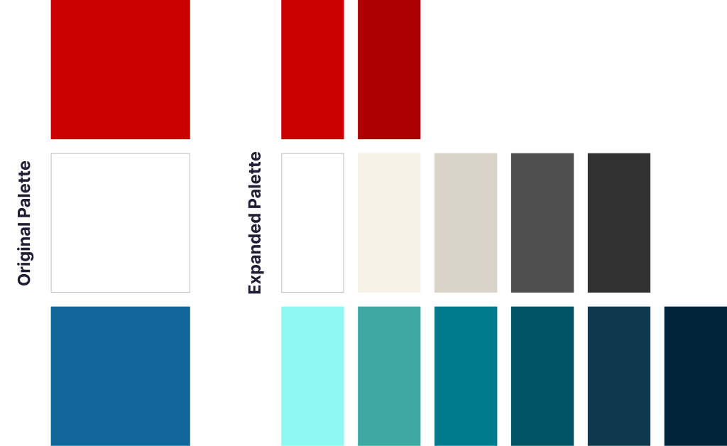
The DREDF team initially came to us with a limited color palette but was open to more exploration. One of the original colors was red, which can be a little tricky to use primarily. We couldn’t discard the color, but we needed to use a light hand when applying it. By promoting darker shades of blue along with teal hues to be the site's workhorse colors, we let the brand red stand confidently in the logo and key headings. In addition, we introduced an off-white color to soften the contrast from the body text to the site background for an improved reading experience. This meant that white also became a utility color to distinguish certain cards and content areas. Throughout the design process, we used tools such as the Contrast Triangle checker to ensure we were considering more than just one facet of accessible color contrast.

The original DREDF color pallet versus the new one

Embrace your constraints

Working with DREDF reminded me that finding inspiration in the little details, such as the selected typeface that solve for accessibility, has the power to scale up into a full-blown design system. Remember that creativity can always be found in the most unlikely places.