At Savas Labs, our focus has always been to craft excellent digital products and experiences that drive results for our partners. One of the ways that we’ve been able to stay true to this commitment is through the refinement and standardization of our departmental processes. These processes aid us in adhering to project timelines, maintaining budgets, and, most importantly, delivering custom digital solutions that satisfy the needs of our client partners.
However, processes are not perfect, and sometimes, specific client needs call for opportunities for us to work outside of our standard processes to deliver the best results for our clients. Due to it being our client’s first time going through a website build and the added complexity of bringing a print-focused department fully digital, we adapted our approach to be much more hands-on and meet the client where they were
Giving rise to Vital Signs
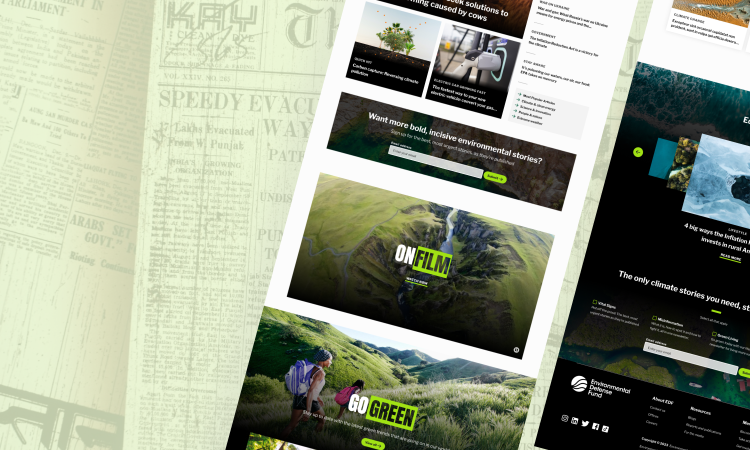
Our original engagement was partnering with the Environmental Defense Fund (EDF) to take their new branding that another agency completed and apply it to their current website, as well as redesign their core pages (homepage, Our Work, About, and Climate). Through our work together, we learned that their team needed to move all of its written news-based content to a new site, Vital Signs. Vital Signs is a brand new sub-brand / sub-site stemming from EDF. Excited by the idea of building an entirely new platform from scratch, we immediately jumped on this opportunity.
Our traditional approach to the visual design phase of website design
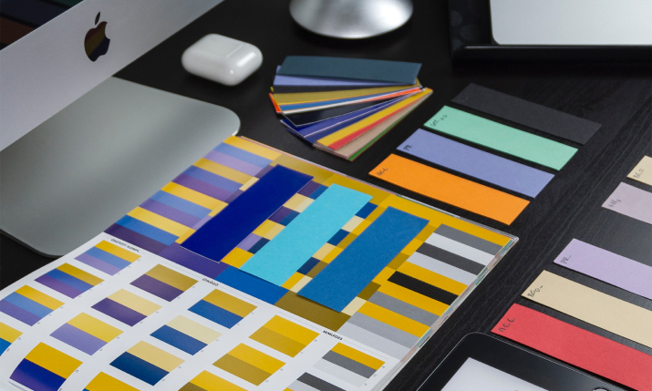
Our clients commonly come to us with set brand guidelines we must follow when building or redesigning a website. We spend a lot of time communicating and collaborating with our client stakeholders at the beginning of the visual design phase to ensure our visual identity aligns with our target audience and expands beyond their core branding elements (logo, color palette, and typography). During this time, we will perform exercises such as spectrum polls and review inspiration sites so that we can produce mood boards for the client to review.
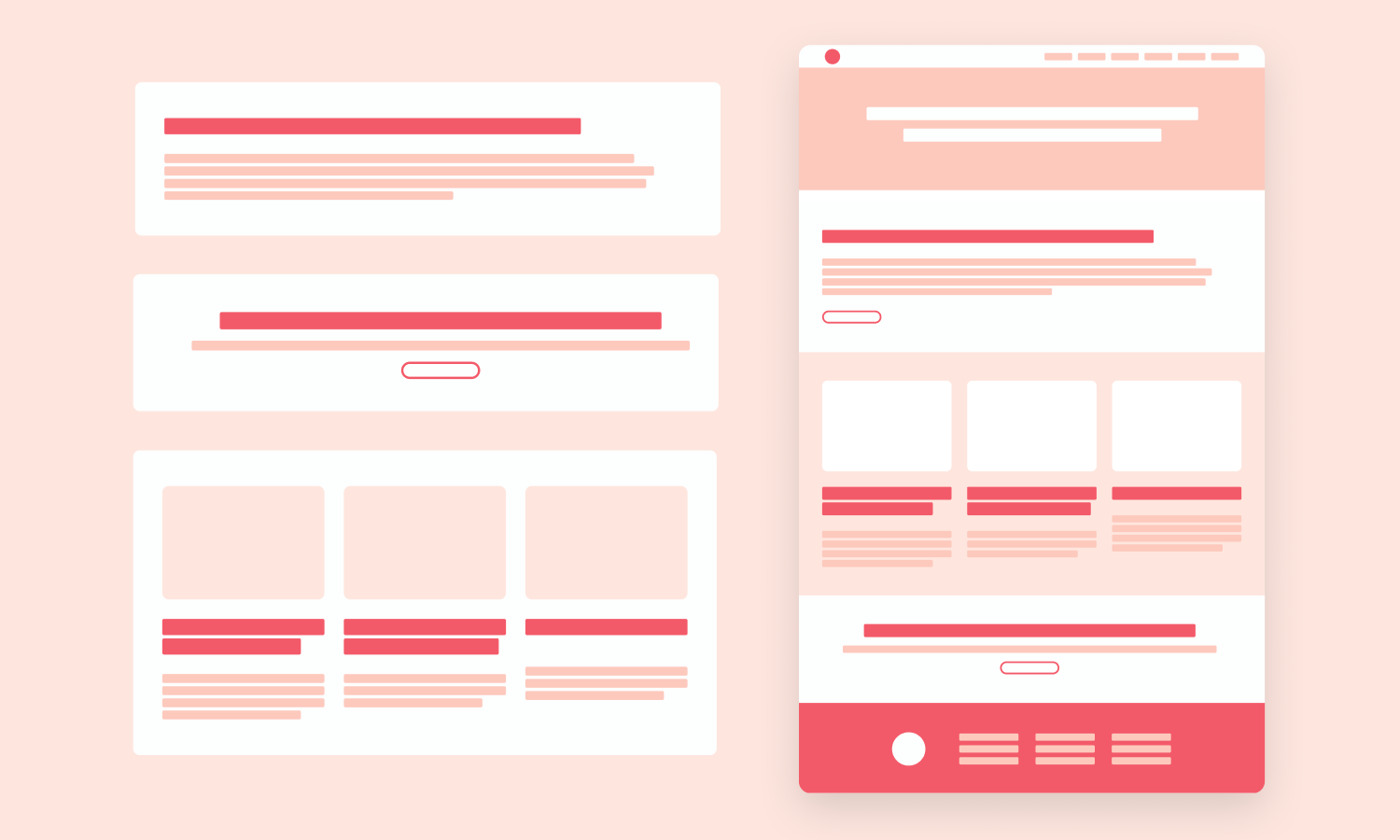
Our design process is iterative - as we transition from low-fidelity wireframes into high-fidelity page designs, we’re prepared to go through multiple rounds of revisions. Through feedback loops and creating iterations of the original designs presented, we ensure that our approved designs reflect our client’s vision and support the user’s needs. This is a very collaborative part of the website process, so it’s imperative that we have consistent and proactive communication with our clients.
How and why we adjusted our process for this project
All design is rooted in the idea of beauty and intent, but there are branches of design that don’t always speak the same way - i.e., print design vs. web design. From the start, it was clear that the Vital Signs team was highly knowledgeable and passionate about editorial writing and its aesthetic.
Given the diverse understanding between these two facets of design, the first challenge became - how can we translate the EDF team’s wealth of printed materials into a compelling online experience without compromising the design quality?
The second challenge was to bridge the knowledge gap around development functionality, content organization, and design best practices for the web so that we could communicate effectively during the visual design process. This was a great reminder to get into the weeds and explain why we made each design decision and what implications would come if we decided to break convention within a page layout.
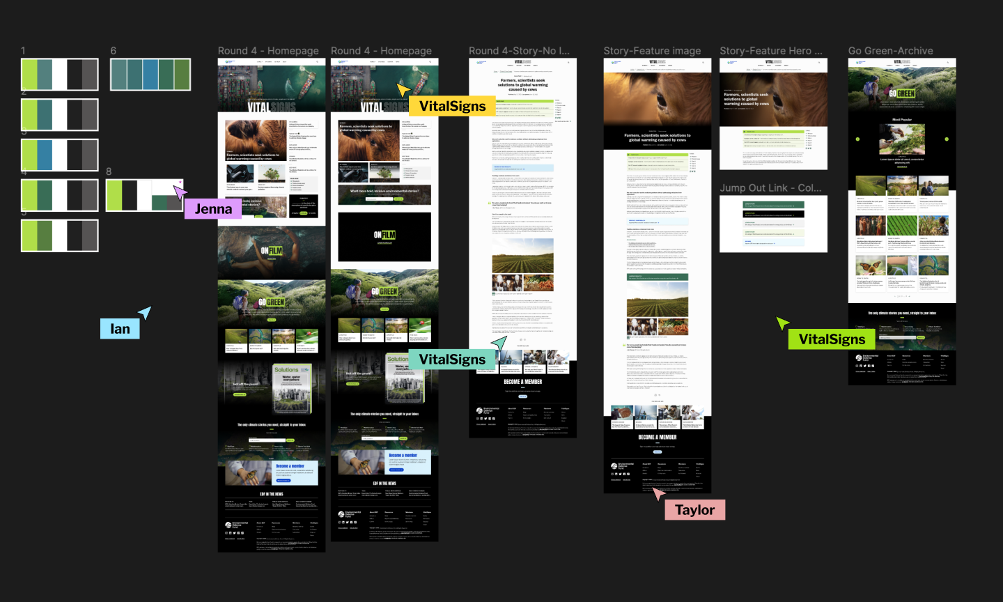
After our first revision cycle, we saw an opportunity to pivot due to frustration and misalignment between such a large stakeholder group. One major break in our process was to start hosting live work sessions with the Vital Signs team so we could eliminate the need for asynchronous communication on major revision requests. It also allowed us to build momentum and gain consensus within a large stakeholder group, specifically when refining the color palette or choosing when to emphasize specific content types within a page. What happened was that it opened up communication because we were showing them “behind the curtain,” which built up a lot of trust and allowed us to drive home the intention behind our design decisions.
As a result of our efforts, everyone working on this project noticed an almost immediate change of perception from the Vital Signs team. It was clear that this change in our design process was making it easier for them to digest and understand our creative decisions rather than trying to fill in the blanks on their own or through the lens of an editorial writer. It also allowed them to provide constructive feedback that pushed the design forward, resulting in a more refined product.
Why it matters to be an adaptable team
Building trust between a client and an agency is paramount, especially in today's digital era, where having a well-designed website is critical to an organization’s success.
While our team specializes in delivering impactful digital products, none of it would be possible without the invaluable expertise our clients bring to the table. By collaborating and supporting each other, we ensure that the final product is a seamless fusion of our strengths.
The outcome
As I look back on this project, it’s important to remember that the situation is always the boss, and even proven processes need to be adapted to most effectively solve unique problems. The willingness of both sides to meet one another in the middle allowed us to push the limits of what editorial design could look like in a digital environment and provided Vital Signs with a website that would empower them as content creators. Building a website from the ground up takes both trust and patience, and we couldn’t have had better partners to work with than the Vital Signs team.

