How to Design an Icon System

Jayson Morse, Savas Labs

Jayson Morse

Savas Labs service icon library

Icons are a unique form of communication, one of the oldest. Cavemen used to draw hieroglyphics on walls of everything from horses to horticulture. Modern icons won’t necessarily tell you where to find the buffalo to kill for your tribe, but the intent is the same. Icons help guide folks to critical information they need, regardless of whether it’s a spoken or written language. 

However, designing an icon system for client projects can be daunting, especially if you don’t know where to start. In this guide, I want to help you understand the overall process for creating a well-balanced icon set that communicates effectively and looks even better.

Getting started

The first thing you want to do when creating a set of icons is to understand the intended location, the size(s) they’ll be displayed, and which concepts/actions you need to convey.

For example, Spot Illustrations tend to be larger, communicate more abstract feelings, and may include numerous colors. An example of this would be empty-state illustrations for an app.

Spot illustration example

True Icons are meant to be “read” at much smaller sizes or from a distance. They include a single color that highly contrasts against the background and typically represents specific actions or objects.

True icons example infographic

Depending on the situation you're designing for, you may want to aim somewhere between. This approach is okay (you don't have to pick one or the other), but figuring it out early, will save you churn n' burn feedback time down the road.

Additionally, getting a list of the icons a client needs determines the project's scope. Of course, some concepts are more difficult to depict than others, so time isn't usually linear when quoting hours. However, it'll help you understand how much work is involved and begin to piece them together.

Concepts

Whether it's a single user action, a collection of actions, or more of an abstract idea, each icon's job is to convey a specific meaning. Therefore, it should include an object or defining characteristic that separates it from its neighbors. No other shape can mean what this one means. 

An easy example of a concept is the Search icon. Sure, a set of binoculars or a telescope might've been just as relevant as a magnifying glass back in the early days of graphical UI. Still, after decades of reinforcement by so much software, its meaning has become ubiquitous. We're so accustomed to "Search" represented by a magnifying glass that we look for and expect to see that shape in particular. As an icon designer, you have no incentive to reinvent the Search icon for fear it would confuse your users. In other words: if it ain't broke, don't fix it.

On the other hand, a more difficult concept to depict in such a small space would be something like "24/7 Virtual Urgent Care". Particularly when you also have "Schedule a Virtual Appointment" sitting next to it. How do we depict these two things as discreet concepts in a way that captures both their meanings yet visually differentiates them? You can see how this could be a time sink.

My advice is to get your list together and find the "easy" ones, so you can focus on the more difficult ones, as these will be where the bulk of your conception time is spent.

Once you've got the basic approach set, start ideating! Work on a single concept for a bit, then bounce to another. Think of the client, their business goals, the audience, and their needs. Other things to consider are your client's brand identity, company culture, and what makes them unique. 

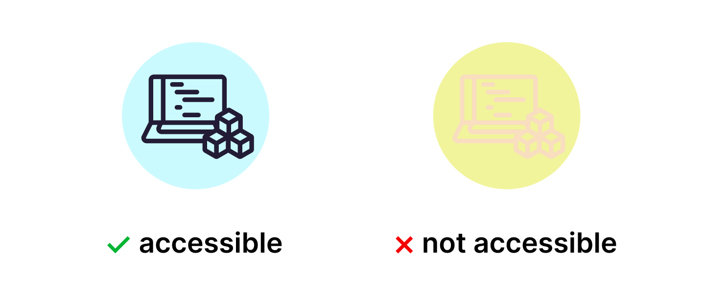
Work in a single color, preferably black on a white background. Adding color can add visual flair, and that's okay! Overall the core function of an icon is to communicate, and we can't rely on color alone to do so. There are several visual and learning impairments some folks have that prevent them from processing color.

Working in high-contrast marks ensures our icons are accessible to everyone. Furthermore, at some point in the early stages, you'll want to reverse your icons: seeing how they look white-on-black can change how some shapes are presented. Doing this early prevents you from having to make many significant tweaks once things become too refined to do so.

Accessible vs. Non-Accessible Icons

Elements of an icon

Rounded corners vs. sharp corners, aspect ratios, thin lines, thick lines, or solid shapes. Angled objects or straight-on views. Each of these are tools to explore and can go a long way in helping your system feel unique and alive even when you’ve started to find those elements that are feeling right, set rules for yourself and follow them! For example, if you’ve got a light-and-airy 2px line art in one and big, solid shapes in another, they’re not going to look like they go together. For example, you know how you might have your mom’s eyes and your dad’s nose? It’s the same thing with icons, and that’s why we say the icons are a “family.”

Accessible icon family
Inaccessible font family
Inaccessible icon family

Pick a single measurement for a stroke, and stick with it! Deviating in some instances is okay, but just remember, the more you do this, the less your icons will look correct. It’s a small thing, but even untrained eyes will pick up on this unconsciously. These deviations increase cognitive load and will cook a user's brain. Not literally, but after a certain number of them, they’ll notice it doesn’t quite look right and come away feeling like they just saw the work of an amateur.

Once you’ve got your ideas out there, you are ready to start refining them.

Housekeeping

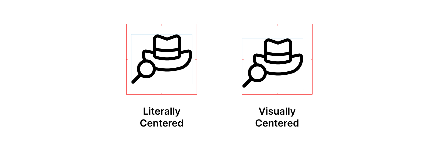
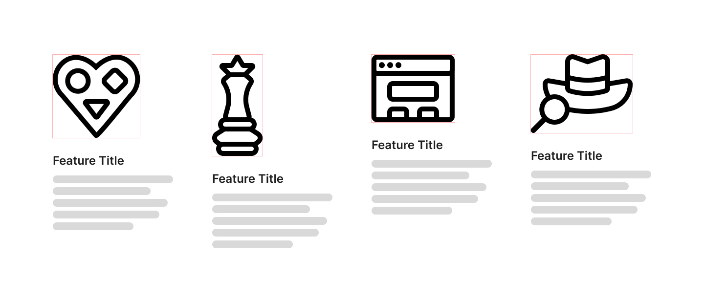
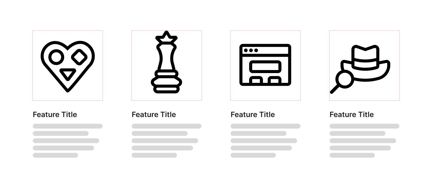
A big thing to keep in mind when you’re balancing your icon set is relative sizing. Developers will have a much easier time aligning your icons to look correct if they all have the same size bounding box. This is why I recommend choosing a size (my personal favorite is 64px) and setting each artboard to that. Some icons may be a little wide, while others are tall. It’s best to keep them roughly squarish, but you can break that rule as needed. Visually center the icon within the artboard and give it a little breathing room, even if it is perfectly square. This will help your wide and tall icons “feel” like it's right-sized with their family members. It allows you to visually compose each into its own little box.

Literally centered versus visually centered

Try to avoid the urge to put your icons all the way up smack dab right to the edge of the bounding box. “But that’s the only way they’ll align with the text!!!!” You say. I hear you, and I get it. But perfect left alignment with your text isn’t always preferable, particularly if your icons are also used in other alignment cases. It’s much more flexible to center them.

Individual-sized bounding box
Common-size Icon bonding Box

Exporting SVGs

In this day and age, you’ll want to make sure you flatten shapes and strokes, unite your shapes and icons and export them as SVG. This will keep the sharpness-tip-top, no matter the display size.

This will drastically affect your ability to edit them in the future, so save a copy before you start batching this up.

It might seem counterintuitive because SVG supports strokes, but flattening your strokes into shapes ensures no rogue CSS classes get in and start jacking up your hard work. Unite as much as possible, and even take a pass at removing extra vector points on complex booleanated shapes. It’s not as necessary as it was in print days, but having too many vector points on a path can sometimes introduce bugs and wonky weirdness with under-supported browsers and devices. The fewer elements and points you have in your icon, the fewer chances there are for something to get wacky on you. 

This is why I recommend using Figma.

Start by organizing your icons into a grid, then make each one a component and combine them as variants.

Naming

There is much debate on the topic of naming. Developers will likely change the name of your icons anyway to make more sense to them in their flow, but I recommend keeping your naming convention literal for your sake. For example, suppose you have to go back much later to grab an icon. In that case, it'll be easier to remember the icon of the cloud raining shapes is called cloud-shapes rather than that single abstract service offering that it was once intended for and has since been repurposed in many places. If you ARE designing for specific features, consider keeping these as separate components, or clearly name them feature-saas to help distinguish them and keep them from getting mixed up with the rest of the bunch.

An excellent example of literally named icons is Font Awesome. They have done incredible work keeping things consistent, easy to use, and comprehensive. I love them; check 'em out!

Are You Ready to Design Your First Set of Icons?

Regardless if you're building icons for a website or an app, they will make up a majority of the interface, so it's essential that you understand the various components to make your icons successful. When done right, they can create a seamless user experience that guides users to take the desired action—whether it's purchasing a product or subscribing to a newsletter.

Most importantly, if you ever have any questions about iconography or are in need of a partner to help design icons for your organization, please feel free to reach out!