Designer's Toolkit: The Creative's Guide to Mastering Moodboards
Senior Product Designer Jayson Morse discusses how to use moodboards as a design tool and the benefits of using them to gather feedback during the design process.
Moodboards are just one of the many tools we use at Savas Labs to quickly communicate visual themes and get stakeholders aligned. They allow us to talk about visual design and make decisions in a broad sense, without getting bogged down in the minutiae of content. In this post, I’ll talk through the elements of a moodboard and how you can use them to align your team around a new visual direction for your website.
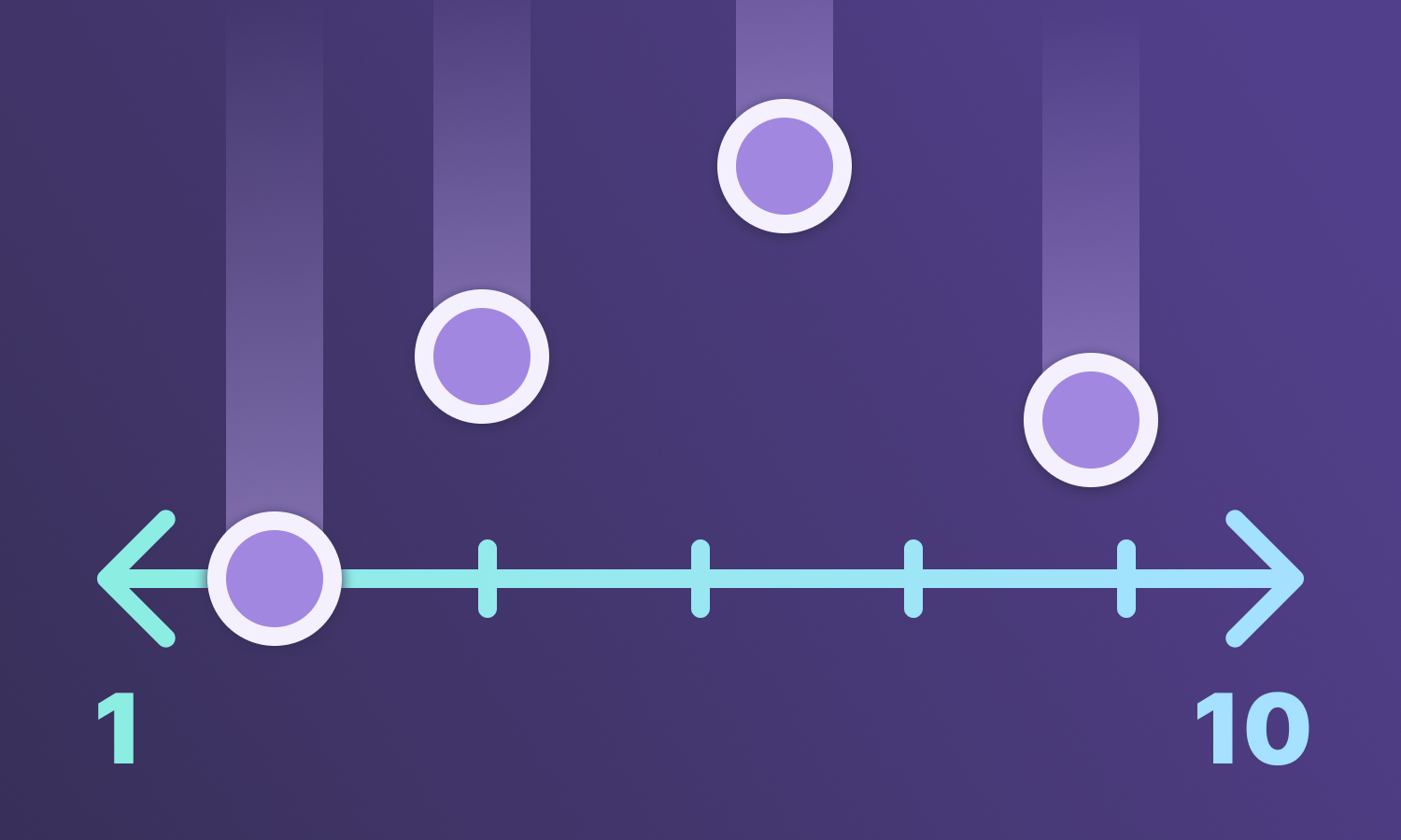
At Savas, we use moodboards early in the design process. They work their best when used after we’ve had a chance to run a spectrum poll. Where a spectrum poll exercise is designed to be a high-level exploration of a stakeholder group’s preferences and sensibilities, a moodboard is our designer’s initial interpretation of those preferences and sensibilities. They are a logical next step, as they allow us to advance from generalized examples into specific ones that seek to directly reflect our client’s brand. They serve as a valuable communication tool to help our clients identify not where they are now, but where they want to be in the near future. In short, moodboards are not webpage content, they're curated collections of key design decisions intended to elicit a desired emotional response in the viewer.
“ Moodboards are collections of key design decisions that seek to elicit a desired emotional response in the viewer.”
When designing moodboards, it’s best practice to generate at least two distinct directions (three is even better!). These directions should explore the balance between all the elements at play and the degree to which they reflect the brand's tone and personality. Before even putting shape to page, I find it helpful to list a few power words, short descriptions, or even explicitly name the directions. This helps define the identities early and gives you a clearer idea of what to target.
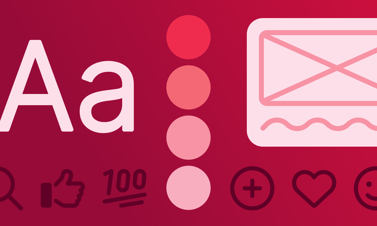
There are entire college degrees dedicated to visual composition, so I won’t try to cover it all here. Instead, I’ll briefly walk through the core components I keep in mind when creating moodboards.
Reiterating from my previous blog about overall color palette usage, color is a powerful tool for communicating a vibe. Different colors hold different emotions, and balancing them within a palette can significantly affect a viewer’s perception of a design and in turn, your brand.
Think about your color palette and how it makes you feel. Does it align with how you want your users to feel?
For example, when working with Global Teaching Partners, we aimed for an identity that felt warm and inviting. Take a look at the moodboards below and focus on the colors. Which color palette better achieves that emotional tone? Why?
Typography is an endlessly fascinating subject to me, particularly font choice and its ability to reinforce a theme. I like to think of fonts as the visual voice of the written word. A lot of emotion can be conveyed just through letterforms alone! Some fonts are brimming with personality, while others are quieter and prefer to let the content do the talking. Take, for example, the image below: we have the same phrase written in three fonts. Which one feels more appropriate for a medical research company trying to establish a brand that feels innovative, yet approachable? Why?
Typography is a critical element in the identity of a brand, so be sure to put thought into what themes your typeface communicates and why it’s a good fit for your moodboard direction.
A key creative decision lies in how you visually tell the story either through photography, illustration, or a smart mix of both. I’m grossly oversimplifying here, but in general, photos are great for making things look real. Seeing is believing, and nothing legitimizes a person or a product like an actual photograph of it (pics or it didn’t happen, am I right?). Illustrations are great for immersing our users and for really capturing a vibe. While they lack the tangibility of a photograph, they double down on the visual brand identity and supplement written content in fun and unexpected ways. You can use a mix of both in your moodboards, but the biggest determining factor will likely be your access to these assets. I.e., We want to look like real people, but is there a budget for a photoshoot? Will we need to rely on stock photography to avoid less-than-ideal cellphone shots? Do we focus on illustrations because our physical product doesn’t exist yet? Who will be drawing those illustrations? Does our design team have the skills and bandwidth, or will we hire a freelance artist? These questions might be answered long before you even write your power words, but if not, you can use decisions in your moodboard to ask your stakeholders directly and gauge appetite one way or the other.
A common hangup during the moodboard creation process happens somewhere around the midpoint. You’ll feel just about ready for internal feedback, then take a step back and realize something terrible has happened! Your two directions look very similar. This is especially the case if you’re exploring two directions simultaneously, or if you’ve yet to define your power words.
Lean on your peers for feedback here; a fresh perspective is always helpful. If you don’t have the luxury of consulting a team, take this opportunity to reference your power words (or define them if you haven’t yet!). Review your moodboards one element at a time and ask yourself: Is my theme communicated in these colors? In the typography? Photography? Etc. This will help you understand what decisions are the most visually impactful. Focus on highlighting those and cutting elements that don’t reinforce your theme. If you’re using similar approaches in both directions, consider keeping the one that’s most successful and doing something completely different in the other.
Ideally, you’ve already run a spectrum poll with your stakeholders, so they’ve started to get comfortable speaking the language of design. Regardless, a good caveat to voice at the start of a presentation is to let folks know that this is a first draft. There is still plenty of room for exploration and refinement. This helps reduce the pressure folks might feel around “making the right choice” and creates an open dialogue. Talk through each of your design directions, and why you made them, be sure to tie them back to things you’ve heard from your stakeholders. If folks are still having a hard time communicating their thoughts, try highlighting the specific differences between the options and asking how folks feel about them. For instance: “In option A, our illustrations are loose and sketchy, reflecting a hand-drawn, human aesthetic. In option B, our illustrations are much more exact, clean, and precise. Which of these better reflects the brand?”
Be careful not to get too specific here, as if left unchecked, the conversation can quickly devolve into the dreaded “Frankenstein Effect.” We are not going to simply take the buttons from A and move them to B. Instead, we want to understand why folks prefer the buttons in A and use that to inform the design of those in B.
At all times, we want to avoid becoming just the executor of stakeholder tweaks. YOU are the design expert. Just doing what they say starts to erode trust and turns you into an expensive pair of hands, and ultimately defeats the purpose of your involvement in the process. If you disagree with a suggestion, politely thank them for it and ask probing questions to understand the underlying reason for that suggestion. This will help you achieve a solution that addresses the root problem, instead of just remedying the symptom.
Moodboards are a nuanced but significant part of the design exploration process. They bridge the gap between abstract ideas and tangible visuals, sparking excitement and collaboration. By using them to guide conversations and gather thoughtful feedback, we can set the stage for an impactful and rewarding process where stakeholders can feel personally invested in the outcome. Whether you’re working with clients or an internal team, moodboards are an important tool for visual collaboration and alignment.
The folks at Savas Labs are profoundly collaborative in nature, and it’s this force that drives us to understand the deeper motivations and needs of our stakeholders. Moodboards are just one tool our design team uses to unlock these insights. If you’re struggling to determine the next iteration of your digital brand, send us a message! We’d love to help. ✌️

.png)
