Introducing Tipit

Maddy Bishop Van Horn on background

Maddy Closs

Tipit: powered by Labs, a place for experimentation at Savas Labs. Text with Labs logo.

The Inspiration

If you’re an avid reader of the Savas Labs blog, you now know about our Labs™ space. What you might not know is Savas founder and CEO Chris’s obsession with palindromes.

During our weekly Monday meetings, we each share a highlight and lowlight from the past weekend. One morning, Chris shared with great delight that he accomplished his first-ever triple palindrome receipt over the weekend:

RELATED READ

Meet (Savas) Labs™
Chris's first ever triple palindrome tip.
Chris's first-ever triple palindrome tip.

Chris is a good sport, and I wanted to burst his bubble a little bit. So, I stated the obvious:

If you start with one palindrome and add another palindrome, you’re going to get a third palindrome, as long as the sum of the digits isn’t more than 9.

To prove Chris wrong, I decided to build a little tool that helps you maximize your palindromic tipping. And that is the story of how Tipit was hatched. (Get it? ... t-i-p-i-t)

Prototyping

The original Tipit was built in a few hours using good ol’ vanilla JS, HTML, and CSS. From the beginning, Tipit has allowed users to enter their bill amount, the lowest percentage they’re comfortable tipping, and the highest percentage they’re comfortable tipping. Then, it outputs the various options for tipping with palindromes.

Slack screenshot. Drew: This is the app millennials crave. Chris: HAHA!!! I'm filing an issue...

The prototype sparked some joy within the Savas team, and I enjoyed building something bite-sized with a healthy dose of whimsy.

Design

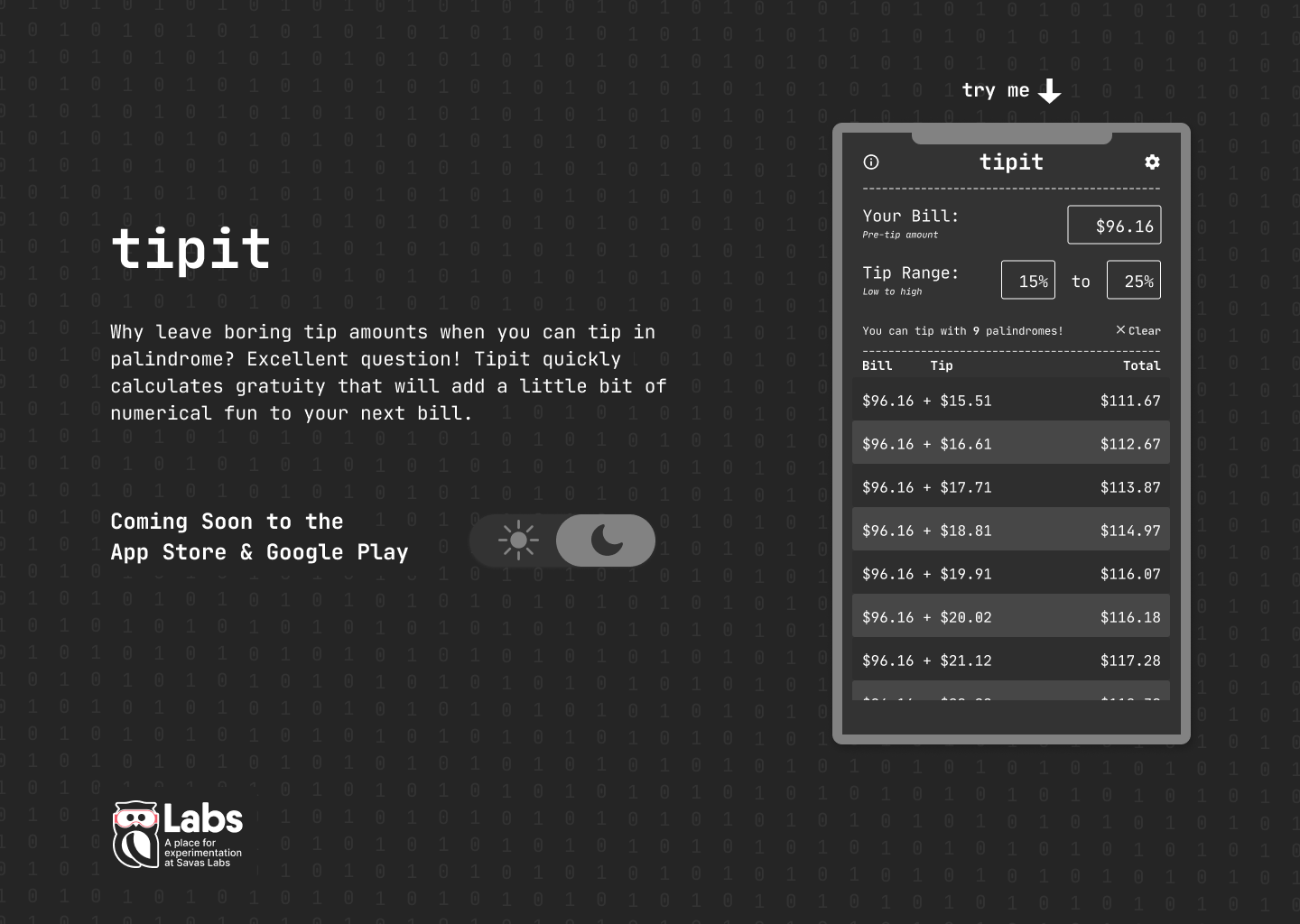
After the prototype, the idea behind Tipit gained some momentum and Drew stepped in to take the design to the next level. Tipit’s design thematically mirror’s the utilitarian and monospaced and monochromatic-nature of print receipts.

Tipit info modal
Info modal
The tipit phone app
Main screen
Tipit settings screen
Settings screen

The next step was a sleek landing page which showcases the mobile application and highlights the darkmode feature.

Tipit landing page - light mode
Tipit landing page – light mode.
Tipit landing page - dark mode

Building

We built Tipit first in React, and then again in React Native. React and React Native share structure and approach, so Tipit’s “engine” was able to be reused for the native app. However, the user interface code differs fairly significantly between React and React Native, so we opted to maintain two separate codebases.

We implemented user settings (including dark mode) using React’s Context API. Users’ preferences are saved to their devices using local storage (for the React app) and AsyncStorage (for the React Native app).

The landing page itself is built in React, allowing the landing page theme toggle and phone simulator theme toggle to be kept in sync.

RELATED READ

Using React Global State with Hooks and Context

Conclusion

Our Labs initiative is all about innovation and impact. That can feel like a lot of pressure, especially with so much uncertainty in the world. Tipit taught me to just… start something. And then share. And then iterate. And then let it out into the world.

It was a blast to build (special shoutouts to Drew, Jenna, and Colleen!) When we get out of this pandemic I can’t wait to use it in the wild. In the meantime, I’ve been using it for takeout!

Try Tipit

We could all use a bit of whimsical fun these days.