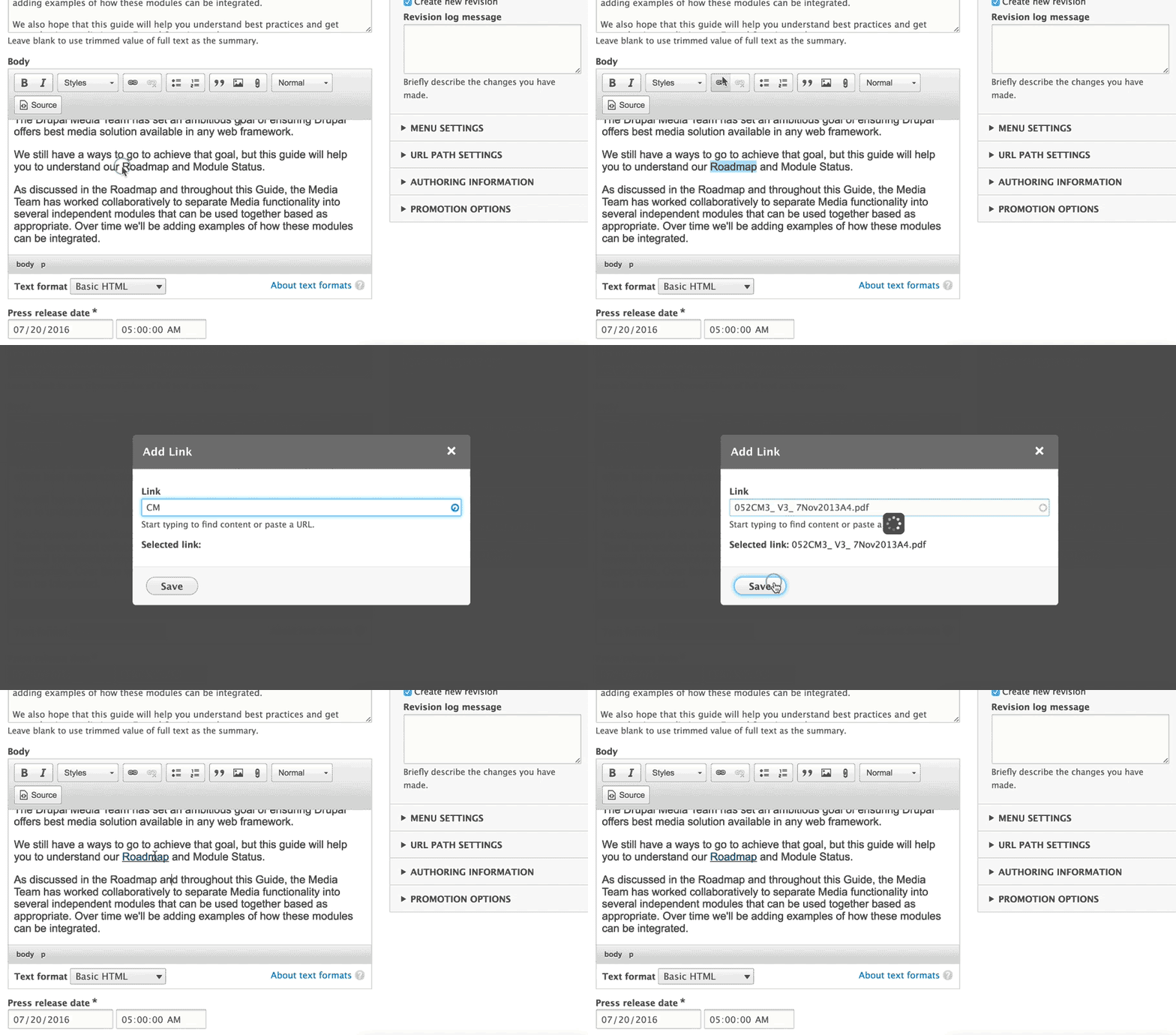
Drupal 8 ships with WYSIWYG text editor in core. The editor even works great on mobile! In a society that is so dependent on our mobile devices - who wouldn’t like to be able to quickly edit a missed typo right from your phone?
Drupal 8 provides superior enhancements to the UX (User Experience) for content authors and editors out of the box. However, with a little configuration, things can be further improved.
When establishing the UI (User Interface) for content authors, site builders should focus on refining rather than whole-sale adoption of the available features. Customizing the WYSIWYG editor is the perfect example of subtle improvements that can immediately make a big difference.
The WYSIWYG text editor is an effective tool for simple content entry since it does not require the end user to be aware of HTML markup or CSS styles. Many great functions like text formatting options (font family, size, color, and background color), source code viewing, and indentation are available at our fingertips, but as site builders we should think twice before adding all those options to the text editor toolbar!
With great power comes great responsibility! Sometimes, when you give content editors control over the final appearance of the published content (e.g. text color, font family and size, image resizing, etc.), it can lead to an inconsistent color schemes, skewed image ratios, and unpredictable typography choices.
How do we help our content authors in avoiding common design / formatting mistakes? Simple!
Use a minimalist approach when configuring the WYSIWYG text editor. Give authors access to the most essential text formatting options that they will need for the type of content they create and nothing more. If the piece of content edited should not contain images or tables - do not include those buttons in the editor. The text editor should be used only for sections of text, not for the page layout.
A properly configured CMS should not allow content editors the ability to change the size of the text or play with image positioning within the text section or the ability to add H1 headers within auxiliary content.
Below is an example of a bad vs. good WYSIWYG configuration.


