

As a developer who often interacts with and creates web designs, I’m always on the lookout for quality resources to level up my design skills, and the Book Apart series has proven to be an excellent source of knowledge presented in a relevant, concise manner. My latest read was On Web Typography by Jason Santa Maria, and I found the book to be a strong resource, especially for the non-designer. In this post, I’ll review the book and detail how we at Savas Labs implemented the lessons we learned.
Thinking about reading
Have you ever stopped to think about the actual process of reading? I think Santa Maria puts it best:
Reading is something we do every day, but we can easily take it for granted. Slapping words on a page won’t ensure good communication, just as mashing your hands across a piano won’t make for a pleasant composition. The experience of reading and the effectiveness of our message are determined by both what we say and how we say it.
Rather than jumping into choosing and pairing typefaces, or even evaluating their characteristics, Santa Maria suggests we approach typography much further back and take the time to consider what users are actually doing when they read text on our sites. This is something I hadn’t considered before and brings a depth to the process that is so much more than picking and applying fonts. In addition to aesthetics, type design can have a significant effect on user experience and, therefore, is doubly important to consider during the design process.
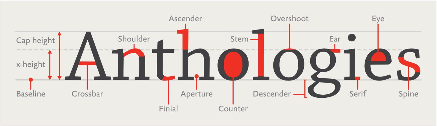
A diagram of typeface anatomy from On Web Typography by Jason Santa Maria.
Base knowledge
Most of us can tell a serif from a sans serif, but I found the base of knowledge Santa Maria provides in the book to be an incredibly useful foundation. Knowing some critical terminology and history has already improved my ability to design type, and this section is compact enough to be a quick overview with serious payoff.
In the book, Santa Maria covers:
- An extremely brief yet useful history of type, focused on how typefaces were created through most of history before the web and how things changed as communication became increasingly digital
- Terminology used to describe typefaces and their elements
- Methods for classifying typefaces that are descriptive and useful when evaluating and choosing typefaces
- An overview of the characters and styles that a well-developed typeface will offer (true bolds and italics, language sets and punctuation among others)
Evaluating typefaces
After reviewing the building blocks that make up a typeface, Santa Maria applies this knowledge by walking the reader through the process of evaluating two classic typefaces. This section is a clear presentation of how to dissect a typeface and understand its geometric structure, tone, history, and classification. Santa Maria also demonstrates how one can capitalize on the tried-and-tested nature of classic typefaces by looking to revivals and alternatives inspired by those classics. These exercises will help you understand typefaces on a deeper level and prepare you for the next part: actually selecting and applying them.
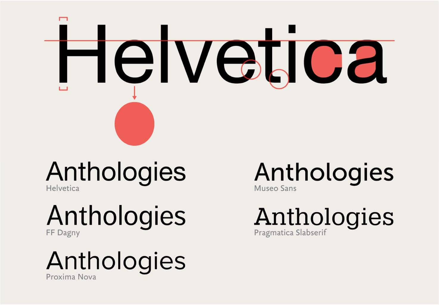
Finding alternatives to Helvetica by examining its physical characteristics from On Web Typography by Jason Santa Maria
Choosing and pairing typefaces
All the previous sections culminate in the ultimate goal: how to design type for your site. Santa Maria introduces two separate contexts to consider: type for a moment (a menu link, a heading, etc.) and type to live with (long text).
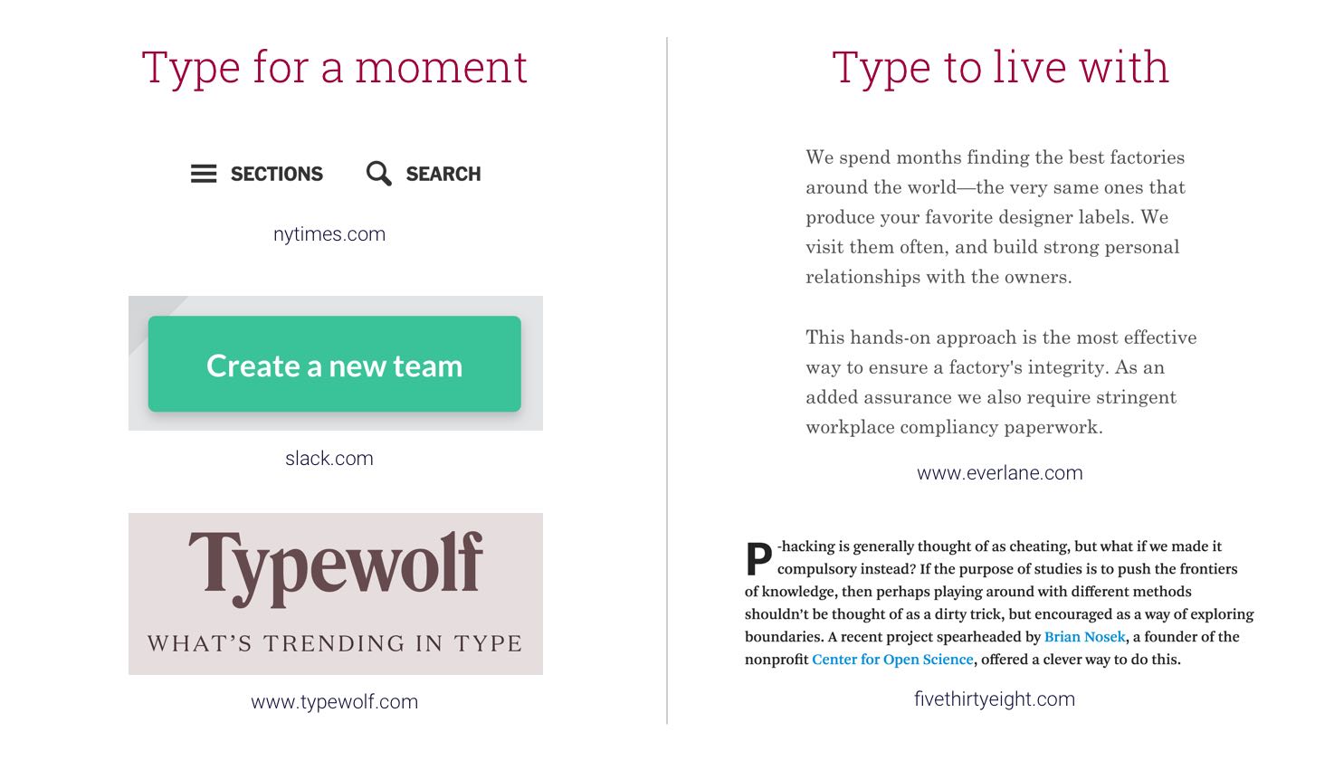
Some examples of the two contexts
These contexts demand different typeface choices based on what’s important to the reader — quickly understanding a snippet of text, or reading paragraphs of text without becoming fatigued or distracted.
Santa Maria provides some helpful step-by-step methods for choosing typefaces. My favorite was word association, something we may all be familiar with, but he builds this process out in a way that seems easy and effective.
Another important skill covered is pairing typefaces, something that poses a challenge to many of us. Santa Maria suggests a balance between two typefaces’ distinction from each other and cohesion with each other, demonstrated with numerous examples, and explained with reference to the type terminology and classification methods reviewed in previous chapters.
What’s next?
After finishing the book, I had a couple of questions:
How can I actively improve my type design skills?
After reading design resources, I usually feel armed with new information but unsure of how to actually apply it. I’ve found that improving design skills isn’t something that happens instantly after you’ve learned something new — it takes practice!
One of the methods I’ve found most helpful is to keep an eye out for design elements I like, and when I see them, break them down and figure out why they work. For typography, this would mean identifying the context, classifying the typeface, evaluating the letterforms to identify their physical characteristics and the feelings they invoke, and (this is key) bookmarking the source in an “Inspiration” folder. Entire books have been written about this process, so don’t be afraid to be inspired by others’ work!
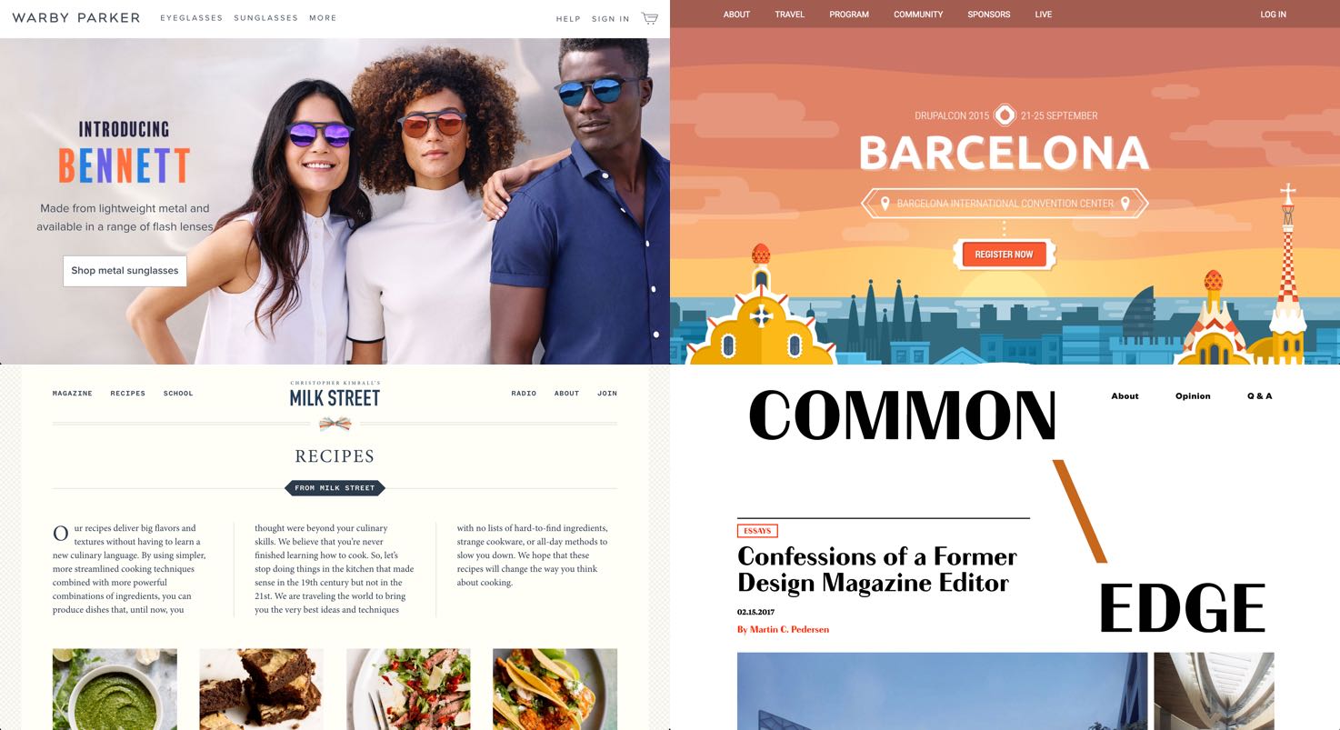
Some samples from my Inspiration folder.
After perusing my Inspiration folder, I follow these guidelines when designing type:
- Keep it simple. It’s conventional to use a maximum of two typefaces, and often using typefaces within the same family or a single typeface in multiple styles gives you all the variety you need.
- Try things out in context. This is recommended by Santa Maria in the book, and giving typefaces and pairings a shot on your actual site (or a local version) is crucial. Most paid fonts are available via free trials, so no excuses!
How can our team apply this knowledge?
Much of the team at Savas Labs focuses on back-end development, but we all have a desire to be holistic teammates with some proficiency at every stage of the process. We don’t all have the time to invest in becoming typography experts — one can spend an entire career doing so — so we wanted to find ways to enable our team to be able to consult on typography and make informed decisions on type design when needed.
To this end, we created a repository where we can continue to house a list of go-to typefaces, tried-and-tested pairings, favorite foundries, and excellent type resources. Curating this list and adding to it whenever we find something we like provides us with an easy reference so we’re not starting from scratch every time, and is a nice way to practice the skills suggested above.
Closing thoughts
I would highly recommend checking out On Web Typography, especially if you’re a typography novice looking to step up your game. In closing, I’ll leave you with Santa Maria’s thoughts on another benefit of developing type design skills: a greater sense of empathy for your website’s users.
Being good at typography makes you a more adept thinker, communicator, and designer. When you immerse yourself in the fine details of text, you not only make yourself aware of those details and how they affect communication, but you also put yourself in your readers’ shoes.