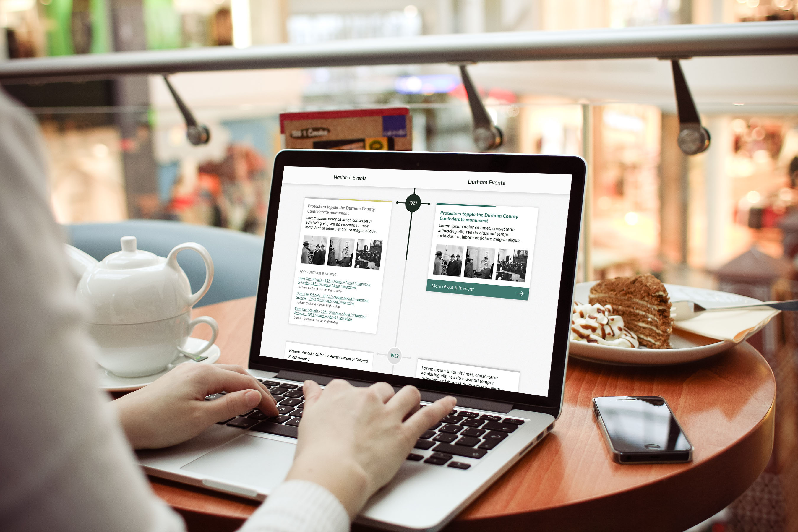
Unified design isn’t just important for the sake of a great user experience across multiple devices. Right now, 13% of US adults are smartphone-only users, and that percentage rises for people without a college degree, people who make less than $20,000 a year, and young people — 21% of millenials use the internet exclusively on mobile. And the US is behind most countries in mobile use! So if we continue gutting the functionality of our sites on small screens, we’re penalizing large and sometimes vulnerable groups of users who can’t afford or simply don’t want another internet connection besides their phone.
So why do our mobile sites fall so short? Constantly growing desktop screens gave us the opportunity to fill those screens with less-than-useful content. Once we needed to adapt to small screens, we had to cut down our desktop sites and often ended up sacrificing functionality. This is where the idea of mobile-first can save us - rather than designing for desktop then scaling down, we can design for mobile and then add enhancements depending on device capabilities. One of the biggest gains for me from this conference was finally grasping the true value of mobile-first design.
Beyond devices, the Internet of Things is coming and can be awesome – if we design responsibly.
I’ll be honest, the Internet of Things usually gives me a creepy, hair-standing-up-on-the-back-of-my-neck, Ray-Bradbury-was-right feeling. But the possibilities in front of us are truly amazing, and if we handle the responsibility with care, we can meld the internet with our physical world in a way that actually improves our lives. Josh Clark suggested that instead of using our powers to bombard people with ads or infantilize them with needless apps, we should strive to make people feel like superheroes. One great example that Josh shared is Wayfindr, an audio navigation system to help visually impaired people use the London Tube.
Josh also called on us to design calm technology - to weave data into the background of our lives rather than overwhelming people with it. A wearable should be something you’d wear if it didn’t contain any technology. And like an escalator, a physical item should still work if the technology within breaks.
As the web seeps further into our lives, compassion is key.
One of the most powerful moments of the conference was Eric Meyer’s presentation on designing for real people through compassion. Through an incredibly personal and vulnerable narrative, which you can read more about in this post or in his excellent book, Eric showed us the importance of considering users beyond the ideal personas we create. Rather than considering these users “edge cases,” Eric encouraged us to think about “stress cases,” users who have an urgent or sensitive need and require additional thought and consideration. He challenged us to question our assumptions about our users, to earn and maintain their trust, and not to exacerbate the bad situations that inevitably affect people – people who still have to use the internet.
Josh Clark brought this up as well when discussing the rapid development of new inputs for touch devices, recognizing that we don’t yet have a set of principles to design by. His simple call to action:


