Visit Website Keep Scrolling
VITALSIGNS
The most amazing stories about climate, people and the planet

Vital Signs

Objective:

Our work on the Environmental Defense Fund's (EDF) digital magazine, Vital Signs, is a comprehensive example of leveraging digital innovation to amplify environmental advocacy. The project aimed to transition EDF's rich printed materials and existing posts into an engaging digital format, focusing on educating audiences, showcasing storytelling, boosting user engagement, and raising brand awareness.

Approach:

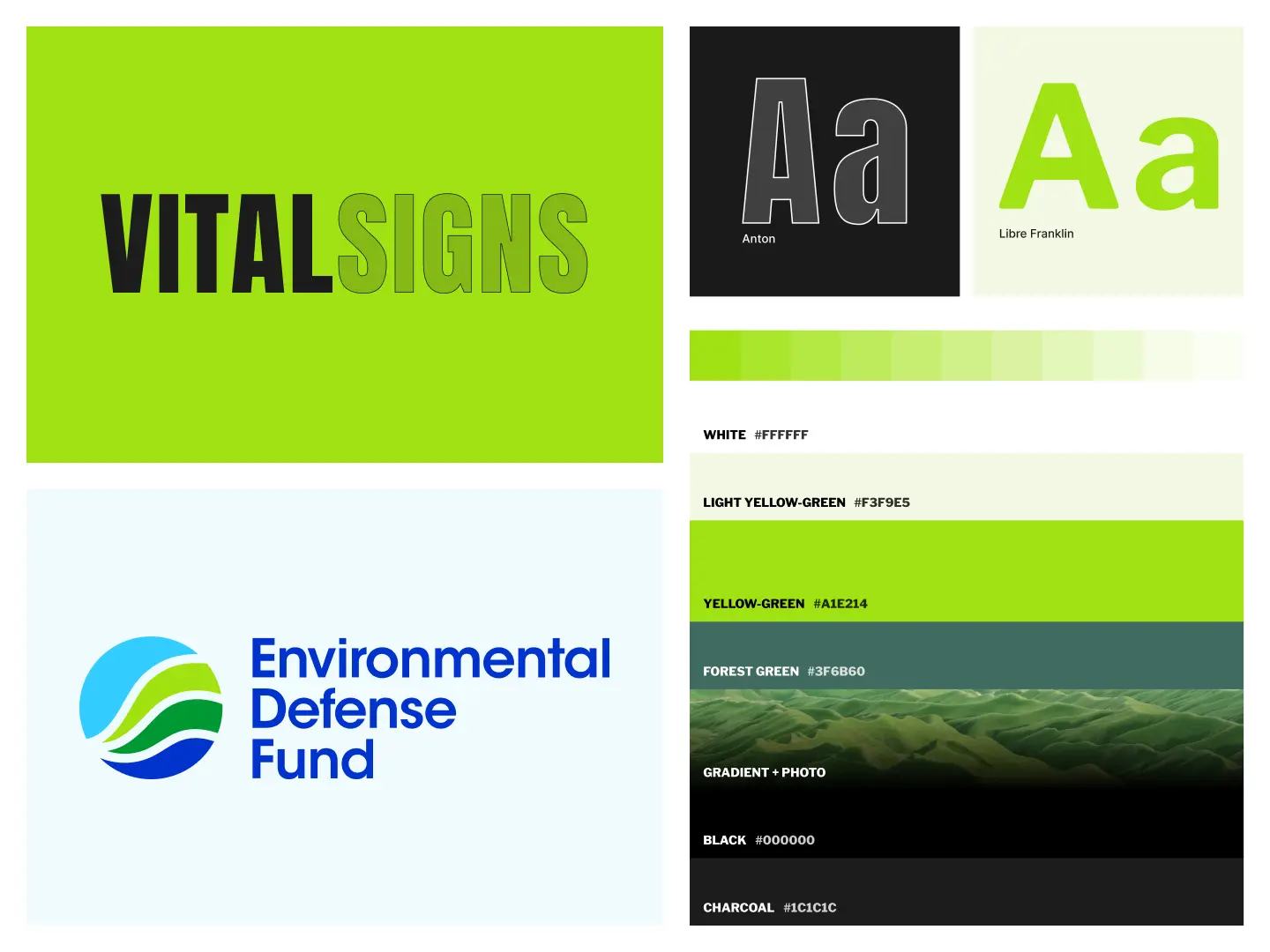
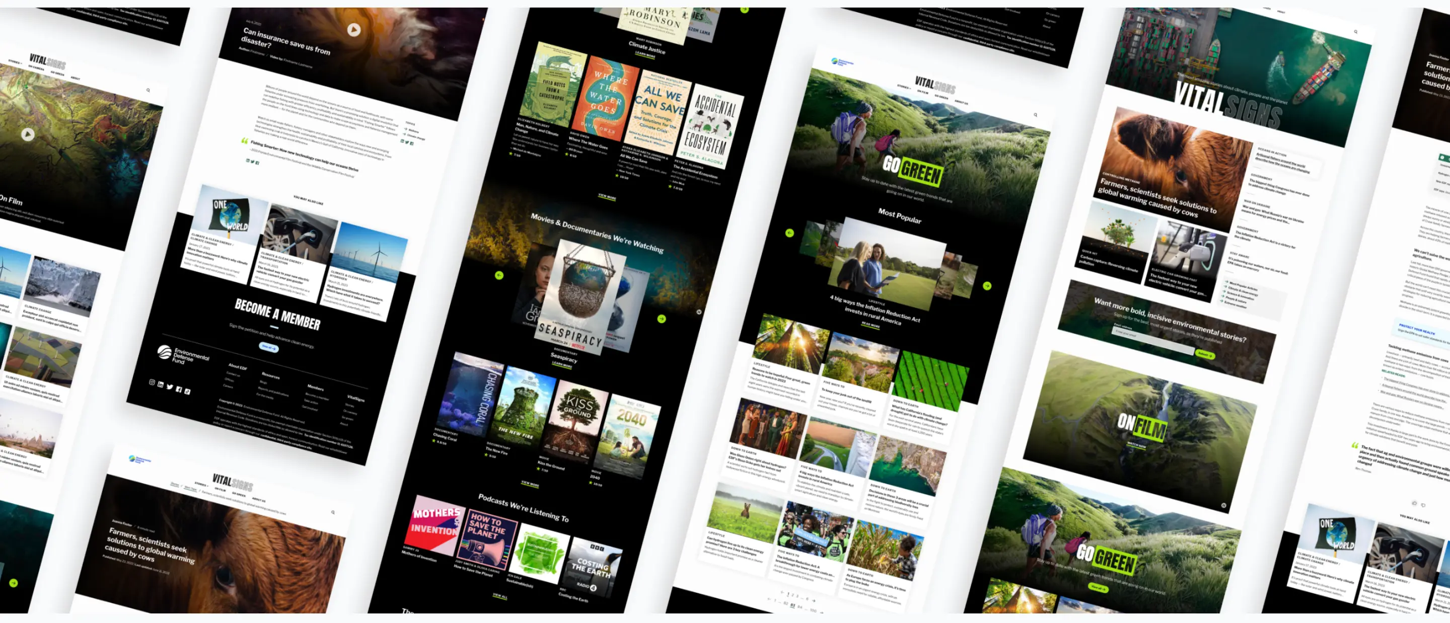
The design had to create a distinct identity for Vital Signs while aligning with EDF's primary branding. Our team drew inspiration from the EDF logo's bold hues, using neon green as the anchor color and contrasting black for the homepage background. Interior pages featured subtle nods to EDF's blue tones and design elements. The challenge of crafting numerous components with unique variations was met with a strategy that ensured seamless functionality and consistency across the site experience. This allowed the Vital Signs team complete artistic freedom in content creation, supported by clear guidelines on component accommodation based on content nature.

Project colors, font samples, and gradients

Compelling stories gave rise to a new brand

The brief required that the Vital Signs site have its own distinct identity while still paying homage to the primary EDF branding. Drawing inspiration from the bold hues of the EDF logo, neon green became the anchor for the new site design, and in stark contrast to EDF.org, we chose black for the homepage background. This new application of the EDF color palette allowed us to differentiate the two websites.

To ensure we still found opportunities to tie back into the corporate brand, the interior pages of the site feature subtle nods to the blue tones from the EDF color palette, along with secondary design elements and typography applications similar to those found on edf.org.

Digitizing content

As we entered the project, we noted that our biggest hurdle would be transforming EDF's long-form storytelling into a captivating digital experience. Additionally, we had to account for the extensive range of content that their team planned to publish, which spanned from short and long-form narratives and photo essays to videos and "Go Green" lifestyle pieces aimed at promoting sustainable living and carbon footprint reduction.

Given these considerations, we chose Drupal as the Content Management System (CMS) for the Vital Signs website. Drupal offers a structured and consistent framework for content creators to build pages utilizing a component system. By offering the flexibility to mix and match components based on each page's unique needs, it grants the EDF team full artistic autonomy to craft more compelling narratives.

To identify the necessary components, we began combing through EDF magazine issues and existing posts to pinpoint which content types could be converted into individual components. We then collaborated with their team to organize these content types into broad categories. This categorization process was pivotal in determining how to structure the content on the Vital Signs site in a way that effectively captivates EDF’s target audiences, enhances user engagement, and boosts brand awareness.

Featured Media Component Example

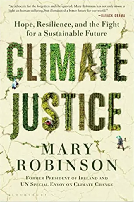
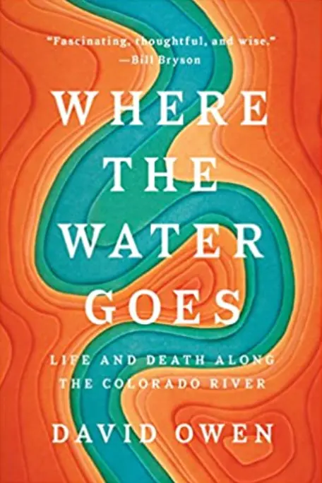
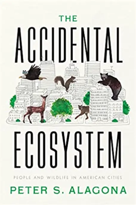
  • Book cover
  • Book cover
  • Book cover
  • Book cover
  • Book cover

Mary Robinson

Climate Justice

Considering the user and the content creator

While developing the site experience, we had to carefully balance the unique needs of both the users and the content creators to ensure an optimal experience for all.

The Users

A key focus of our developers was to facilitate engagement by directing users to content that aligned with their interests and that the high volume of media-type content wouldn’t compromise the website's performance.

Filtering

To foster an engaging digital experience for users, our developers added a robust filtering system to the website’s ‘Story’ and ‘On Film’ Archive pages. As a result, the user can choose between different categories, such as “Climate and Energy” and “People and Nature,” and the system dynamically feeds content based on their selection. To take these pages one step further, the hero image changes depending on the filter category selected.

Media

Images and videos play a significant role in many of the components, as it was crucial that we handled the different forms of media in a responsive and accessible manner

One noteworthy example of our developer’s approach is the video hero component. Rather than uploading videos directly to the site, we opted to host external videos on YouTube and Vimeo. Given their existing channel, YouTube was our go-to platform for longer-form interactive videos. For the more passive, ambient videos, we selected Vimeo, allowing content creators to customize how they display on the site.

Additionally, as part of our commitment to maintaining a high-performance website, we used Drupal's capabilities to serve images in the appropriate size, format, and aspect ratio for each device type.

Content Creators

One of the significant challenges was crafting the many different components, each with its own unique variations. It was imperative for the integrity of the website that these components, regardless of their order on a page, would function seamlessly, granting the Vital Signs team total artistic freedom when creating compelling content. To achieve this, we meticulously encapsulated padding and margins within each component.

Moreover, we set clear guidelines: depending on the nature of the content, only specific sections of a page would accommodate certain components. This ensured both consistency and adaptability in the website's design.